Zarden Jewellery
Branding and Visual Identity
- Year
- 2024
- Client
- Zarden Jewellery
- Service Scope
- Branding and Visual Identity
Project Overview
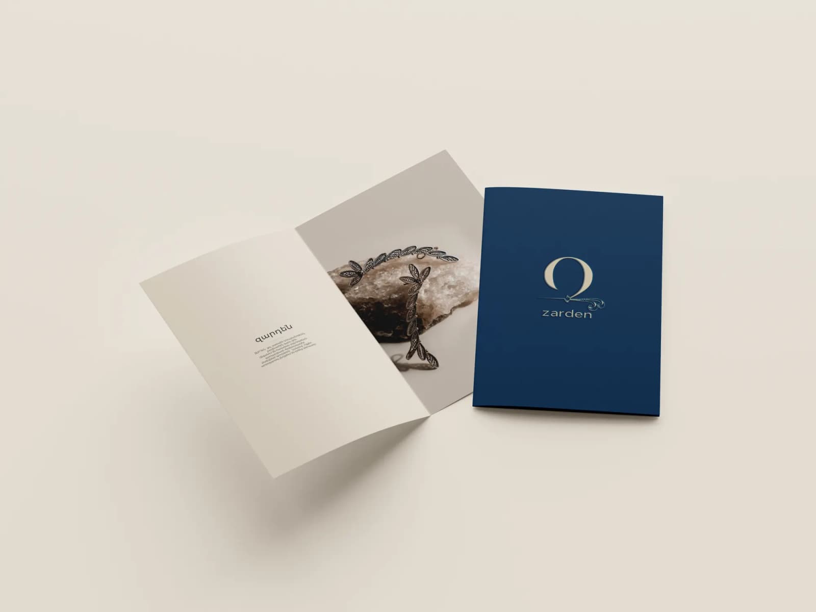
Zarden is a silver jewellery brand drawn from Armenian traditional decorative art and made for women of every age. CREO named the brand and developed its identity, visual content and art direction.
We came up with the brand name, Zarden, a newly coined Armenian word meaning an exquisite, adorned woman: someone who carries the motifs of Armenian ornament into today and expresses her character through jewellery.
Naming
ԶԱՐԴԵՆ (Zarden)
noun, neologism. An extraordinary, peerless, adorned woman; literally, an ornament-woman.
The name for women who carry the motifs of traditional Armenian decorative art into today and use adornment to emphasize their character.
Brand identity
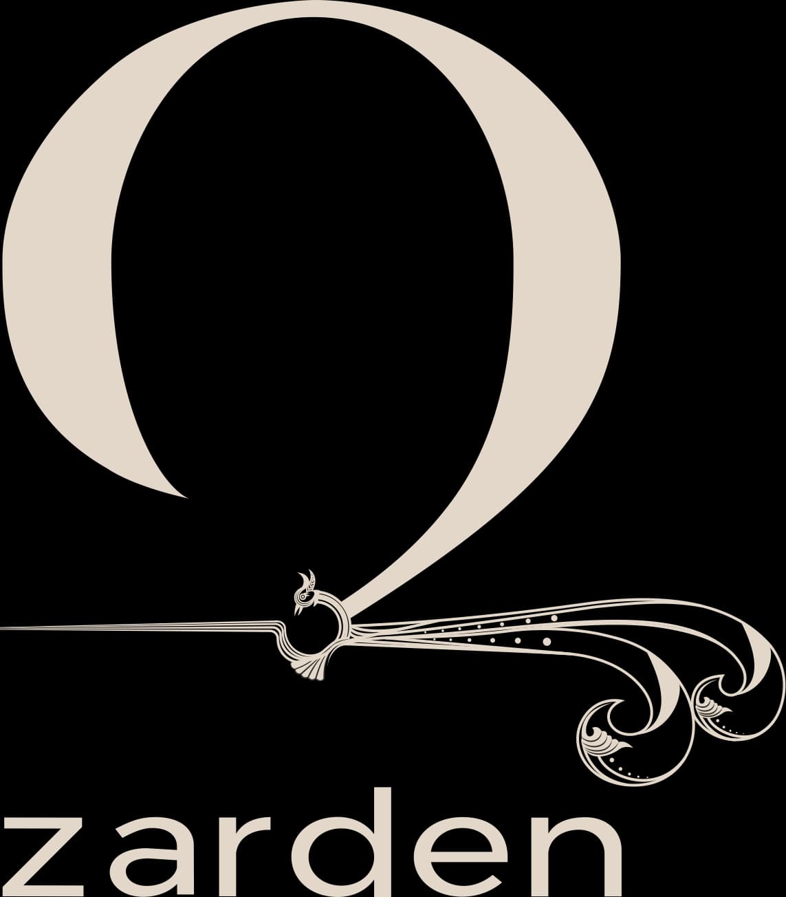
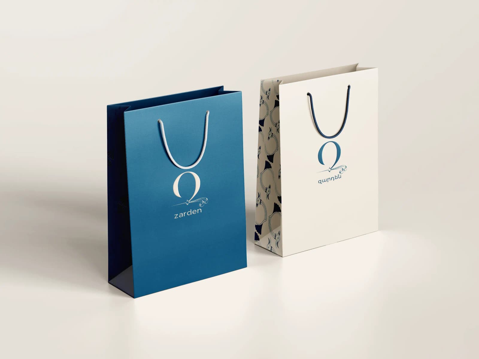
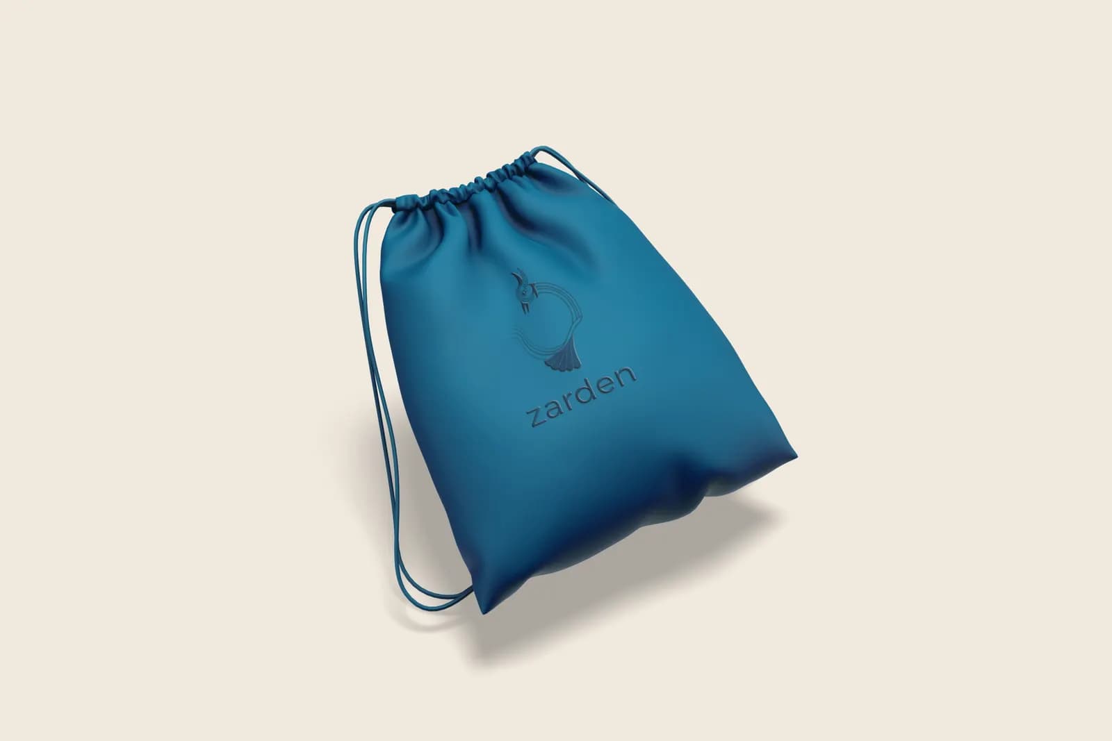
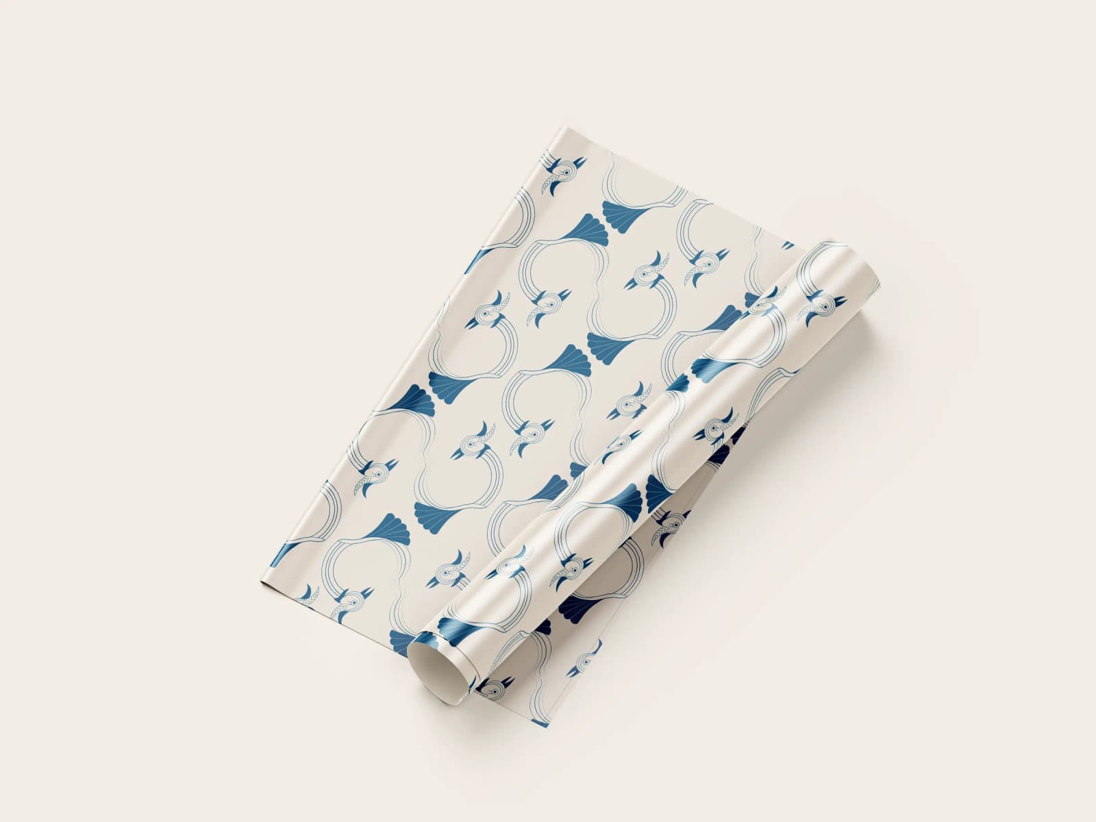
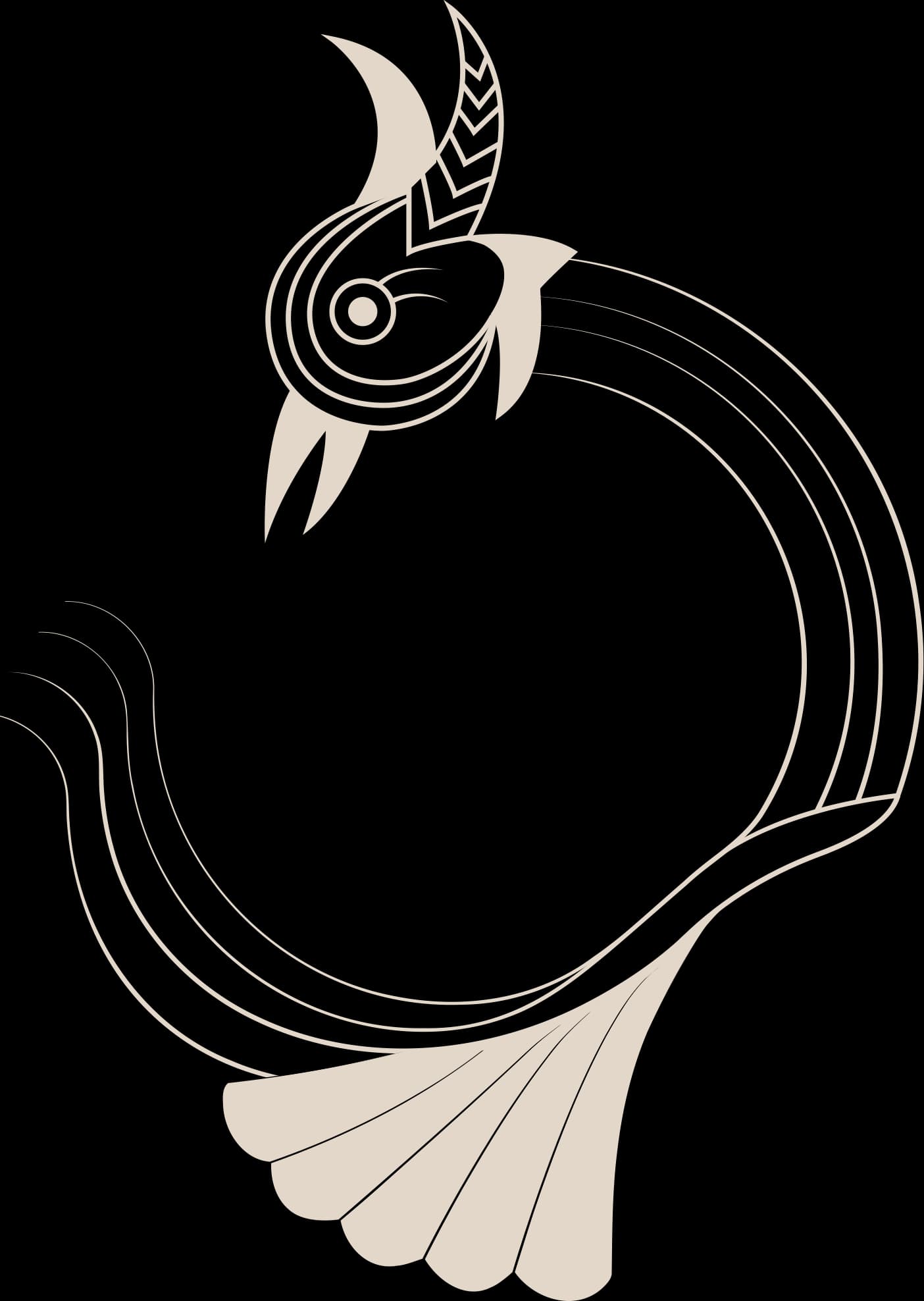
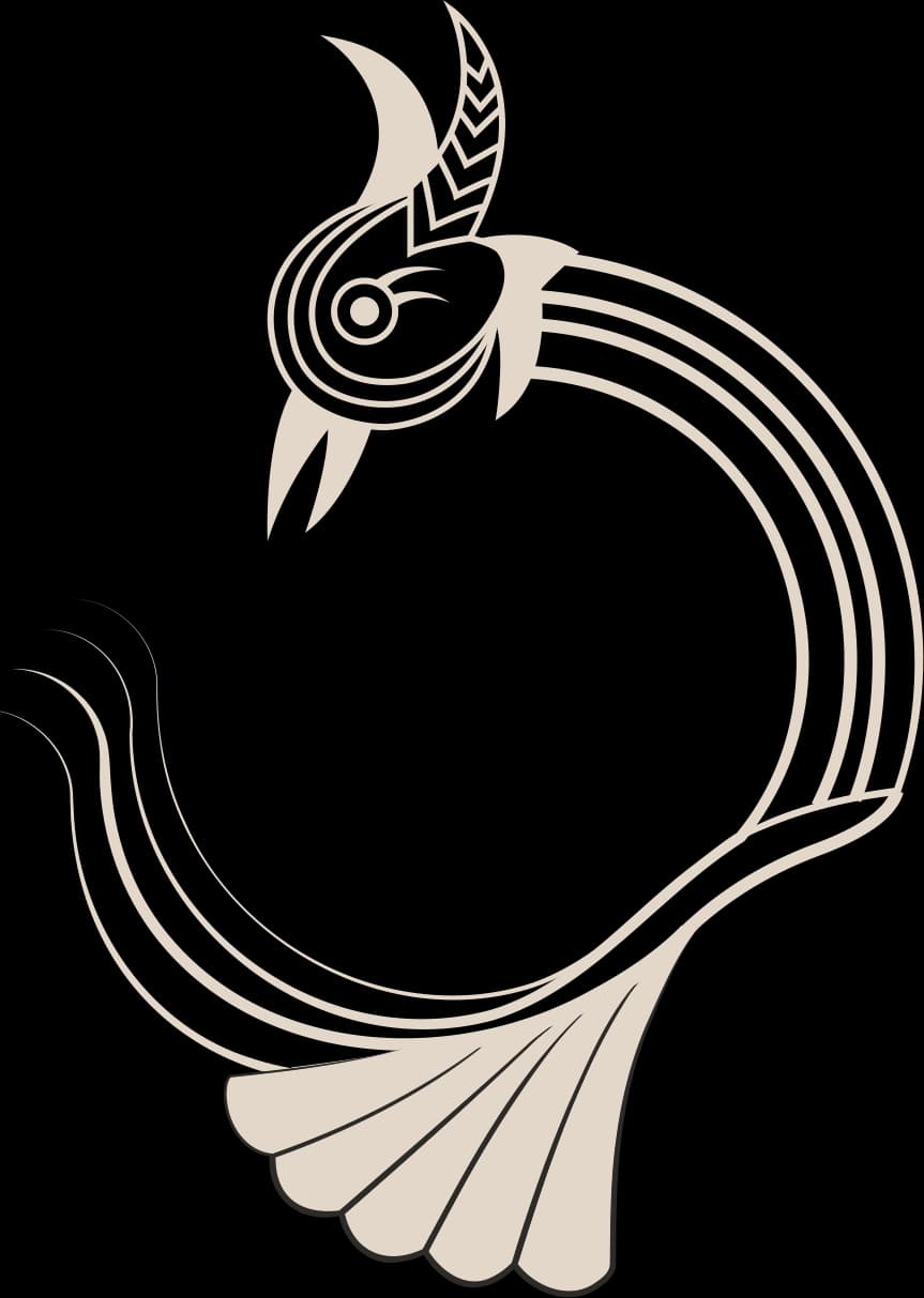
The logo merges old and new together. The upper part of the Armenian Զ (Z) follows today’s minimalist trends. Its base is a bird-letter, the ornamental letterform of medieval Armenian manuscripts.
Logo construction


Dark Cerulean
- C97 M66 Y35 K17
- #005173
Harmony of mind and feeling. A royal colour that presents silver as a noble metal.
Bone
- C10 M13 Y20 K0
- #E3D7C8
A link between past and present, roots and history.
Visual content
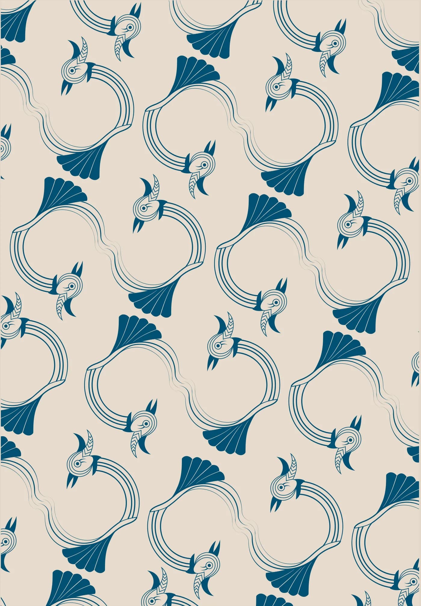
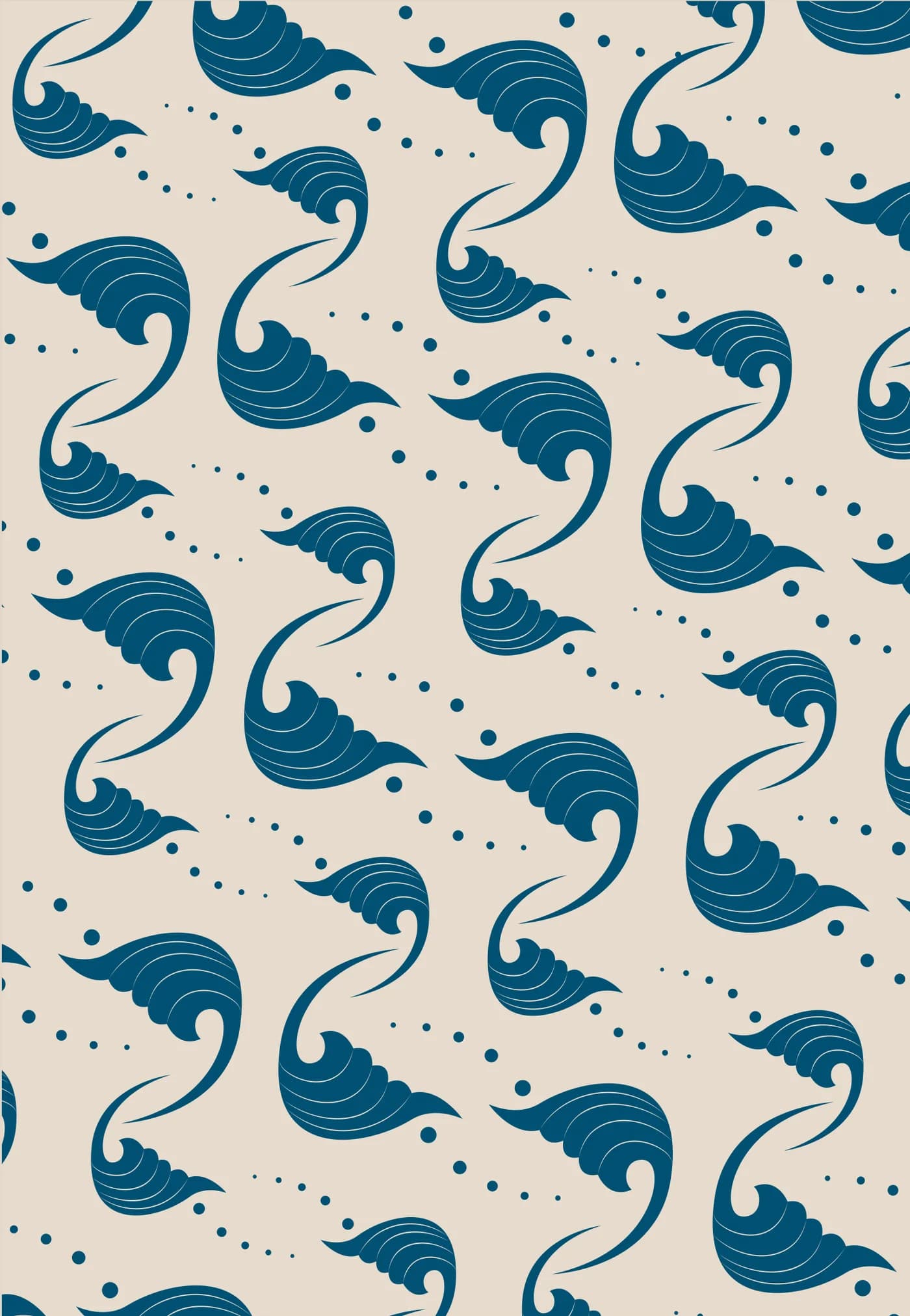
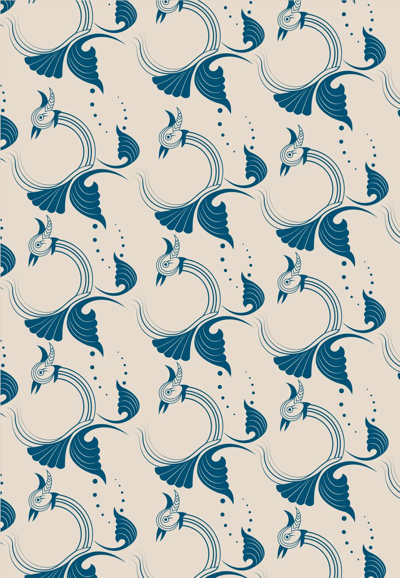
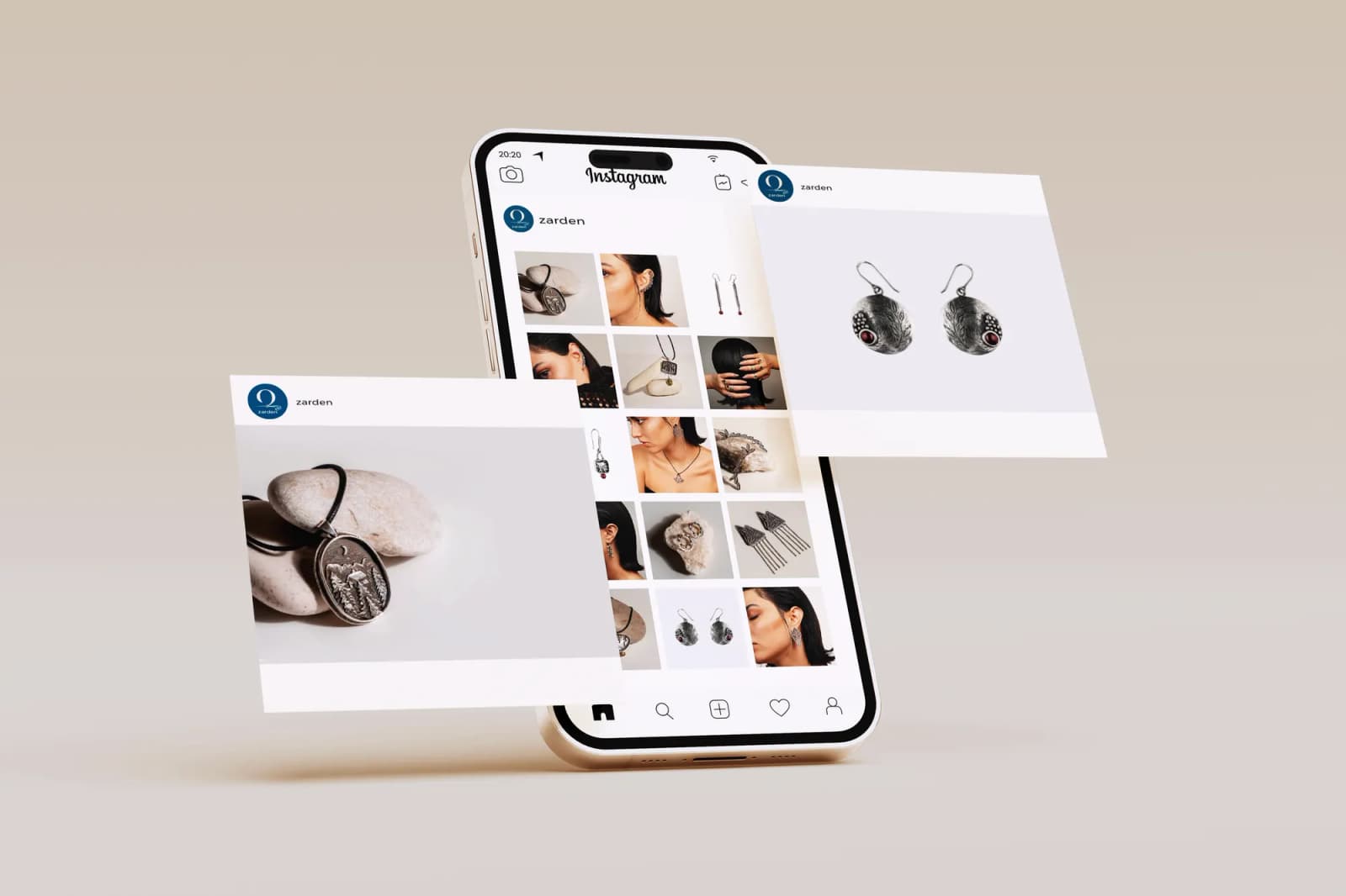
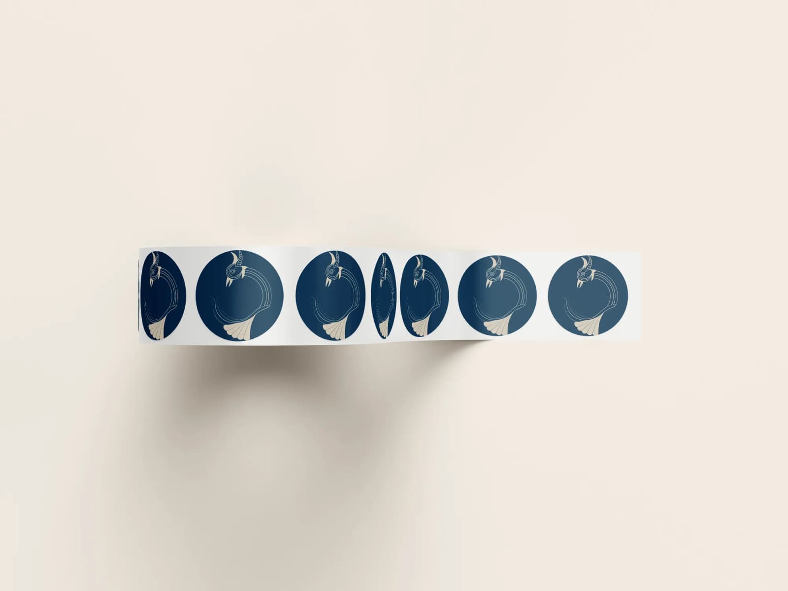
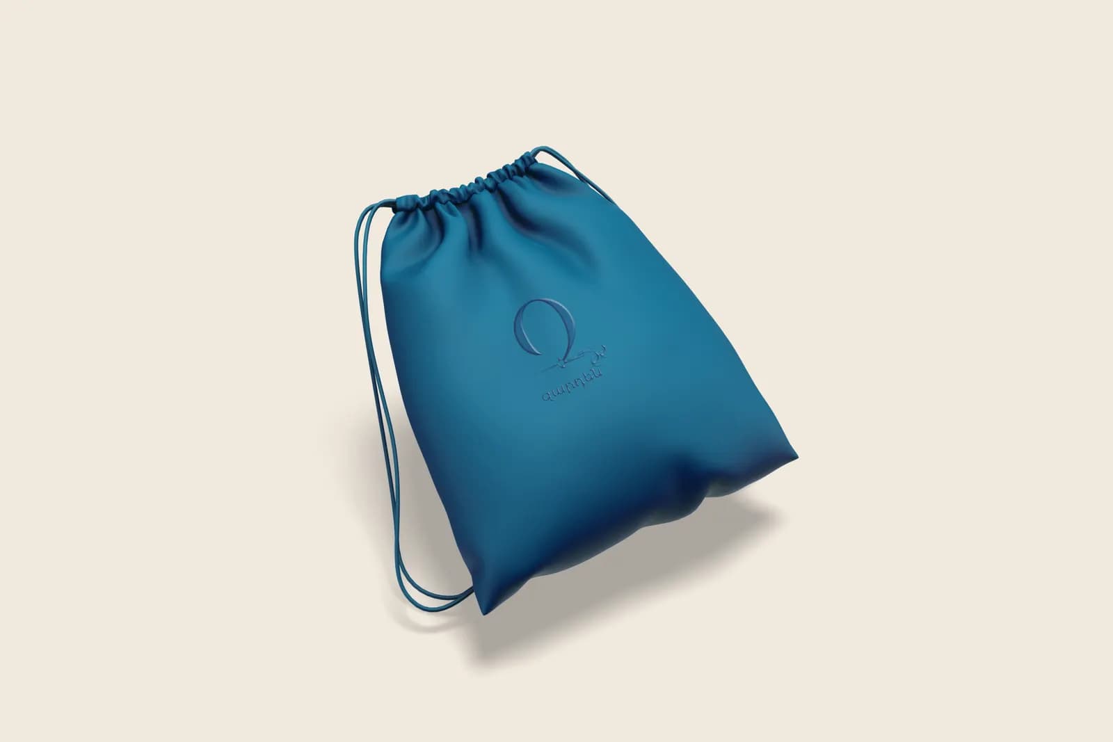
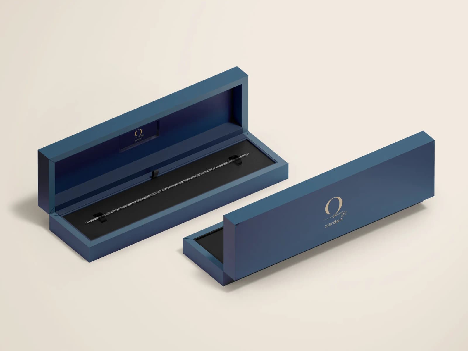
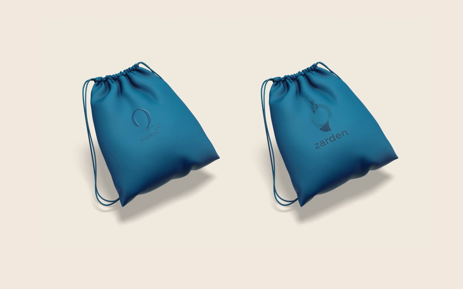
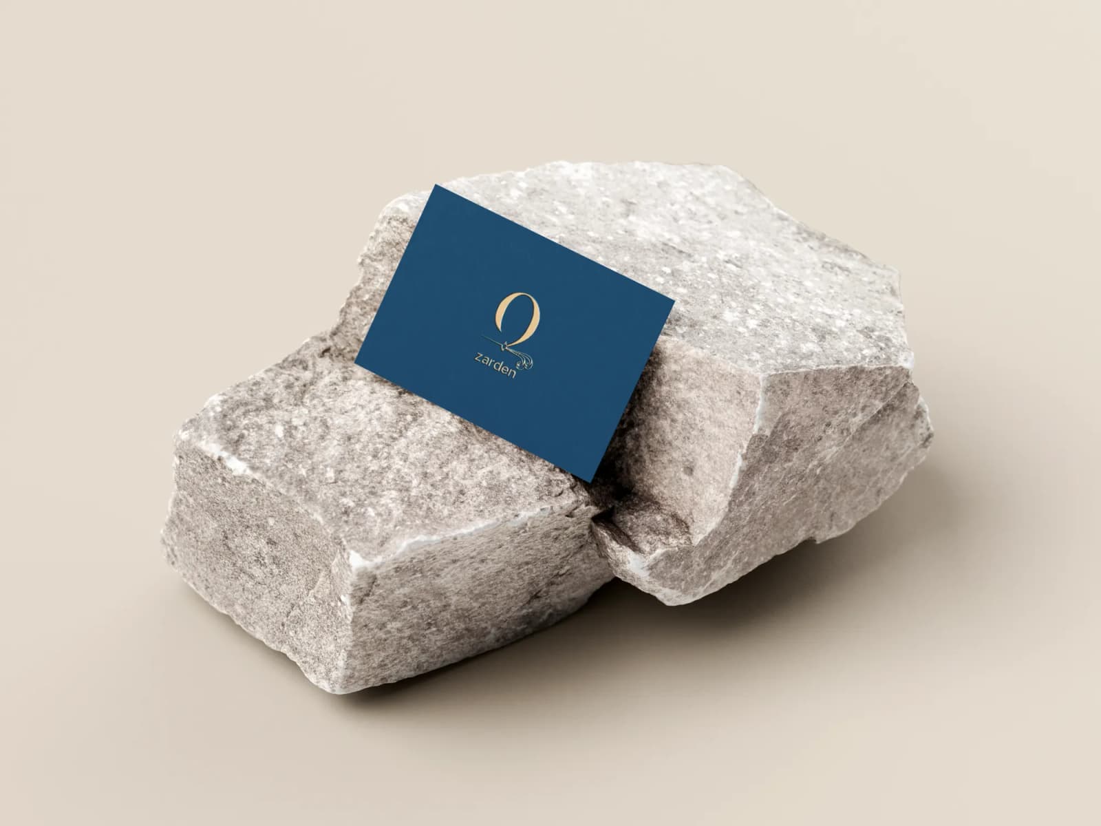
Brand identity in use