Yerevan Youth Orchestra
Branding and Visual Identity
- Year
- 2026
- Client
- Yerevan Municipality
- Service Scope
- Branding and Visual Identity
- Deliverables
Project Overview
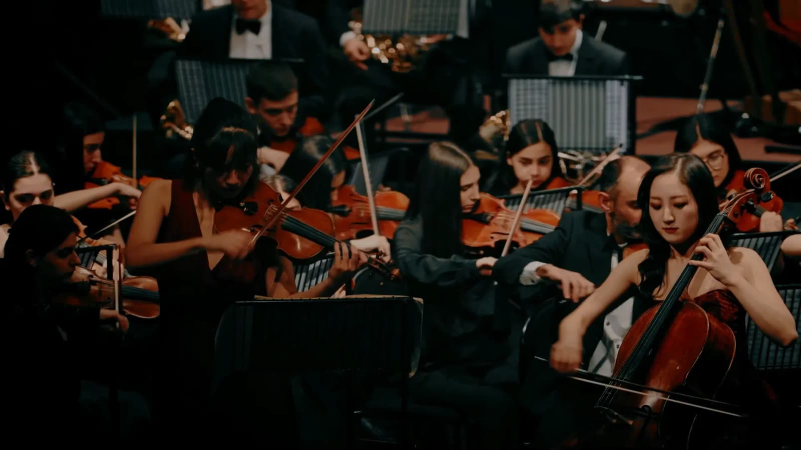
The Yerevan Youth Orchestra is Armenia’s first permanent youth symphony orchestra, established on the initiative of the Mayor of Yerevan. Its musicians come from the city’s leading music schools and colleges, and the orchestra is where their training meets a professional concert stage.
Because the orchestra is a city institution, expected to represent Yerevan’s creative potential at home and on international stages, this was a commission CREO took with utmost responsibility. The rebrand began with a fresh look at what the orchestra stands for, shaping its mission, vision and values and the whole identity.
Three things guided us the whole way: the city, the young musicians and the music they play. Every decision had to work for all three, from what the orchestra stands for to the form of its mark, where all three meet.
Rebranding
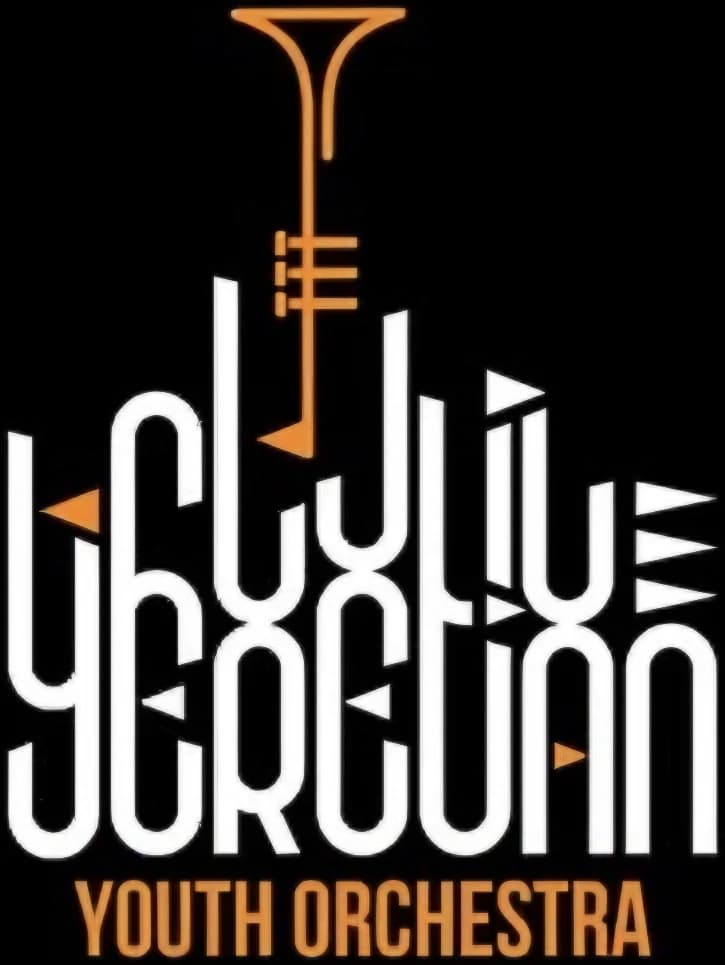 Before
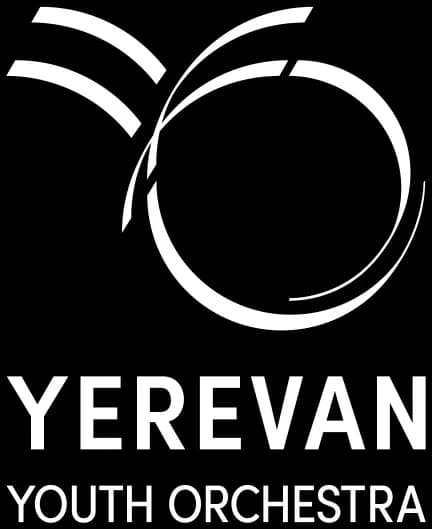 After
Brand platform
- Precision
- Discipline
- Expression
- Coordination
- Responsibility
AMPLIFIERof greatness
- Artistry
- Presence
- Interpretation
- Confidence
- Impact
It is not the sum of individuals, but the discipline of unity that creates impact.
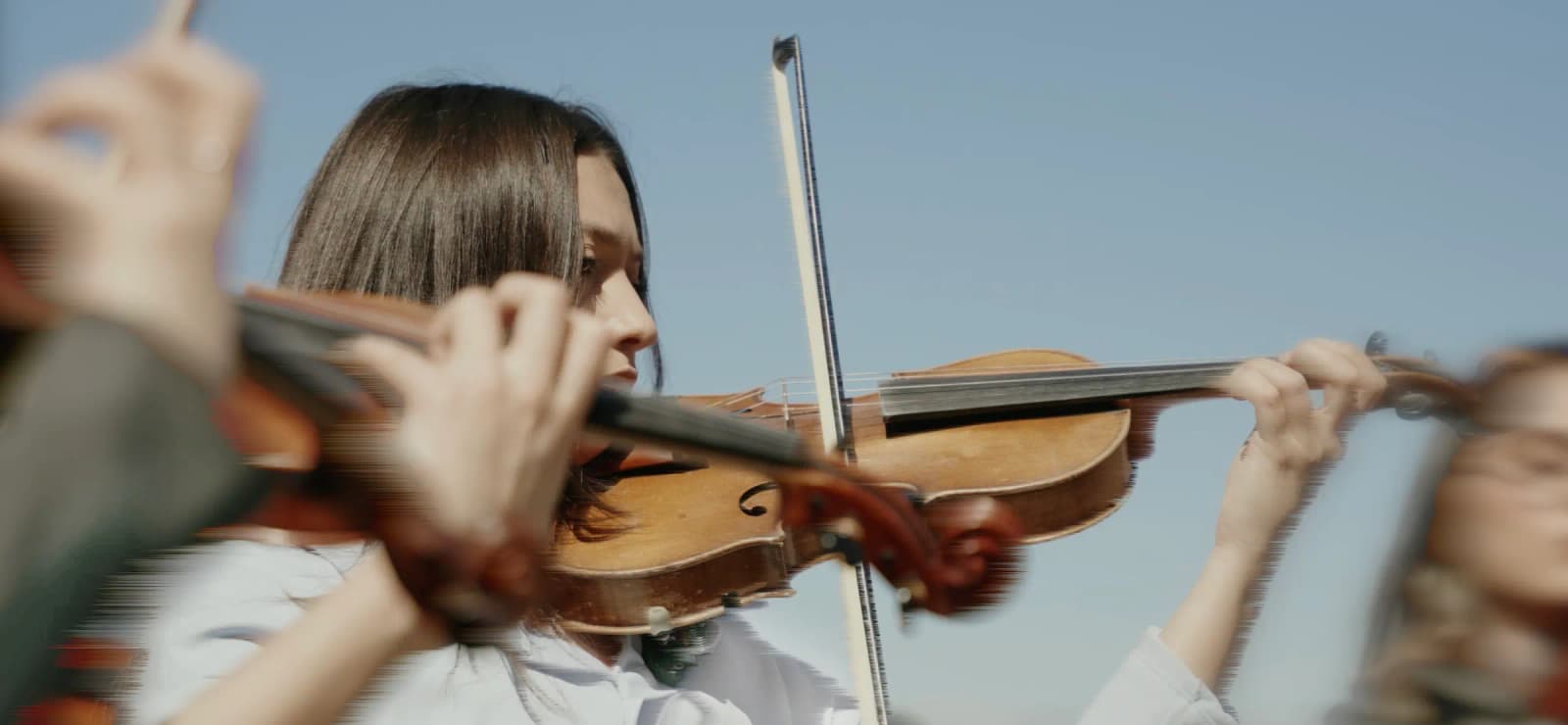
Mission
We create a contemporary educational and artistic environment where young musicians discover their path of continuous development, combining creative freedom with professional orchestral experience.
Our mission is to enrich music education, engage new generations, and strengthen the role of musicians within society by opening pathways to international stages.
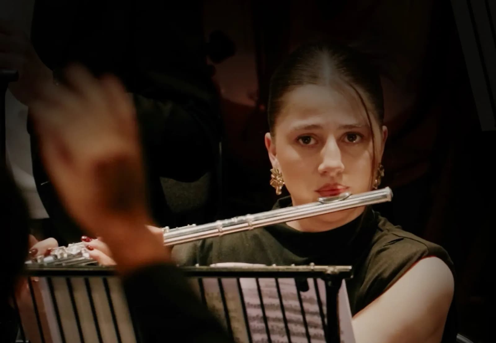
Vision
CULTURAL
AMBASSADORS
OF YEREVAN
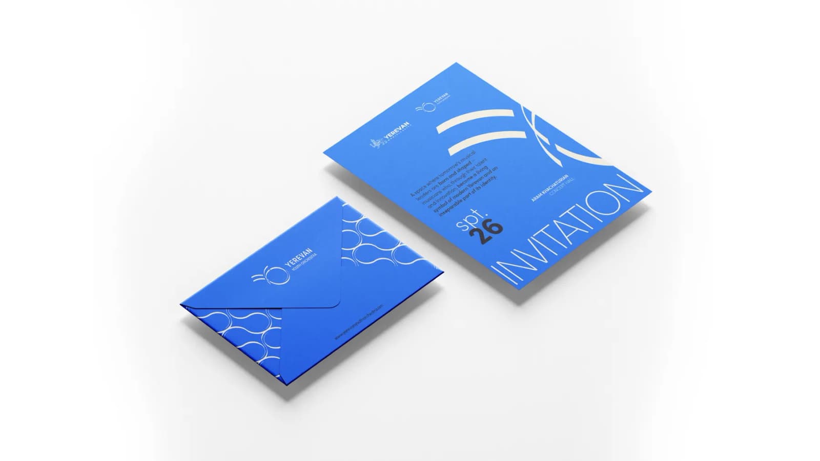
A space where tomorrow’s musical leaders are born and shaped: musicians who, through their talent and innovation, become a living symbol of modern Yerevan and an inseparable part of its identity.
Strategic Direction
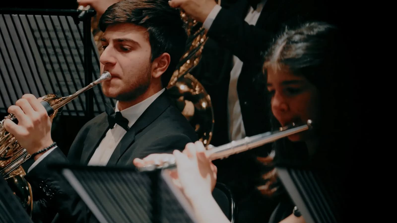
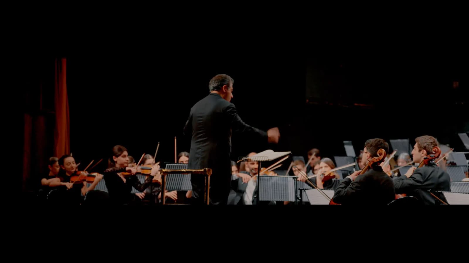
EDUCATIONPERFORMANCEEDUTAINMENT
Tagline
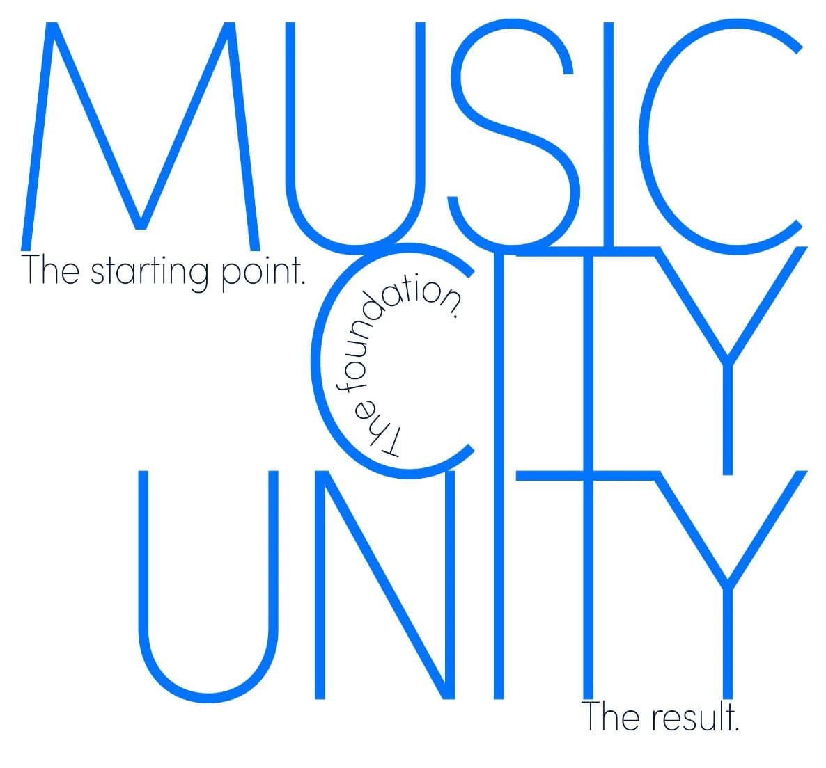
Three words, one continuous movement.

Logo design
A single line, in constant motion, carrying sound, city, and generation forward, as one continuous expression.




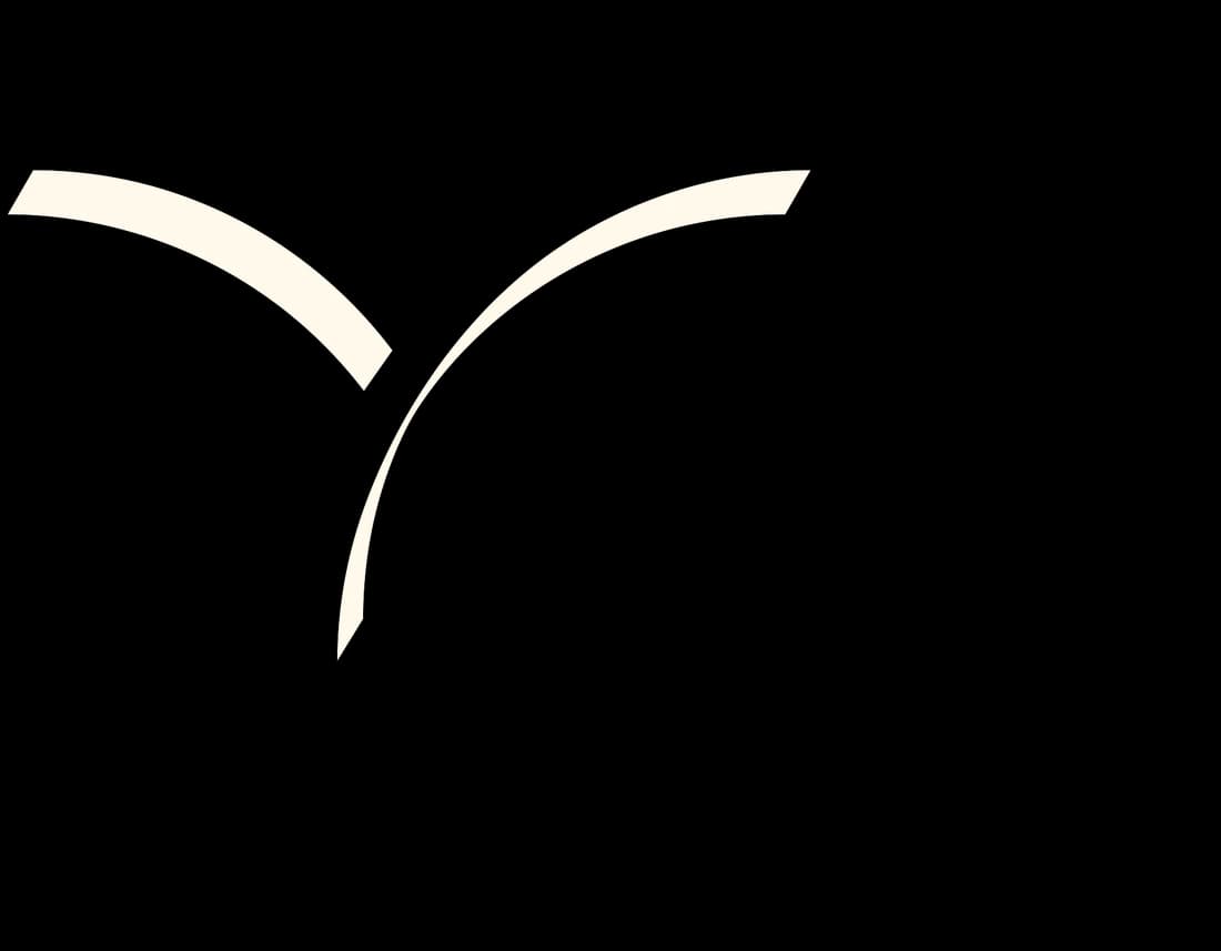

The first stroke: one open arc curving down like a bowl.
The logo is built on a single, continuous gesture: a line that embodies sound, movement, and connection. At its core lies the principle of legato, a musical expression where notes flow without interruption. This line becomes the foundation of the identity, transforming into different forms while remaining one unified structure.
Visual identity
THE COLORS
OF THE
CITY
The color palette is taken from Yerevan: from the small elements that give the city its character. It carries the warmth, the light, and the feeling of a city that lives within everything we create.
Main Colors
Bright Pearl
- RGB
- 255, 249, 235
- HEX
- #FFF9EB
Original Blue
- RGB
- 58, 111, 247
- HEX
- #3A6FF7
Matte Dark Blue
- RGB
- 13, 13, 85
- HEX
- #0D0D55
Strong Dark Blue
- RGB
- 4, 18, 48
- HEX
- #041230
Electric Orange
- RGB
- 255, 96, 0
- HEX
- E96E00
Primary Colors
Melanie Pink
- RGB
- 226, 193, 211
- HEX
- #E2C1D3
Buckingham Lilac
- RGB
- 214, 139, 187
- HEX
- #D68BBB
Pastel Denim
- RGB
- 176, 194, 232
- HEX
- #B0C2E8
Pastel Denim
- RGB
- 0, 115, 186
- HEX
- #0073BA
Secondary Colors
Pale Robin Egg Blue
- RGB
- 148, 218, 205
- HEX
- #94DACD
Blue Lagoon
- RGB
- 0, 128, 138
- HEX
- #00808A
Gooseberry
- RGB
- 196, 217, 91
- HEX
- #C4D95B
Rio Grande
- RGB
- 193, 203, 0
- HEX
- #C1CB00
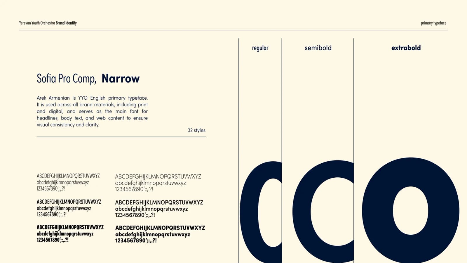
- primary typeface
- Sofia Pro Comp, Narrow
- primary typeface
- Noto Sans Armenian
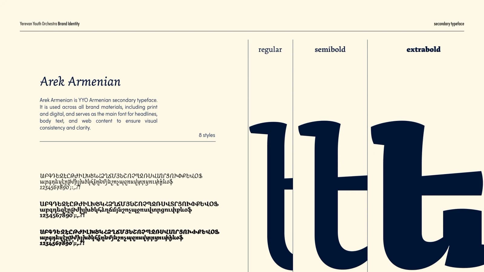
- secondary typeface
- Arek Armenian
Pattern






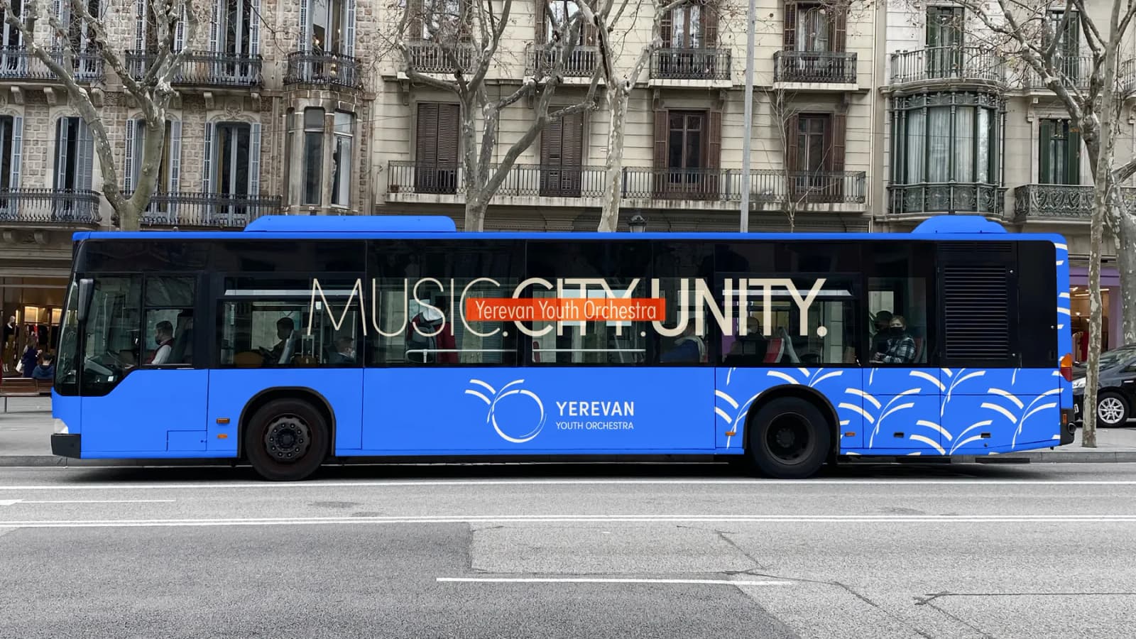
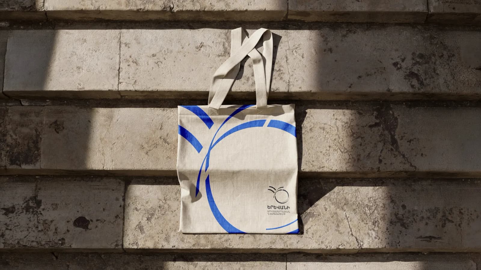
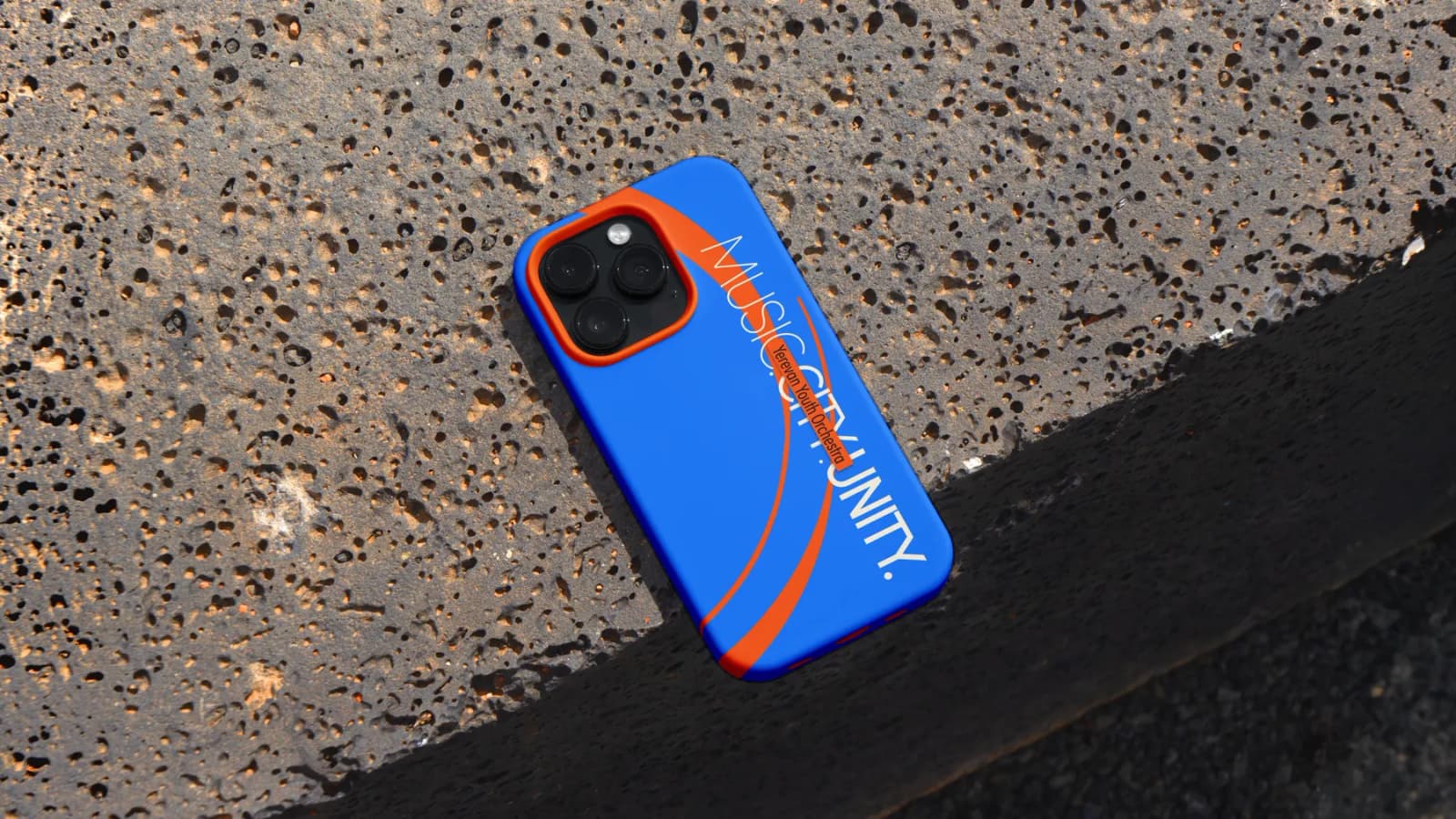
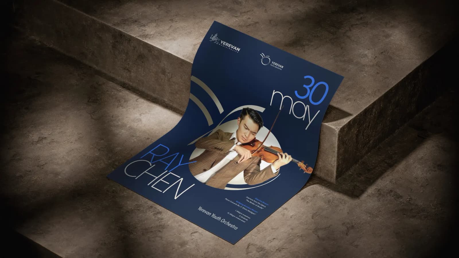
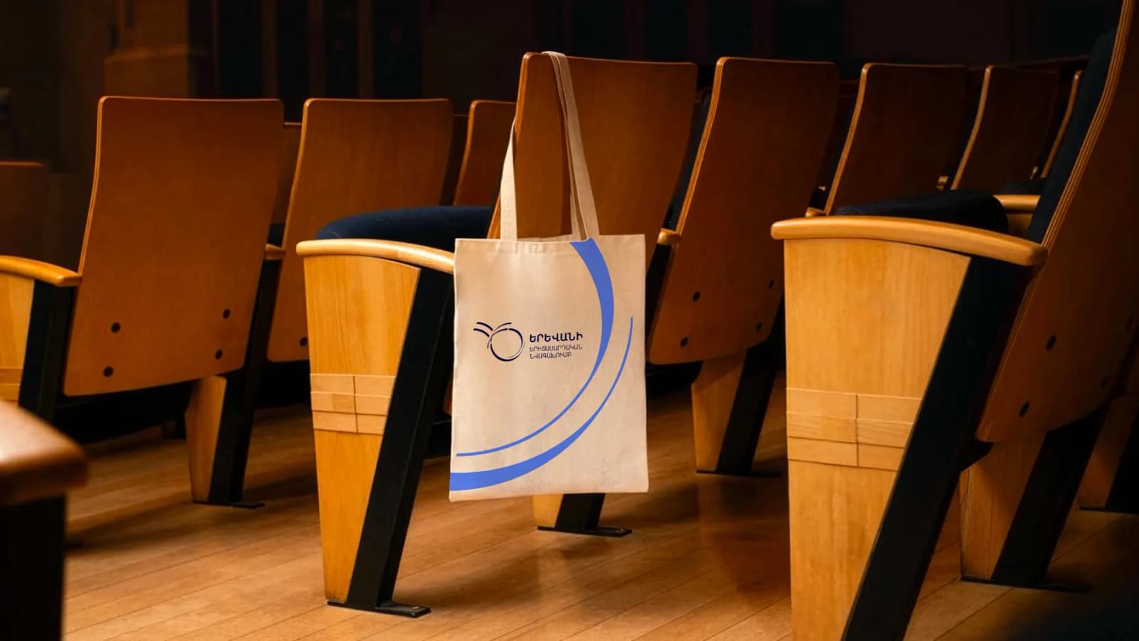
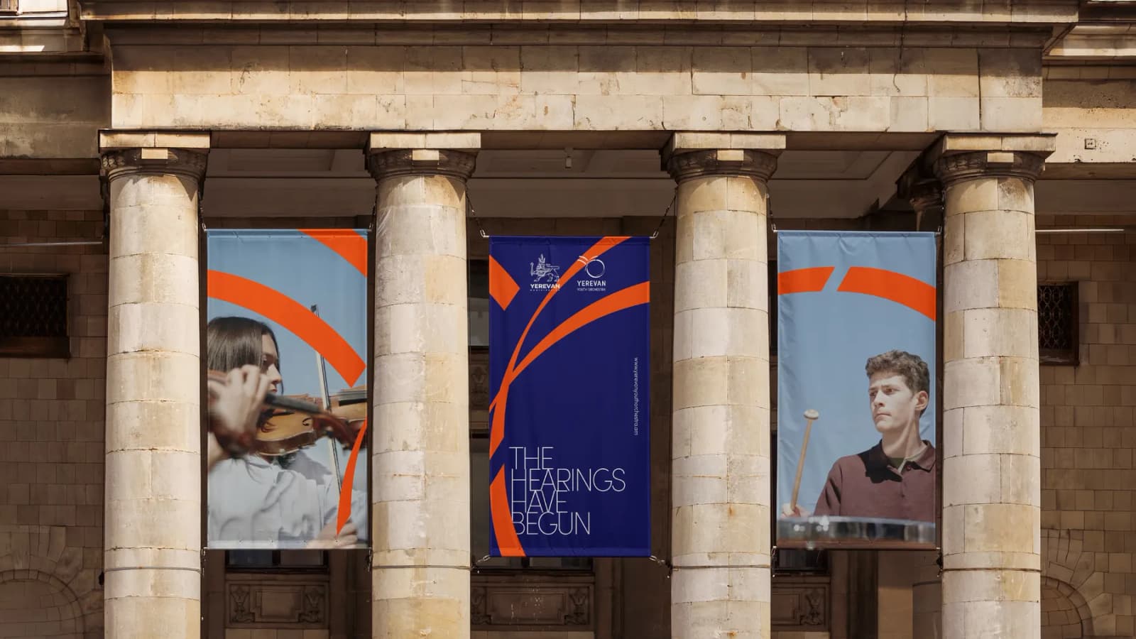
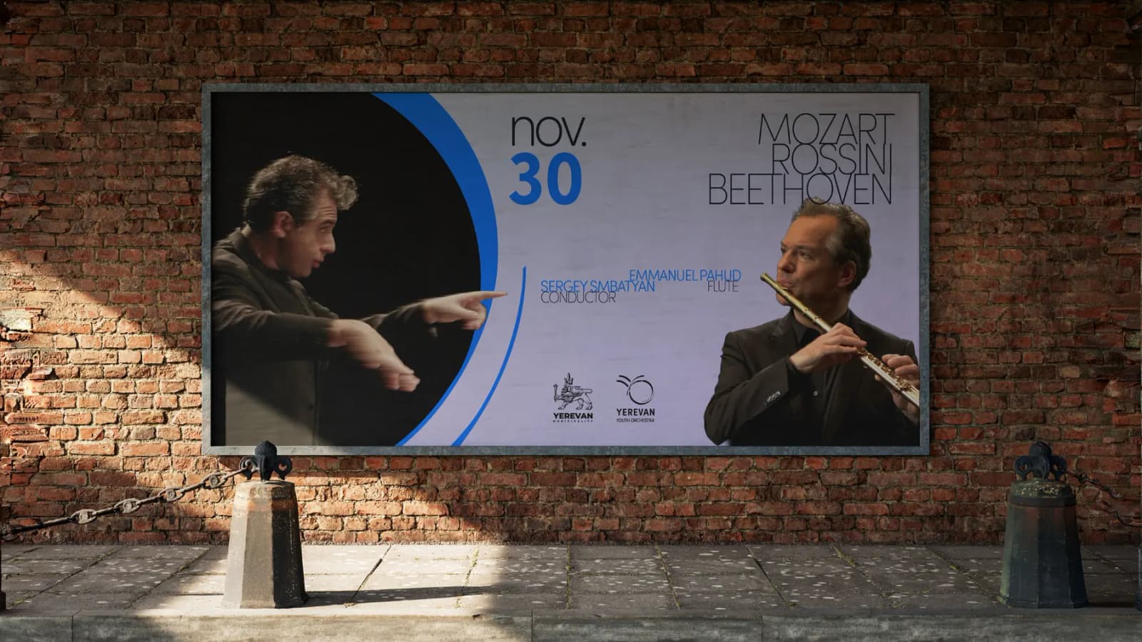
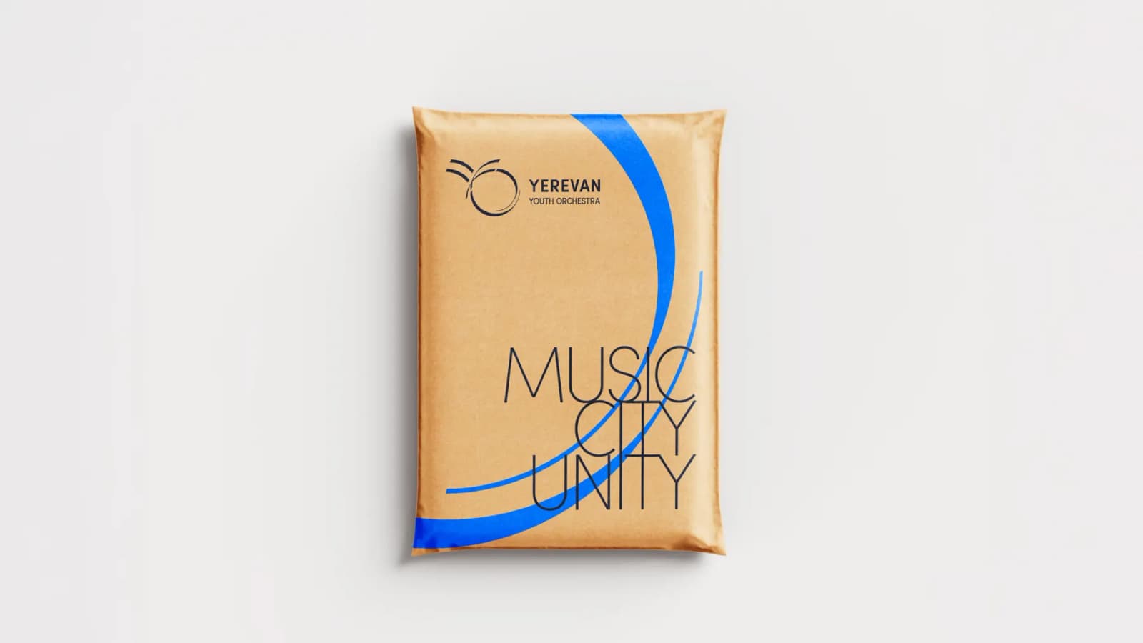
Brand applications