Mental Health for All
- Year
- 2023 - 2026
- Stakeholders
- WHO Armenia
- Service Scope
- Branding and Visual Identity
- Integrated Marketing
- Event Management
Project Overview
Mental Health for All is a programme by WHO Armenia and the Ministry of Health of the Republic of Armenia, funded by European Union Humanitarian Aid. It aims to make mental health part of everyday conversation in Armenia. The programme works to break the silence around mental health and make support easier to reach for anyone who needs it.
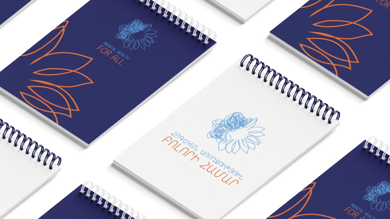
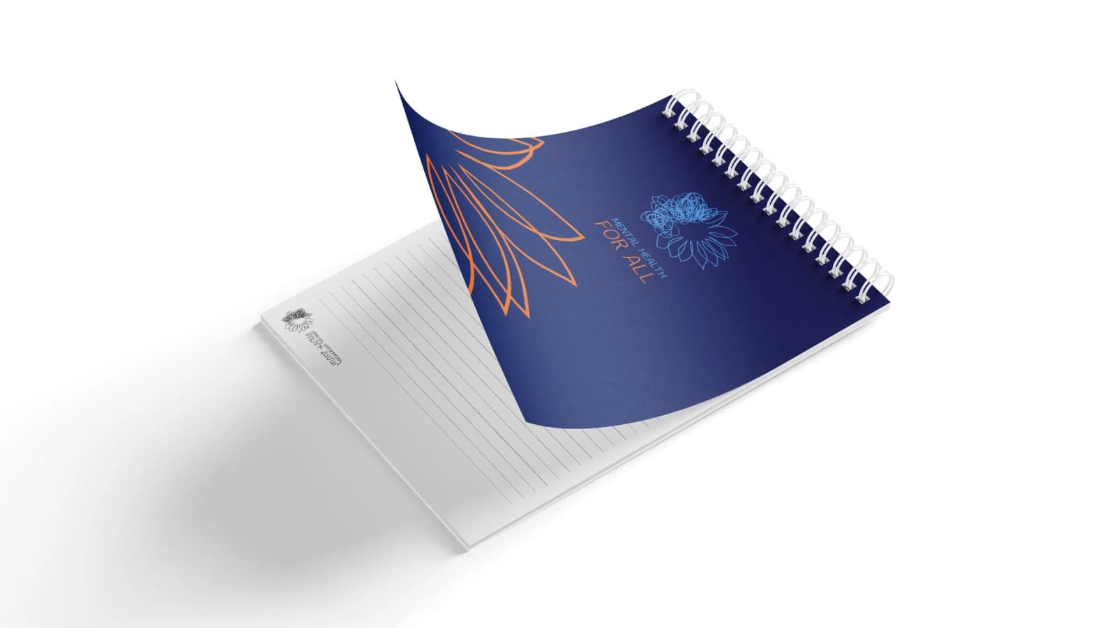
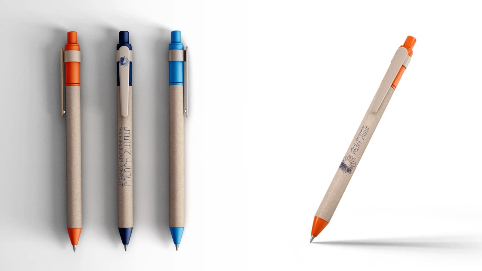
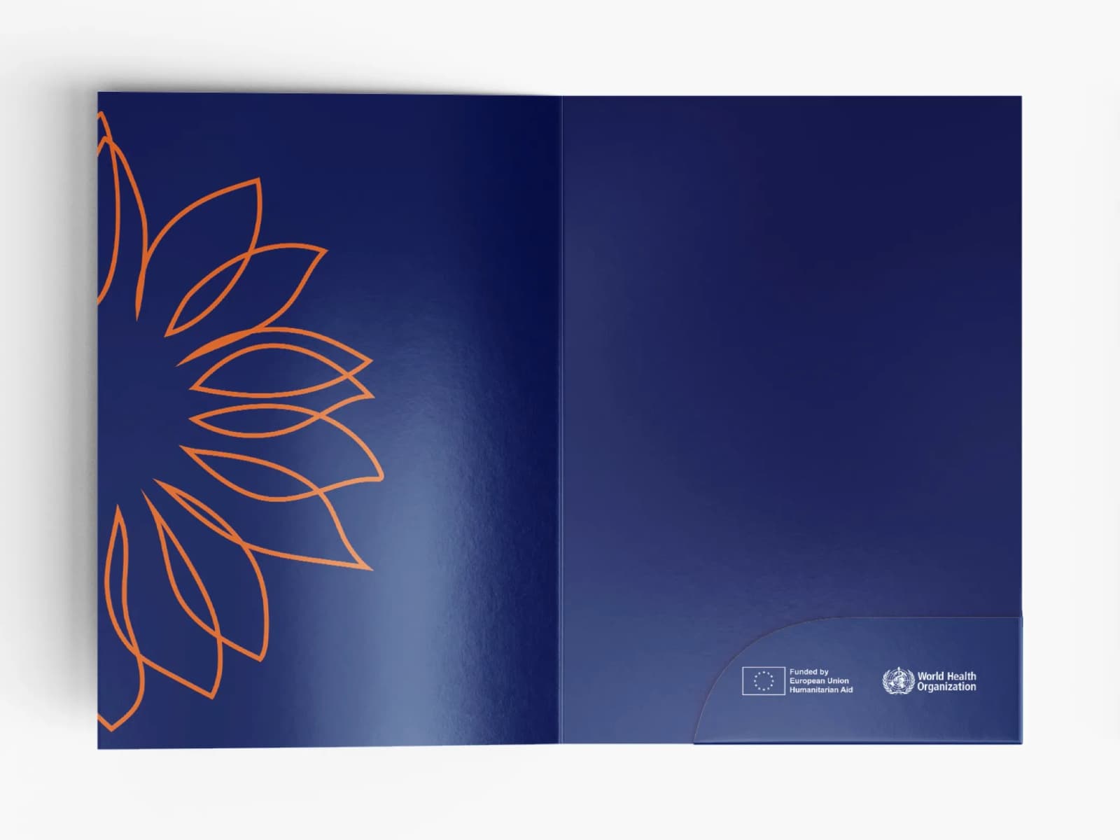
CREO developed the visual identity for the initiative. Applied across point-of-sale and promotional materials as well as campaigns, it gave the initiative a consistent voice and kept its purpose clear at every point of contact.
Visual Identity
The left side signifies the struggles we face in our minds
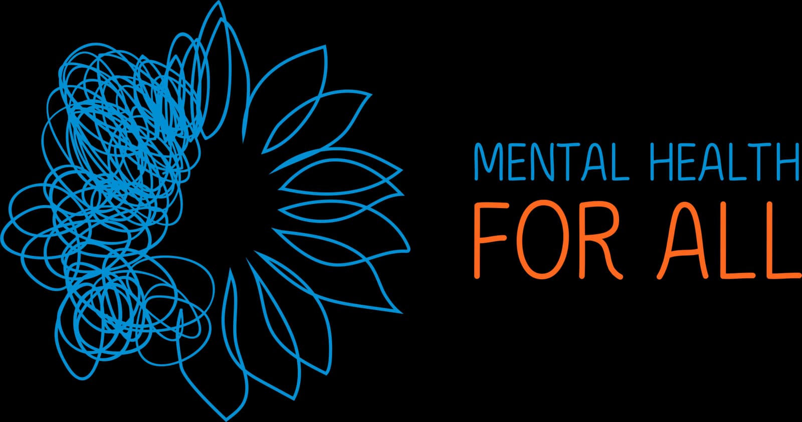
The right side represents the helping hand, the support we provide
These elements coexist harmoniously, revealing the connection between these opposing states.
The logo shows that those who need help and those who are willing to offer it exist side by side in our communities. Two parts represent different feelings, connected to remind us there's hope and solutions and the idea that we are never alone in our struggles.
A bright sunflower is a hope that reminds us that from tough times, we can shine and grow.
It represents the promise of a brighter tomorrow, no matter how difficult our current challenges may seem. It embodies the capacity for overcoming obstacles, showcasing our innate ability to rise above difficulties and flourish.
Colors
WHO Navy Blue
Pantone 281CC100 M90 Y31 K35R0 G32 B92#00205C
NAVY BLUE – Security, trust
The Navy Blue symbolizes trust and loyalty, a sense of confidence and security. It symbolizes a helping hand that is reliable and trustworthy and can be counted on for support.
WHO Blue
Pantone 2925CC77 M25 Y0 K0R0 G154 B222#009ADE
BLUE – Solidity, calmness
The Blue symbolizes calmness, and harmony of soul, mind, and body. It conveys a firm determination to take real steps to solve all problems and enjoy life.
WHO Orange
Pantone 165CC0 M74 Y95 K0R242 G104 B42#F26829
ORANGE – Emotion, optimism, hope
The Orange symbolizes positive emotions and feelings, joy, warmth, hope for a better future, and victory.
Brand applications
Campaign: “See the Invisible”
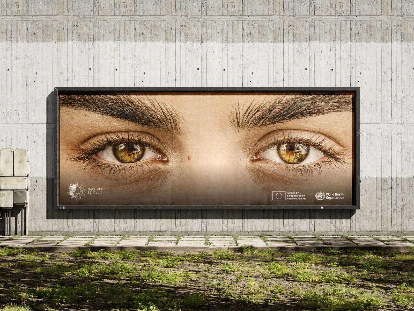
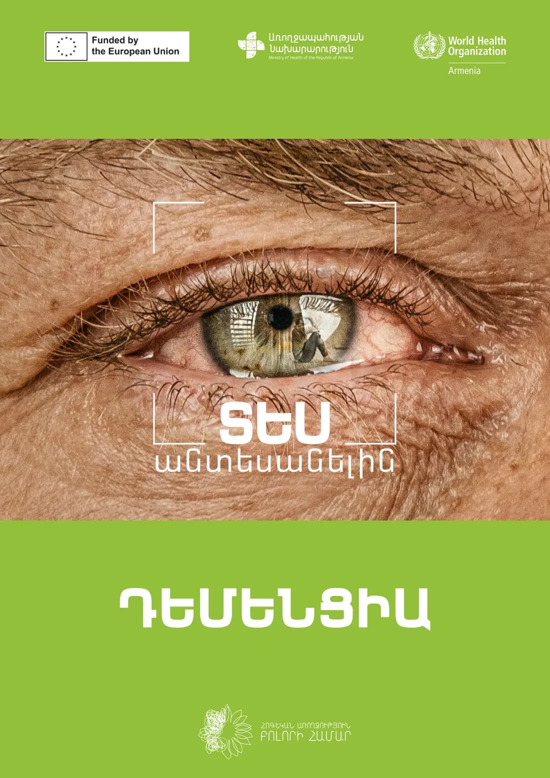
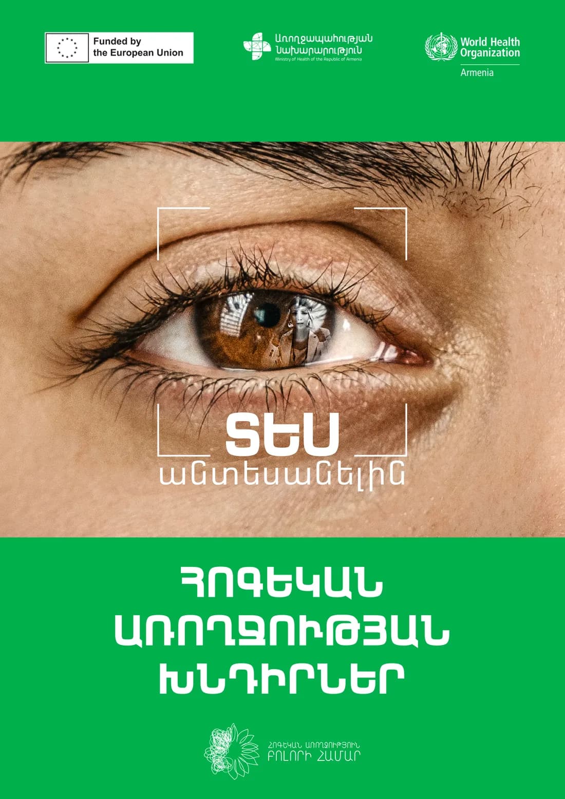
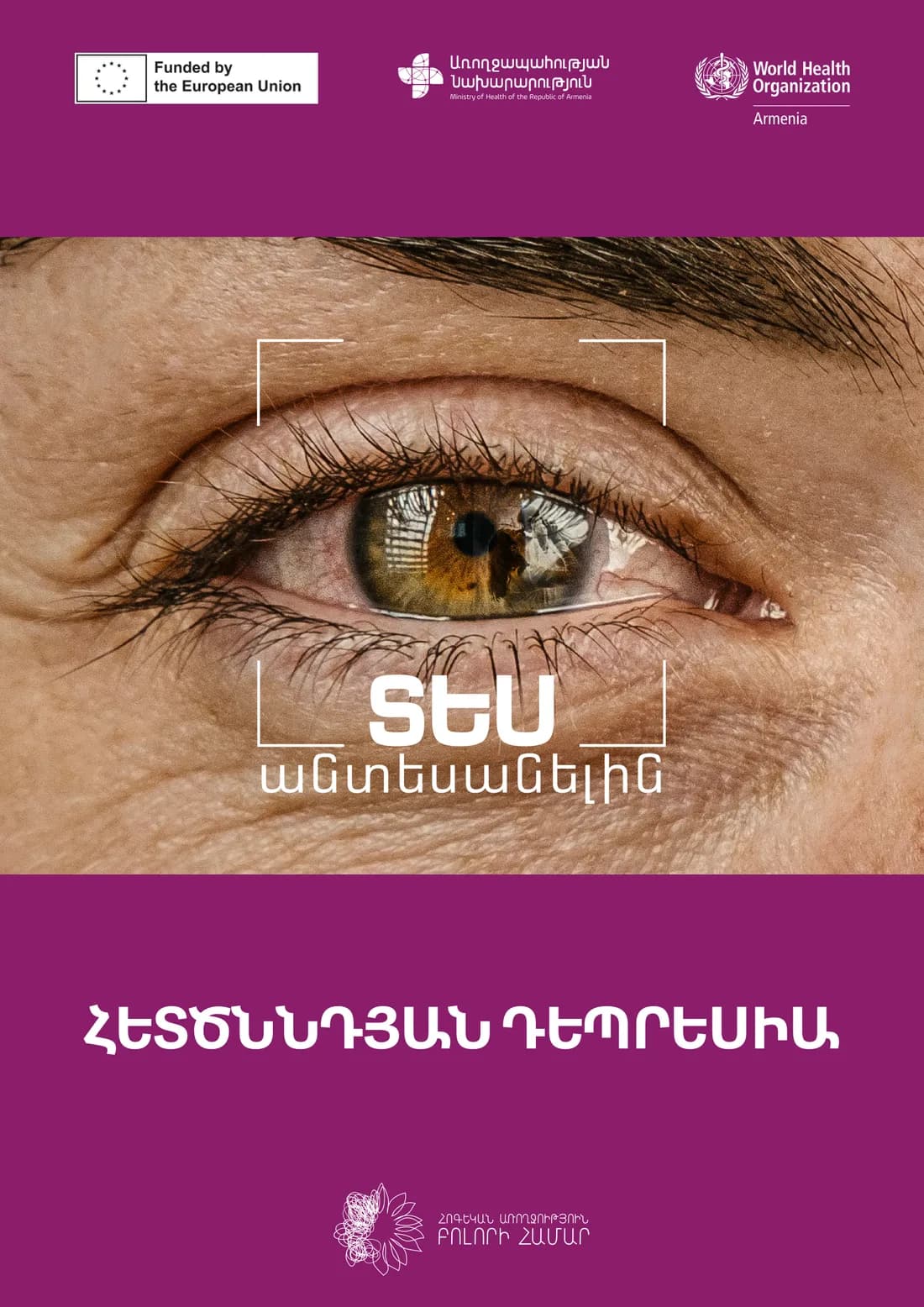
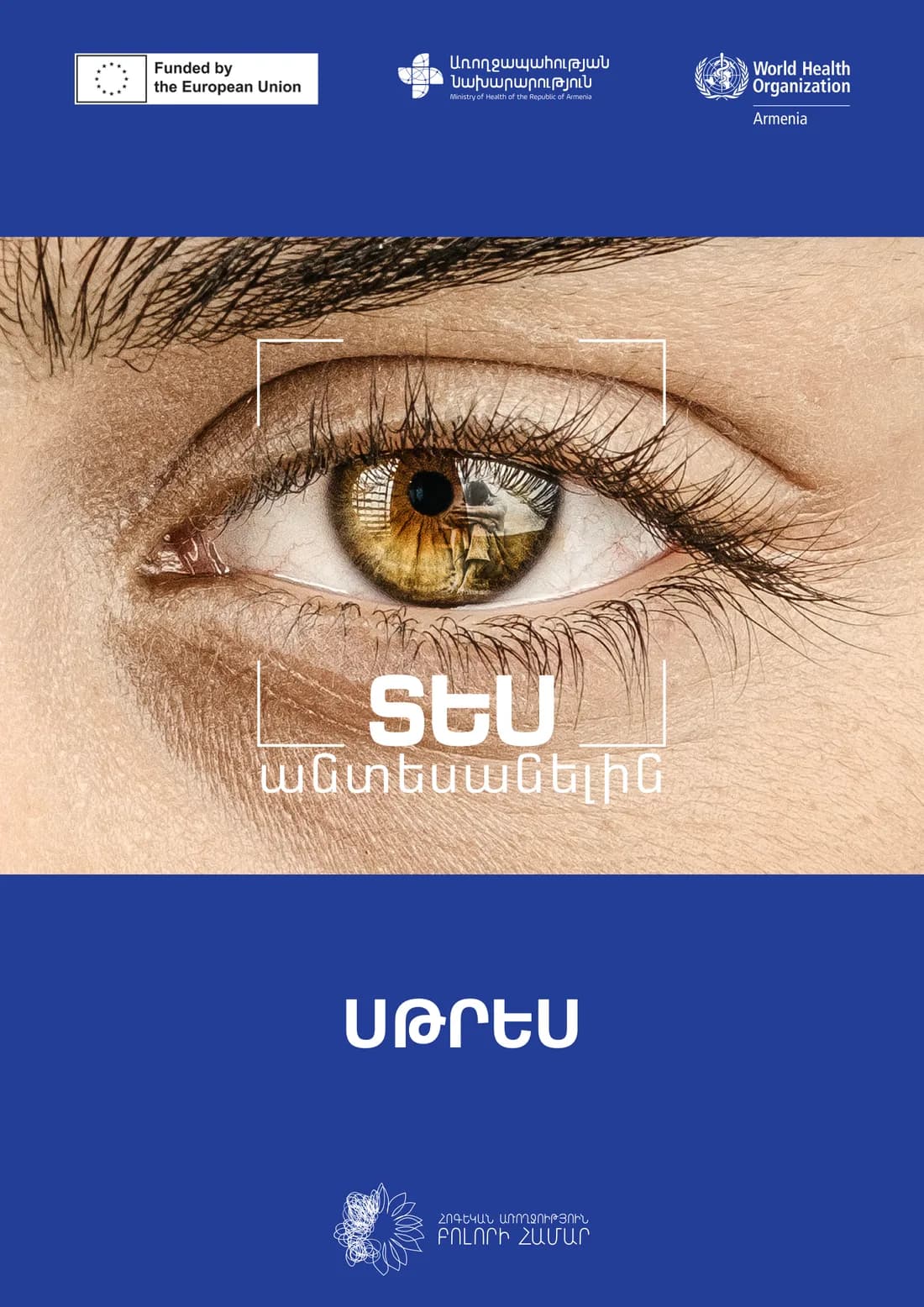
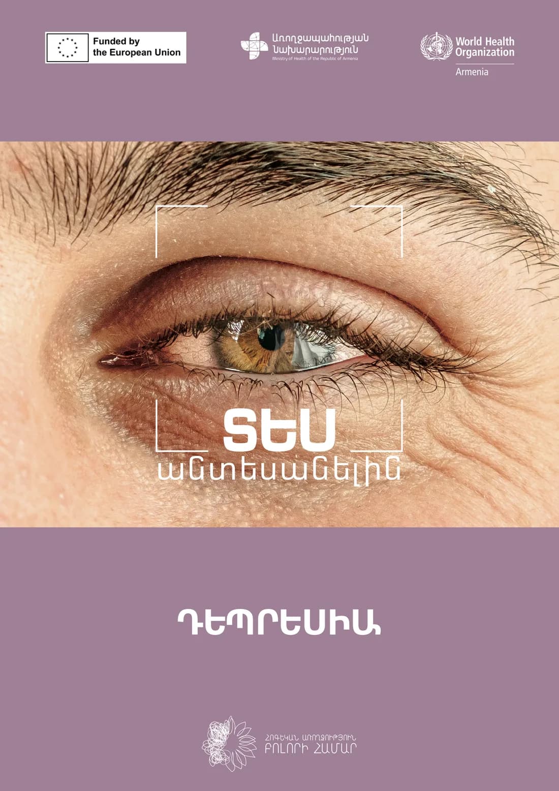
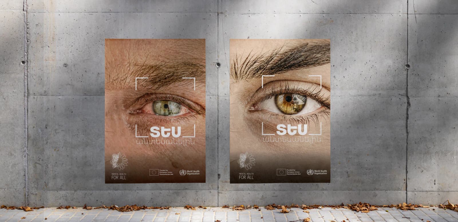
Mental health conditions rarely show on the surface. A person can look fine while struggling, and the people around them often miss it. The campaign built its message on that gap. Its line, “See the Invisible”, asks people to look more closely, at themselves and at those around them.
Every visual is a close-up of human eyes, used across print, outdoor and social media. Each condition has its own colour, which keeps the materials distinct while holding the campaign together.



World Mental Health Day 2026
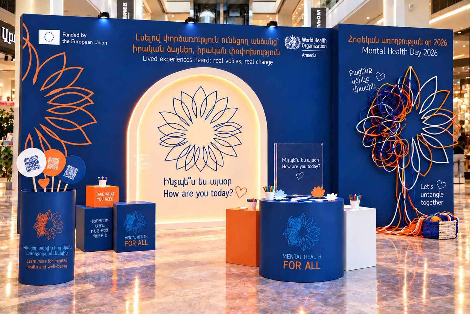
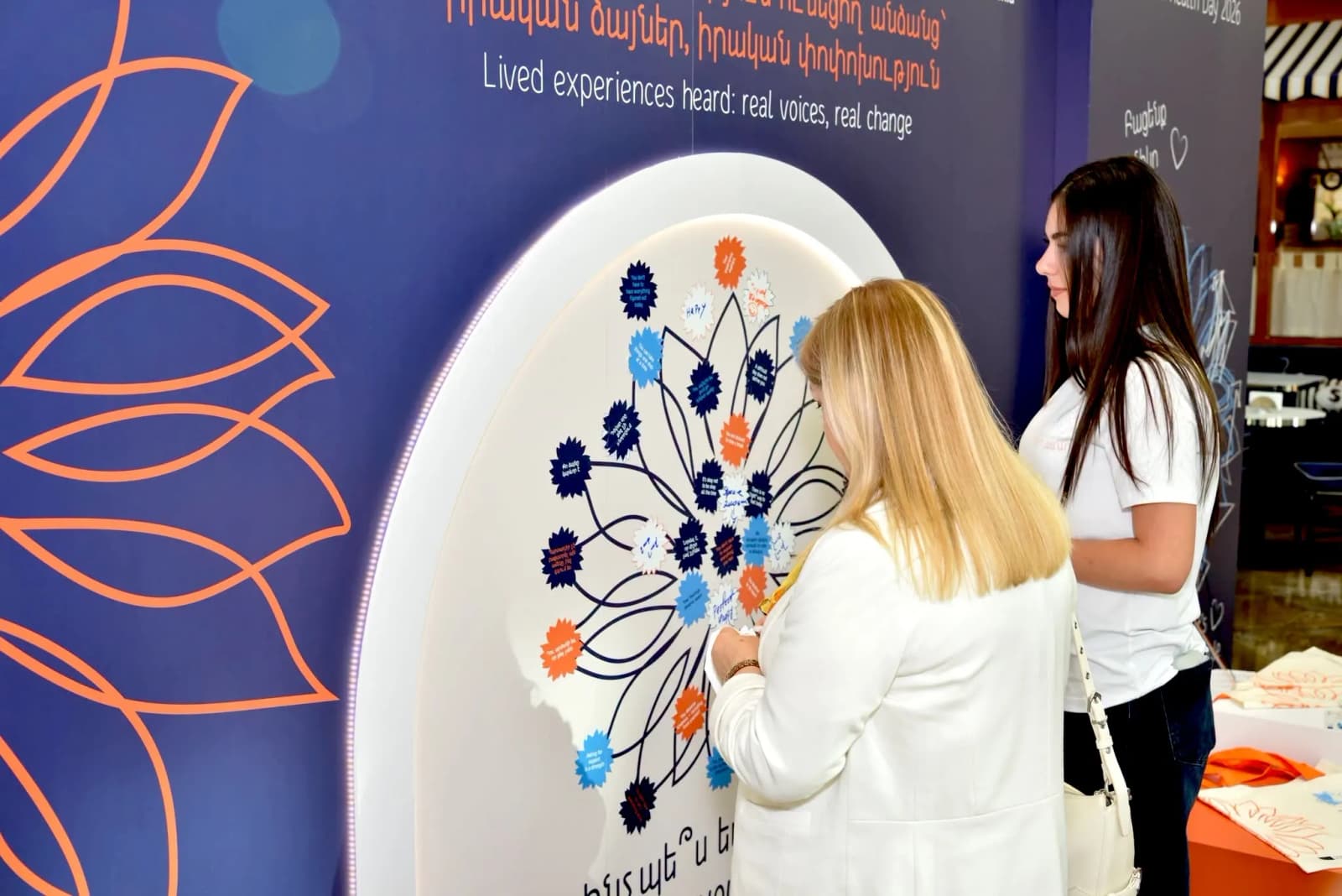
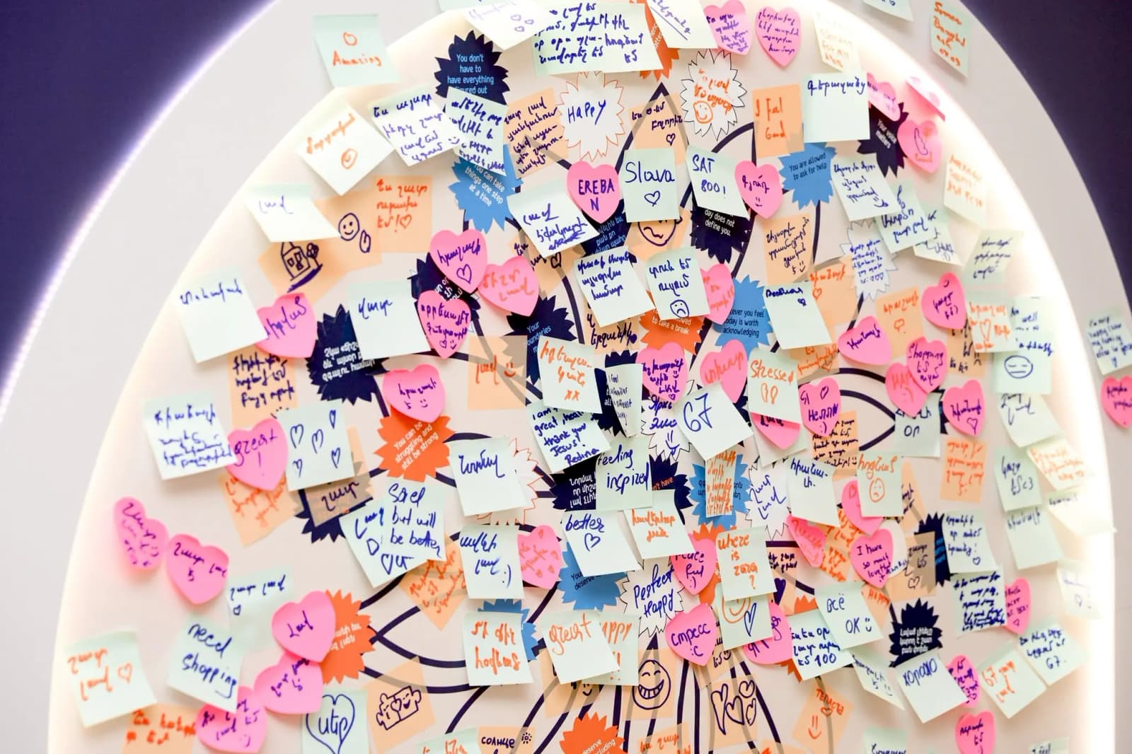
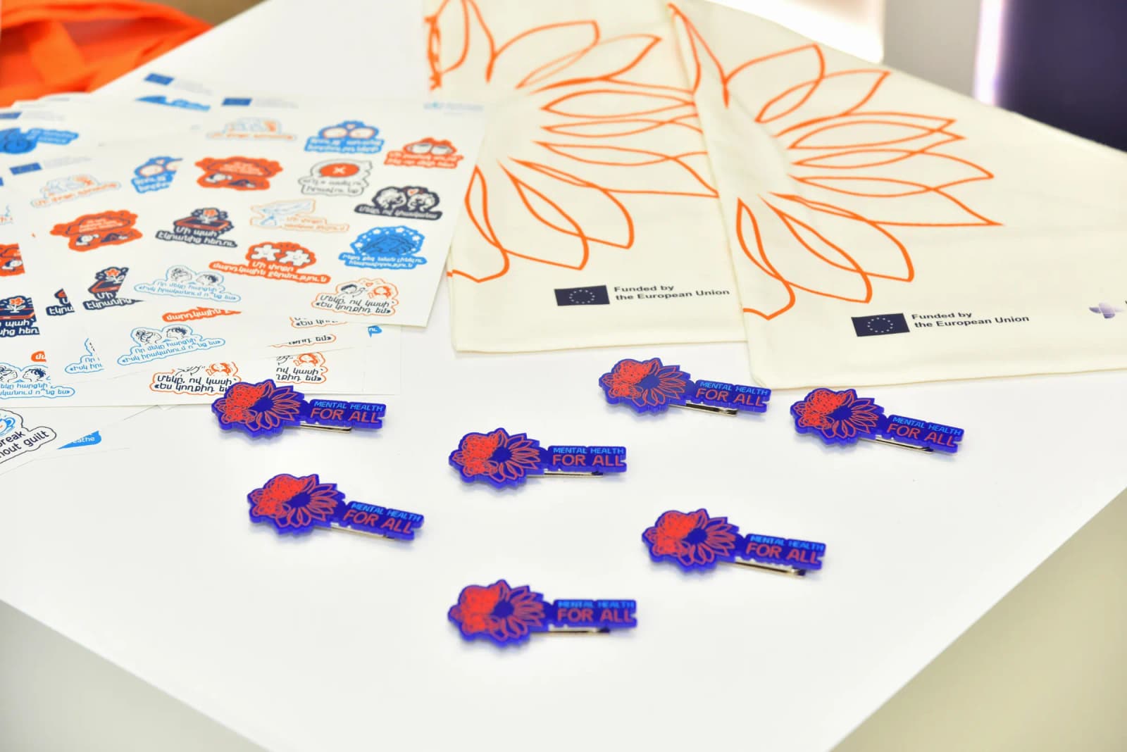
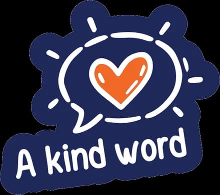
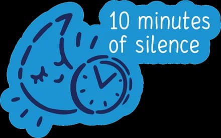
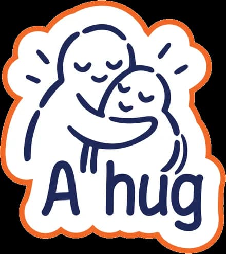
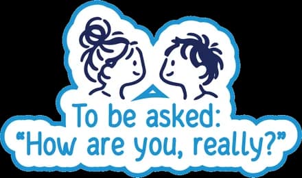
The campaign marked World Mental Health Day 2026 with an interactive stand in a public space, under the theme “Lived experiences heard: real voices, real change”. Visitors answered the question “How are you today?” on cards and added them to a shared wall, which built up into the programme’s flower symbol. A “Take What You Need” stand handed out stickers with simple self-care prompts, and QR codes linked to information on mental health and support services.