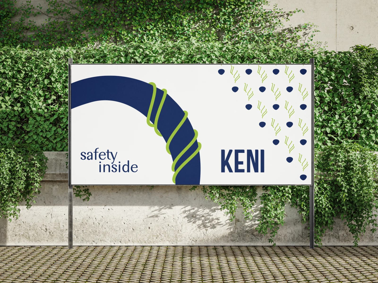
Keni
- Year
- 2023
- Client
- UNICEF
- Service Scope
- Branding and Visual Identity
heart & soul
A story of a brand, having one name but thousands of lives to stand for.
imagine
a place
A welcoming home, a comforting corner, where EVERY CHILD is guaranteed Education and Healthcare, embraced by Protection and Love, surrounded by Opportunity and Hope
why ԿԵՆԻ
- ԿԵՆ
- կյանք | life
- Ի
- դեպի | towards
ի կեանս
դեպի կյանք, դեպի ապագա | life ahead, the future ahead
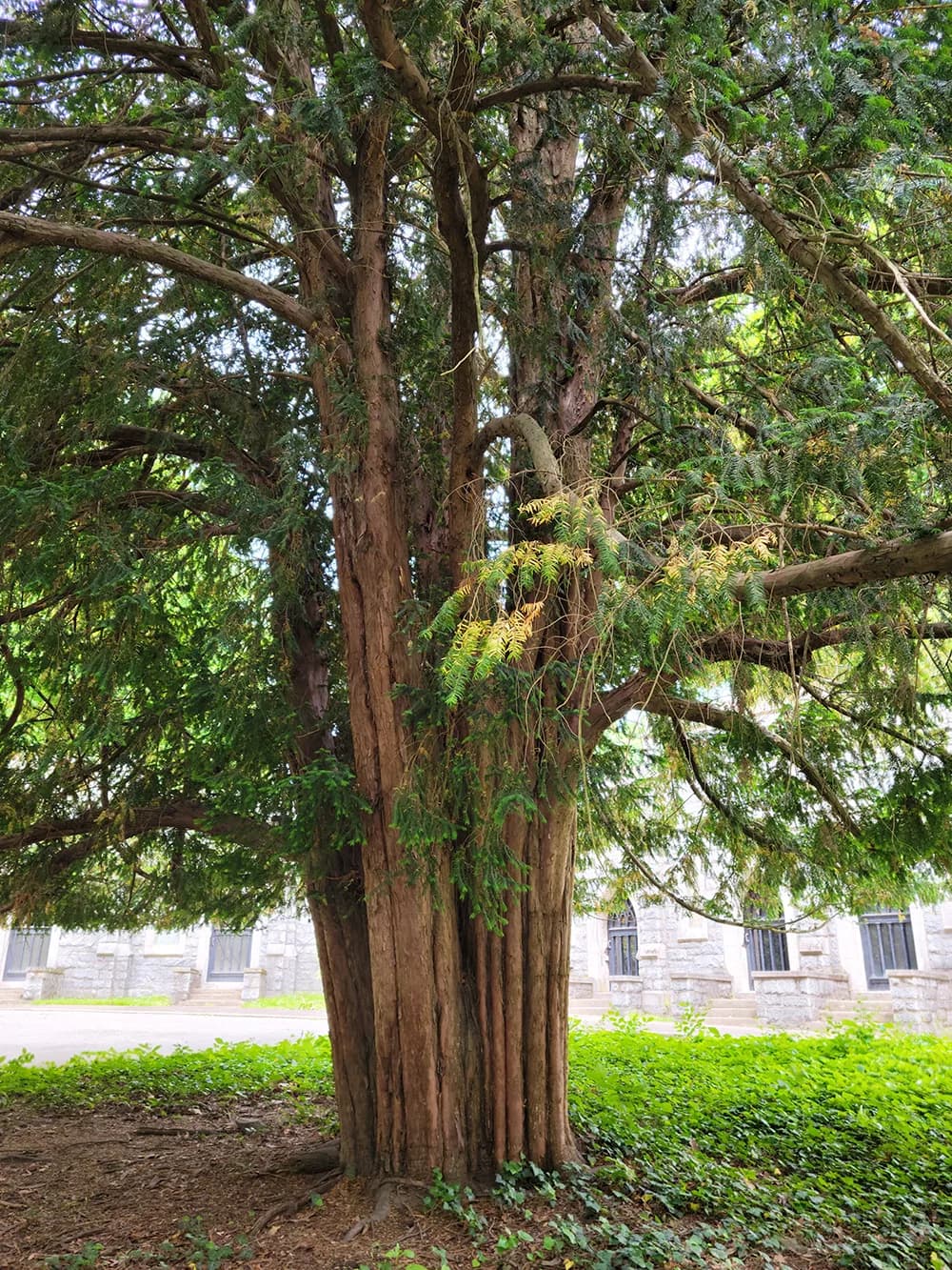
KENI = an evergreen tree
Just as the evergreen tree, thriving for 2–3 millennia and reaching heights of 25 meters, KENI embodies the enduring strength and ever-greenness.
Just as these towering giants remain evergreen, KENI stands tall, safeguarding everyone under its roof.
Just like the roots and branches of these trees, anyone at KENI stays deeply anchored in the soil and confidently envision the future reaching for life, sunlight, and prosperity.
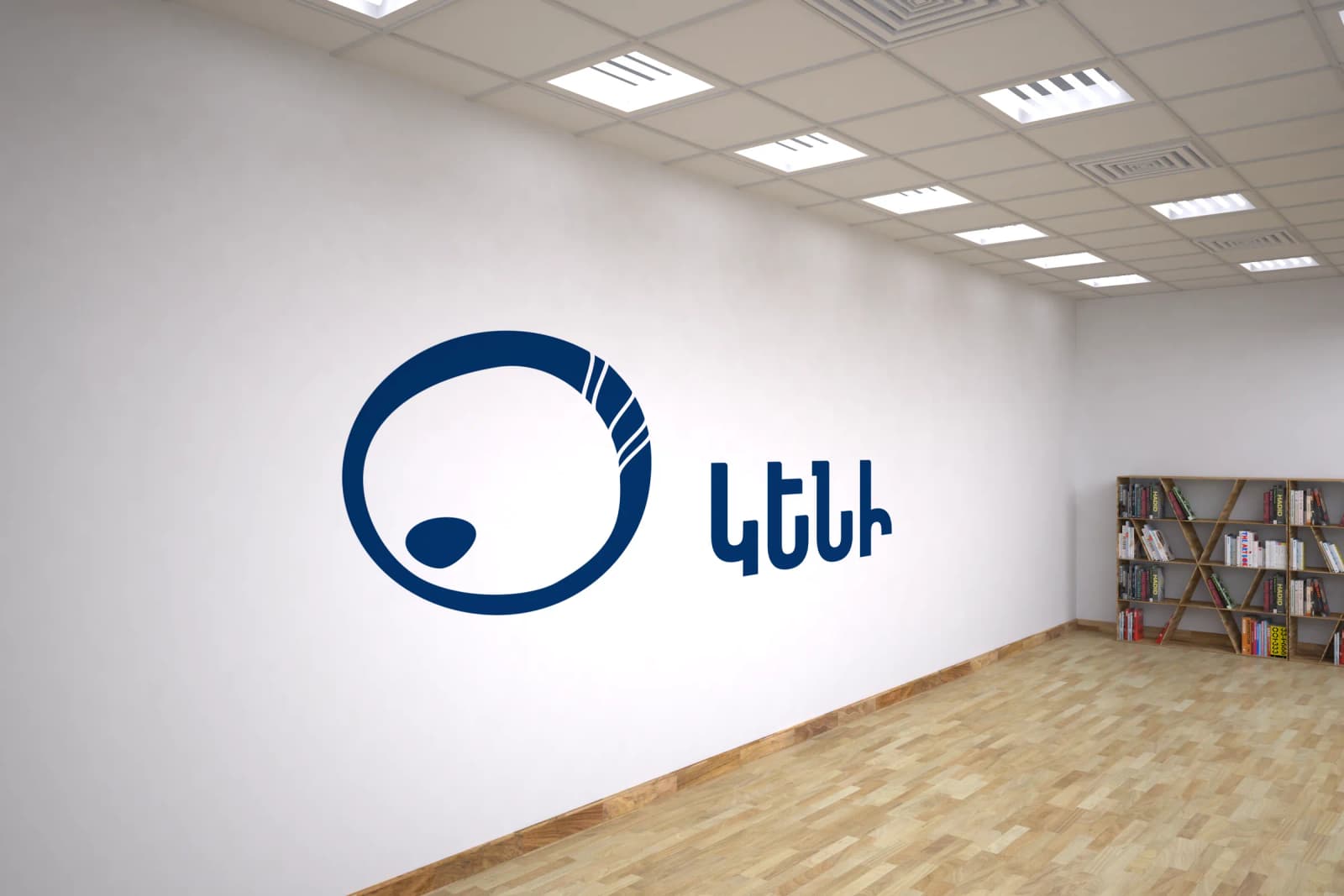
logo: icon & wordmark

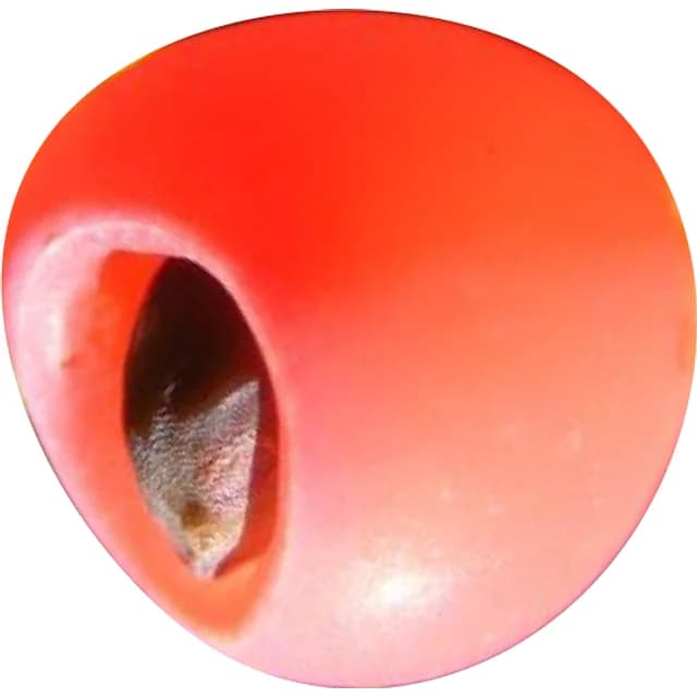
A continuous journey, embodying a constant evolution where each turn brings a renewal – THE LIFE CYCLE.
Yet, life’s cycle encompasses both highs and lows, navigating through ups and downs, for this cycle is never without its imperfections – THE LIFE.

animation
vision
To foster a world where every child thrives in a safe environment, embraced by support, love, & opportunity.
mission
To create a safe & nurturing environment that empowers children and their families to overcome challenges, ensuring an uninterrupted course of life regardless of difficult circumstances.

values
- People Centrism: Placing people at the heart of every decision and action, prioritizing their needs and well-being above all.
- Holistic Approach: Embracing an approach where every decision is evaluated from diverse perspectives, striving for optimal solutions that benefit individuals, families, communities, and the nation.
- Safety: Ensuring a protected and secure environment for every child.
- Empathy: Understanding and resonating with the emotions of those in need, fostering a caring atmosphere.
- Inclusivity: Embracing diversity and ensuring that everyone feel welcomed and supported.
brand colors
- Hex
- hex #1CABE2
- RGB
- r0 g 174 b 239
- CMYK
- c 100 m 00 y 00 k 00
- Hex
- hex #03346A
- RGB
- r 3 g 52 b 107
- CMYK
- c 97 m 51 y 0 k 58
Blue embodies trustworthiness, symbolizing reliability, and authenticity. It evokes the feelings of confidence and stability.
- Hex
- hex #8EC539
- RGB
- r 142 g 197 b 57
- CMYK
- c 28 m 0 y 71 k 23
This light green represents new beginnings, the essence of life, and the drive towards prosperity. It mirrors the strength and will of a small sprout, thriving through barriers and rocks.
brand secondary colors
- Hex
- hex #DD571C
- RGB
- r 221 g 87 b 28
- CMYK
- c 0 m 61 y 87 k 13
- Hex
- hex #F9BA4C
- RGB
- r 249 g 186 b 76
- CMYK
- c 0 m 25 y 70 k 2
- Hex
- hex #004883
- RGB
- r 0 g 72 b 131
- CMYK
- c 100 m 45 y 0 k 49
- Hex
- hex #4F8AD2
- RGB
- r 79 g 138 b 210
- CMYK
- c 62 m34 y 0 k 18
- Hex
- hex #E44F5C
- RGB
- r 228 g 79 b 92
- CMYK
- c 0 m 65 y 60 k 11
- Hex
- hex #ADD0B3
- RGB
- r 173 g 208 b 179
- CMYK
- c 17 m 0 y 14 k 18
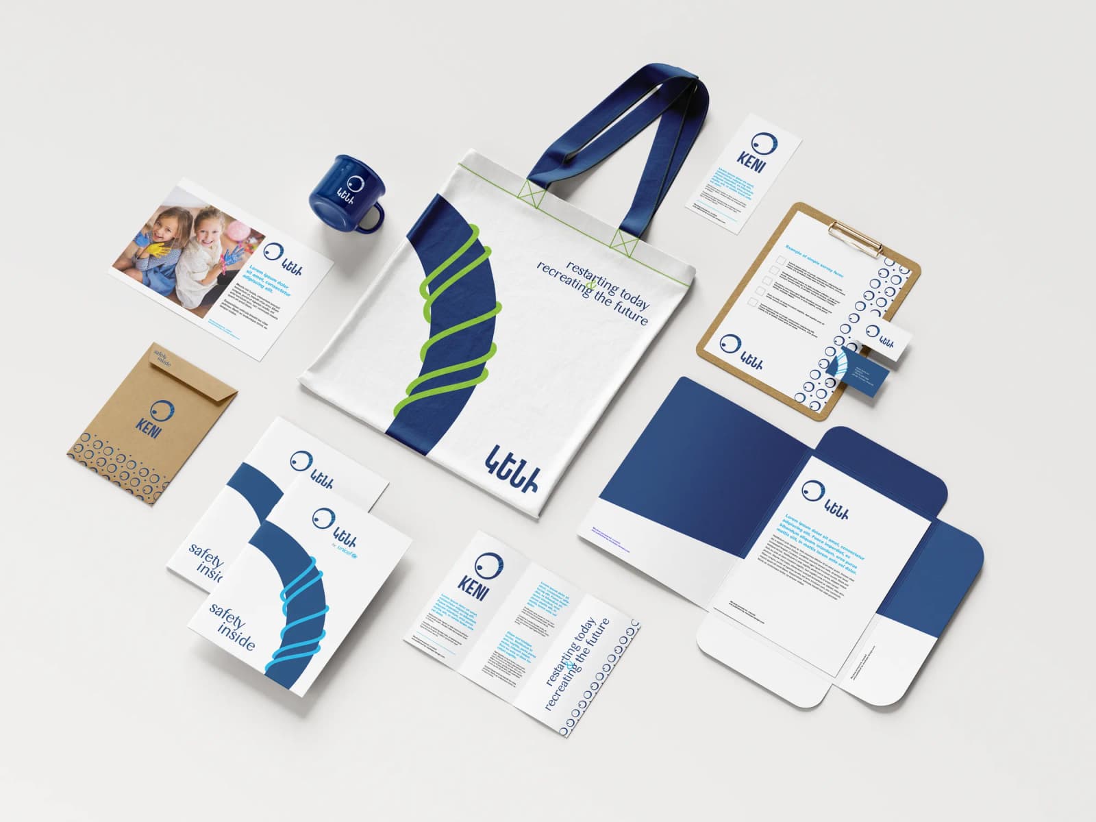
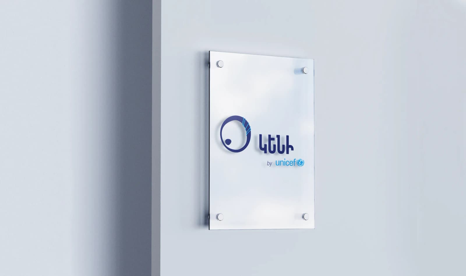
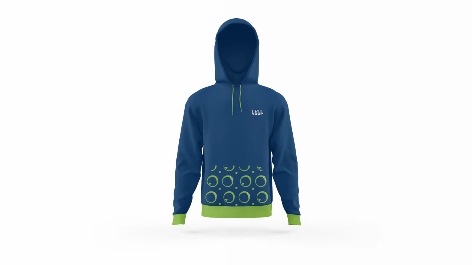
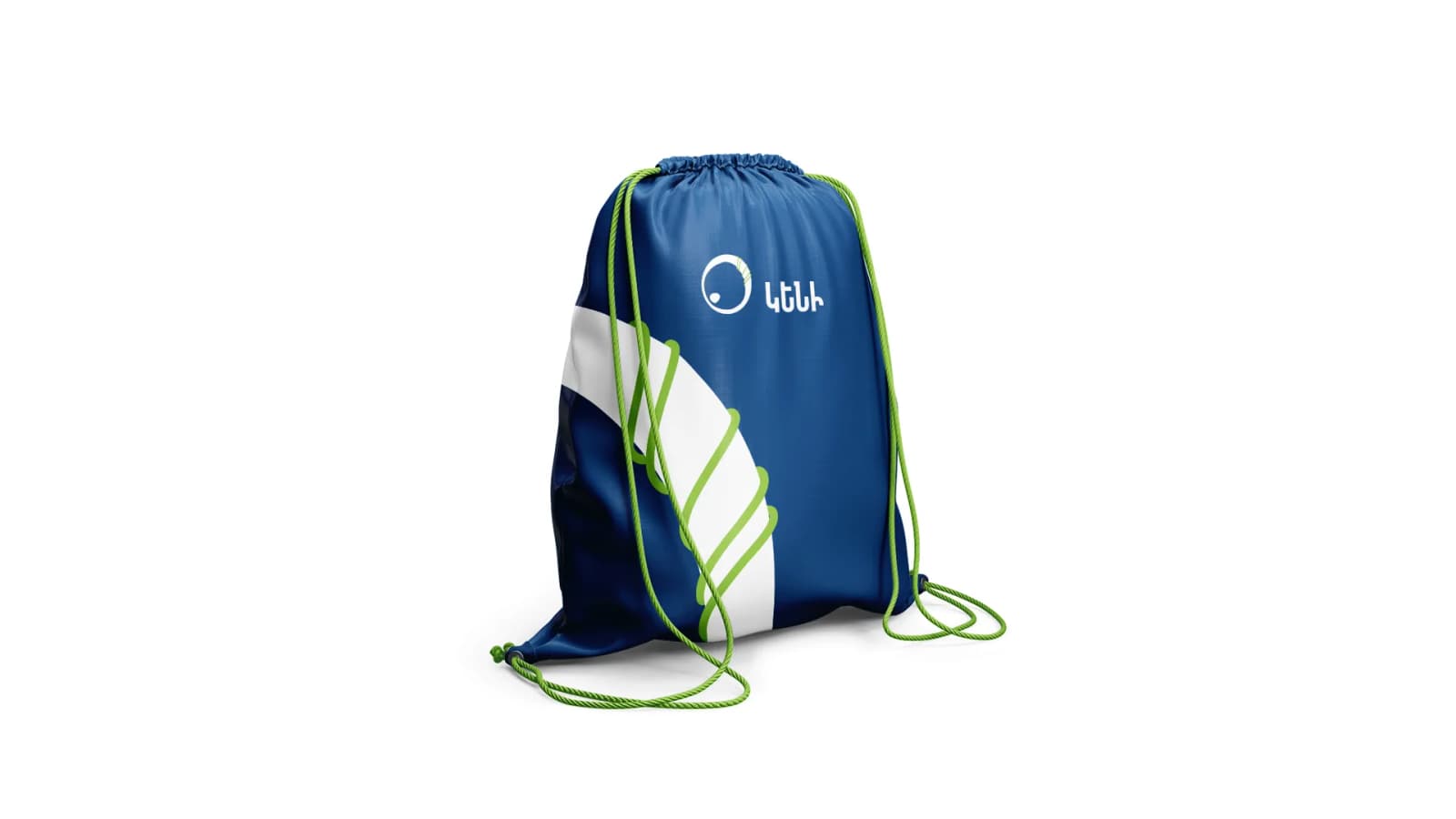
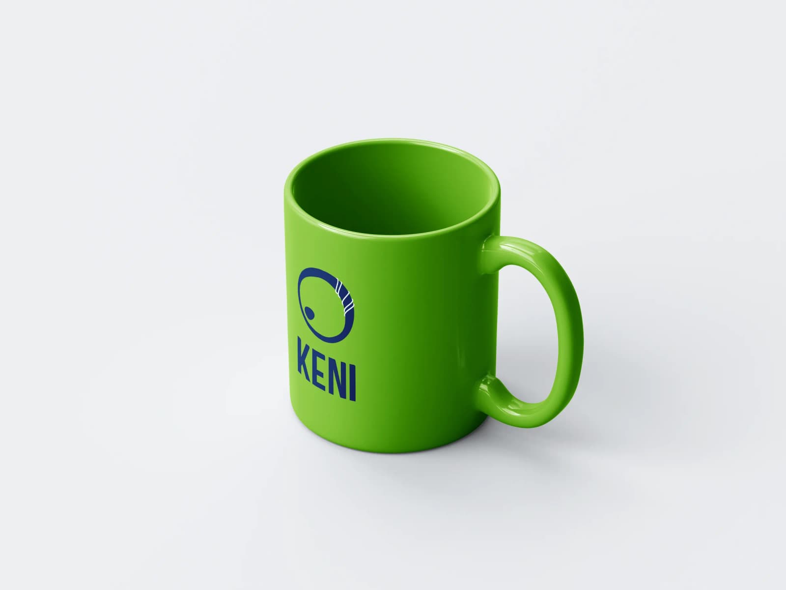
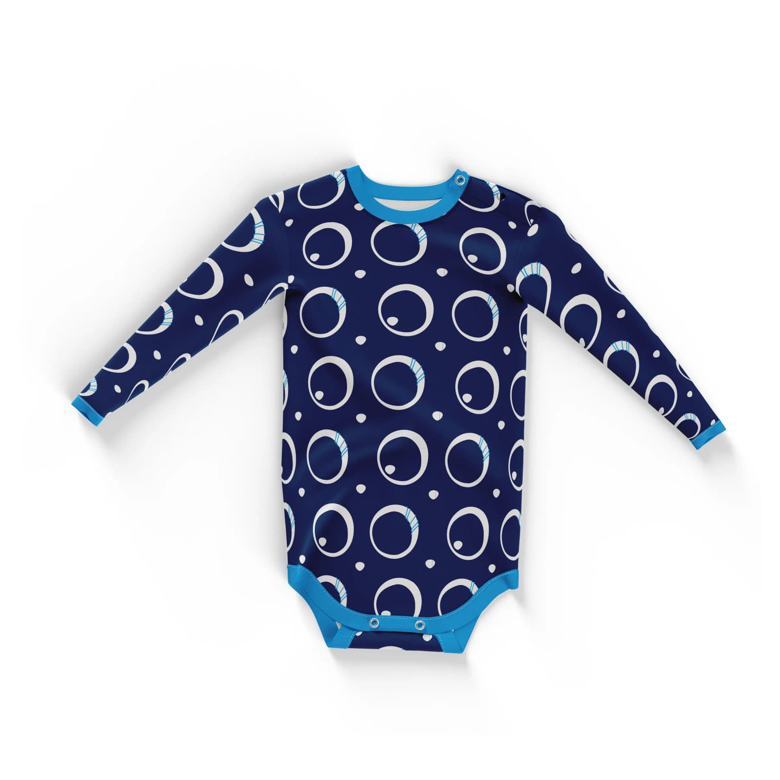
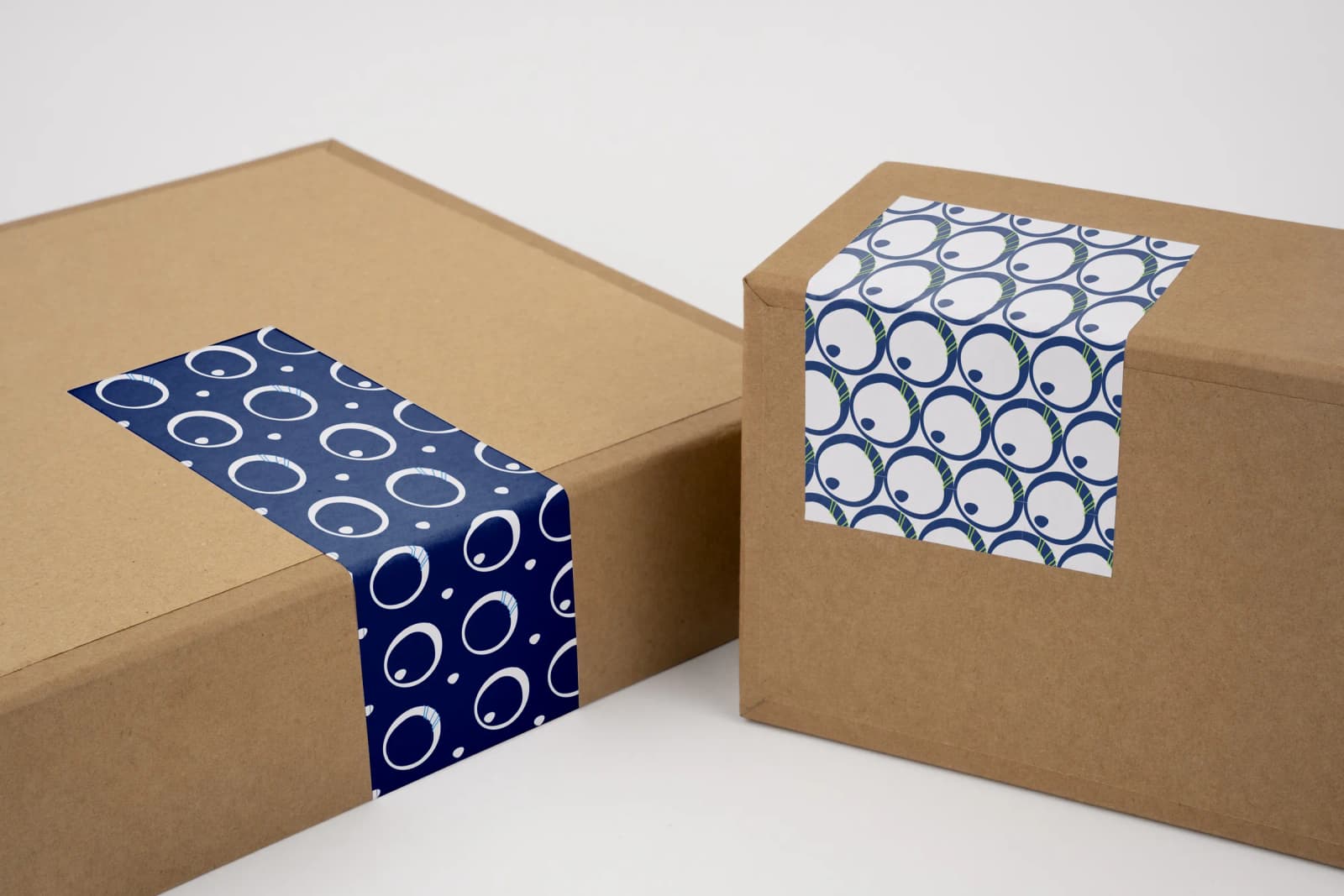
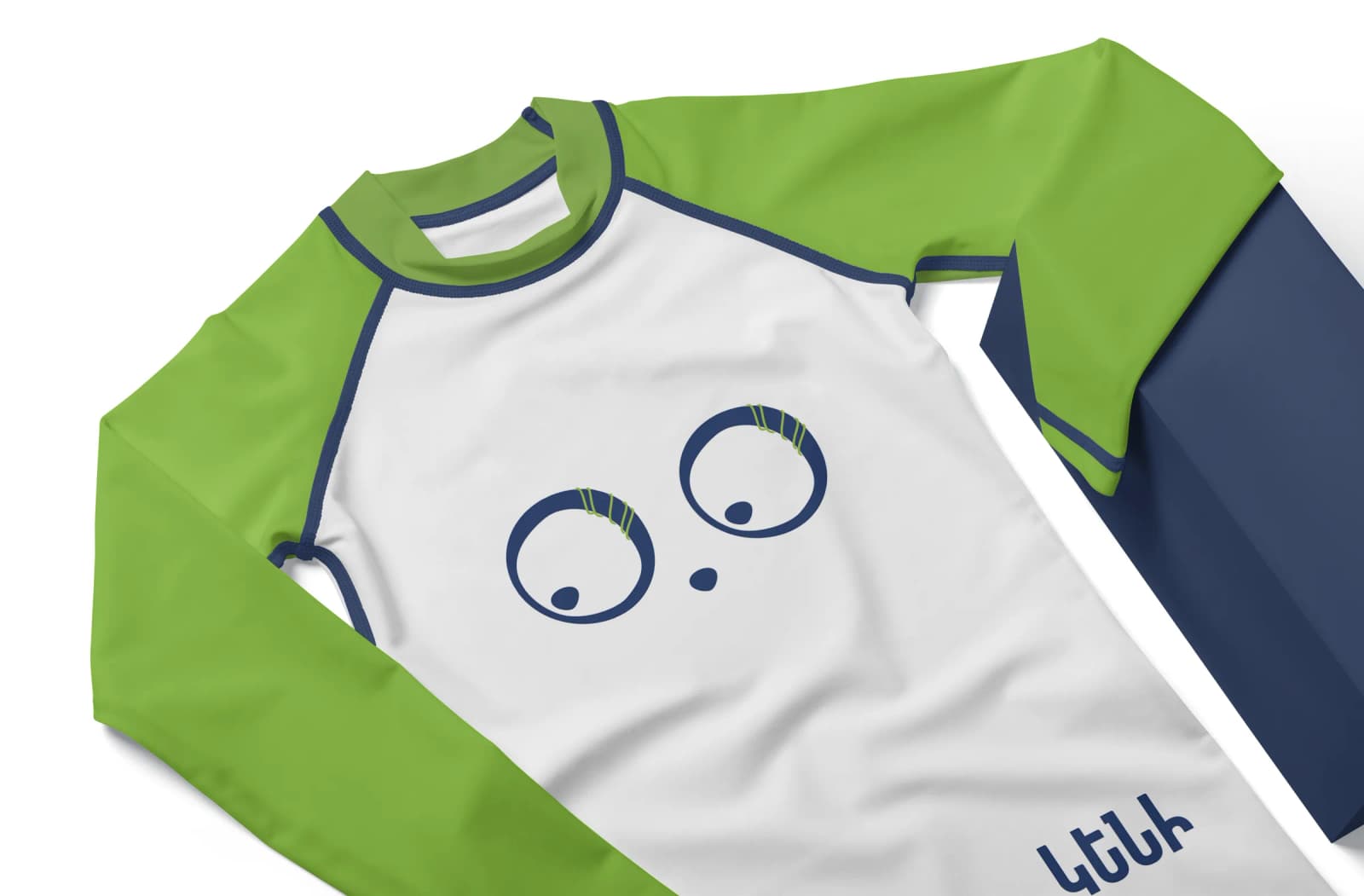
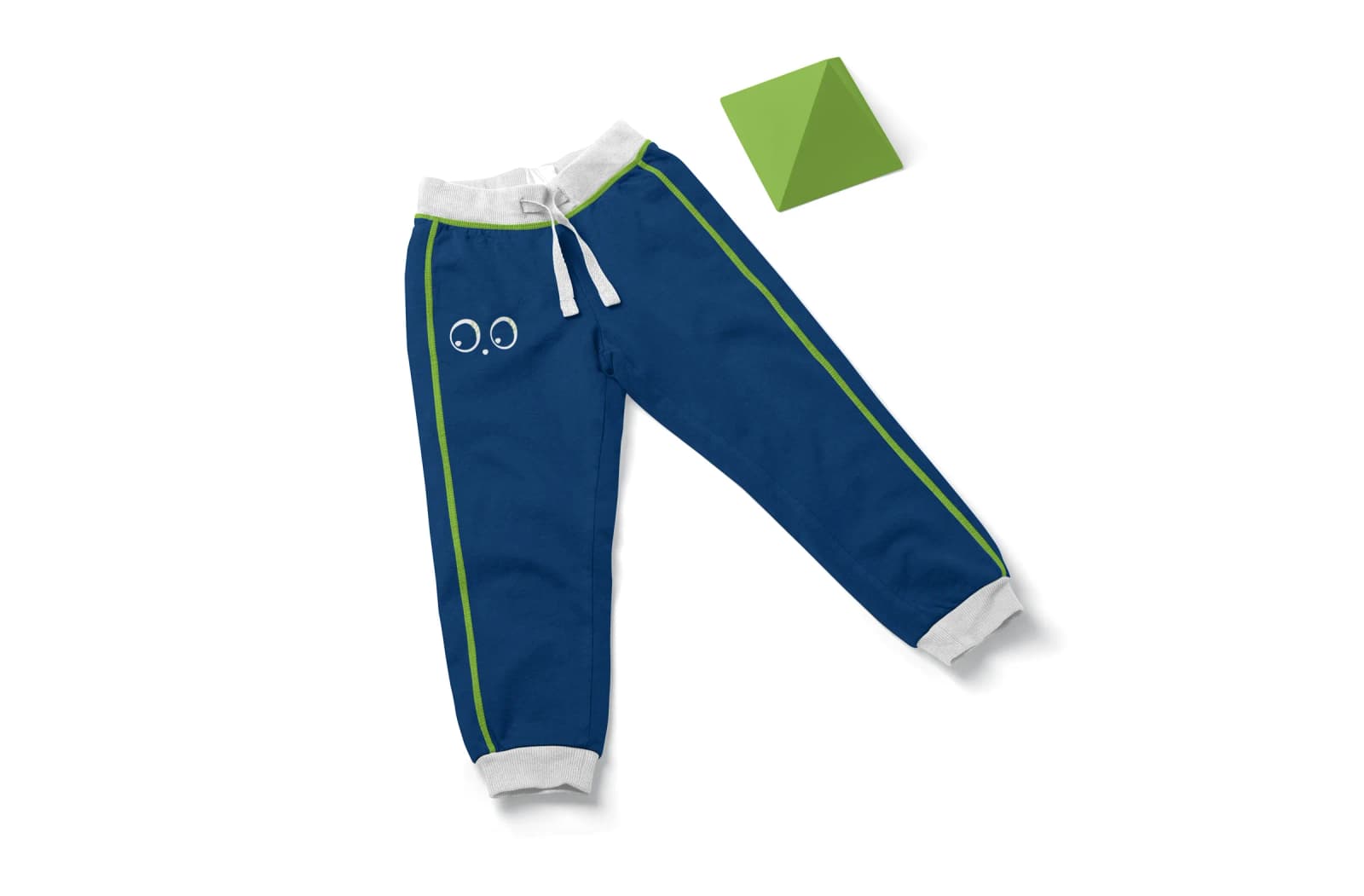
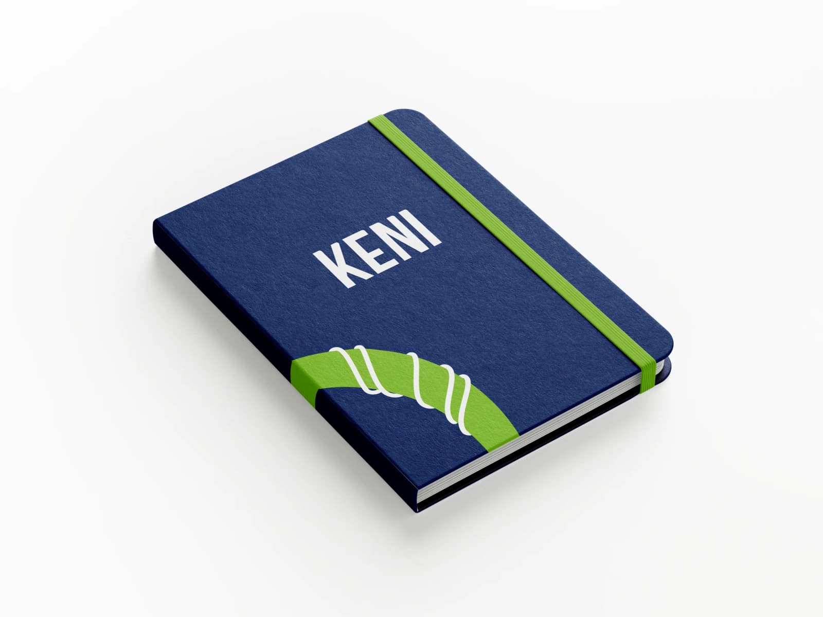
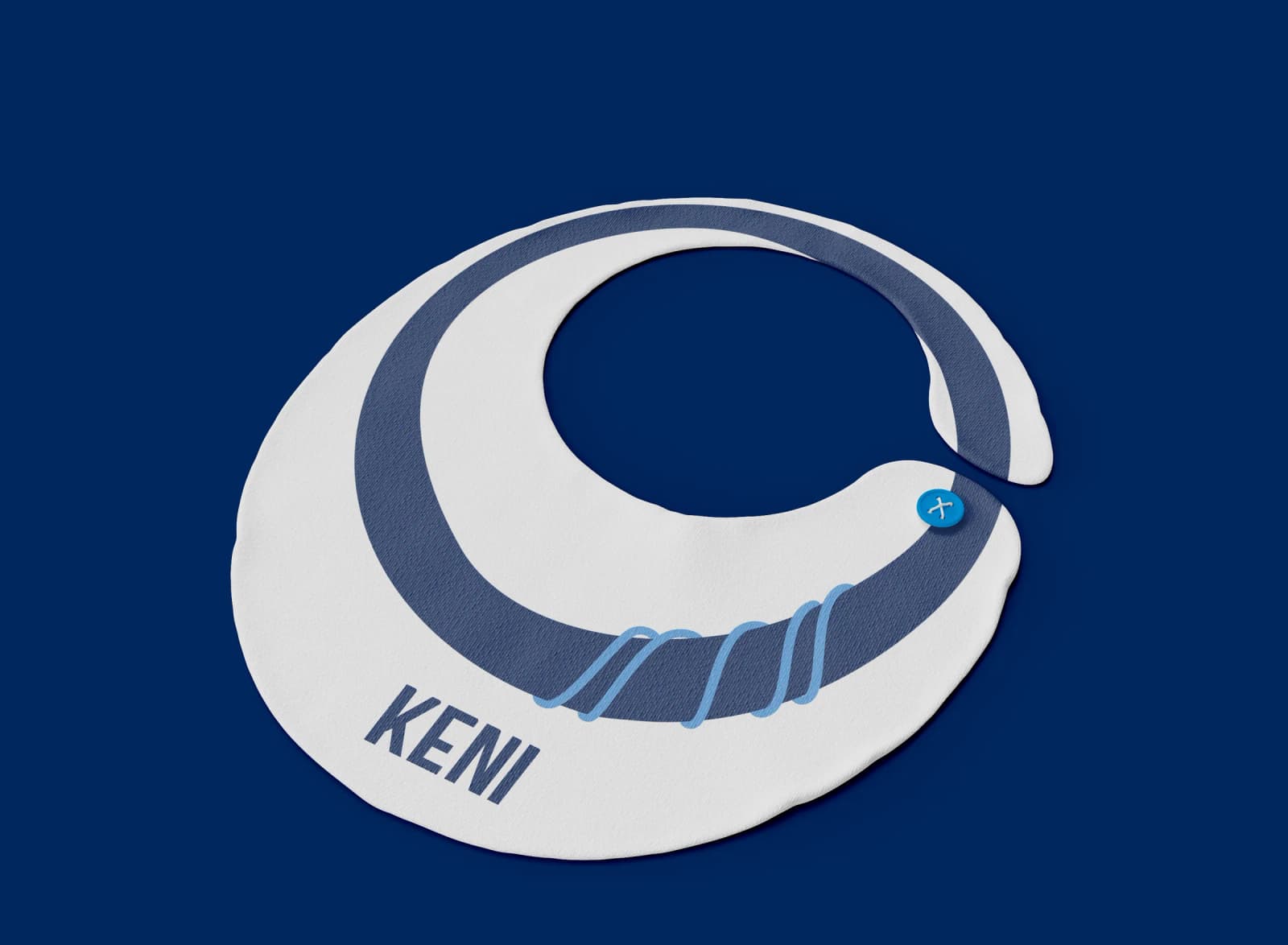
brand in use