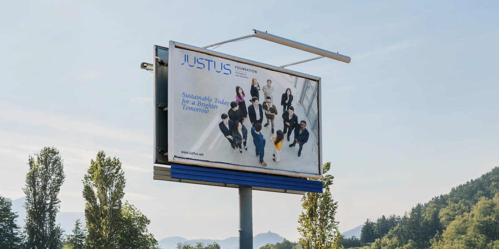
JUSTUS Foundation
Branding and Visual Identity
- Year
- 2025
- Client
- Justus Foundation
- Service Scope
- Branding and Visual Identity
Project Overview
Justus is an independent policy and research foundation based in Armenia, working on a fair transition to a low-carbon economy.
The foundation speaks to two very different audiences: policymakers who expect rigour, and communities who need to trust that it is on their side. It also works internationally, so its identity has to be clearly rooted in Armenia and equally at home in a global setting. CREO took on the challenge of building one identity that would hold up with both audiences and read naturally in Armenian and in English.



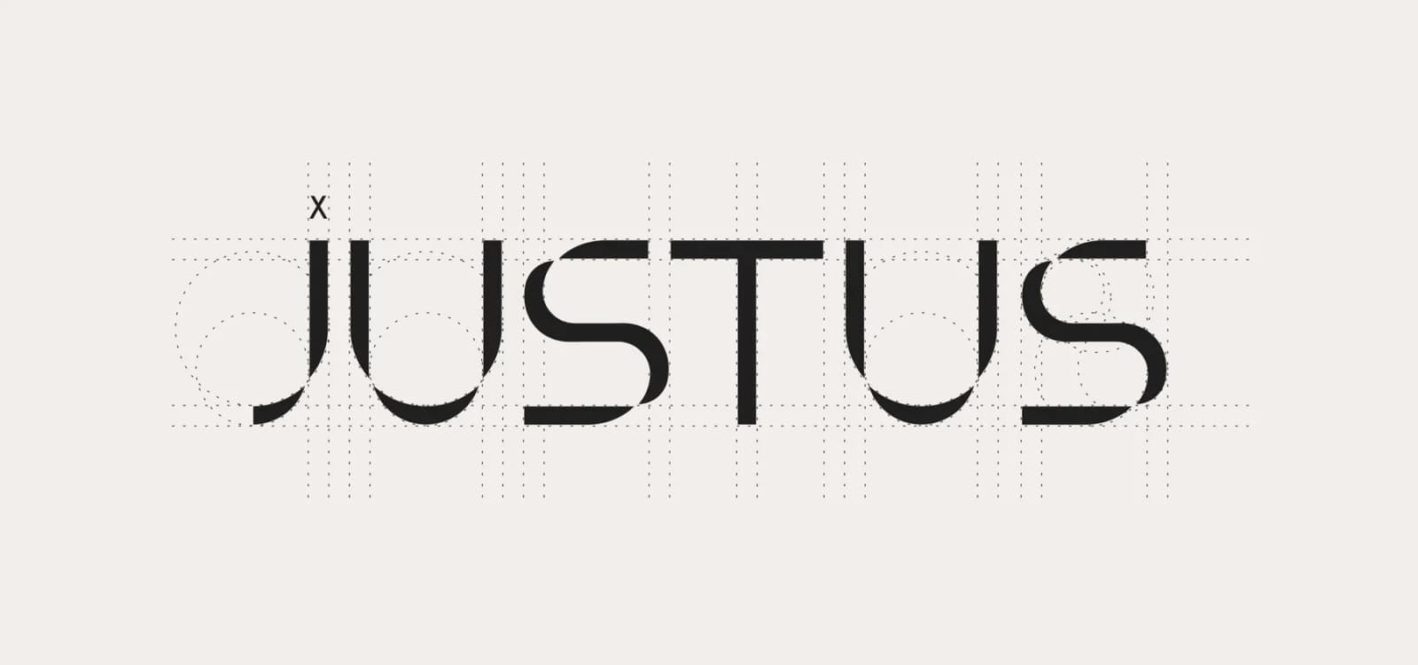
We began with the smallest element of the Armenian alphabet.
Not the letter. Not the word. But the foundation beneath them.
This smallest sign is our core that everything stands on.
What usually remains unseen.
Because real systems (societies, cultures, justice) are never built from what is loud.
They are built from what connects.
CONNECTION AS JUSTICE
This element lives under the letters, like justice lives under society.
It does not dominate, it supports.
It does not speak loudly, it holds meaning together.
It is:
- -National identity, reduced to its purest form
- -Unity, without uniformity
- -A bridge between past and future
- -A thread linking generations, cultures, people
- -The invisible structure that makes fairness possible
JUSTUS AS A LIVING SYSTEM
We believe Justus is not an abstract ideal.
It is a living system.
A system that:
- -Connects people rather than divides them
- -Honors memory while enabling progress
- -Respects difference while protecting unity
- -Builds the future without erasing the past
Justice, for us, is continuity.
What flows between generations.
What links responsibility to action.
What turns values into structure.
Tagline
For Green & Just Transition
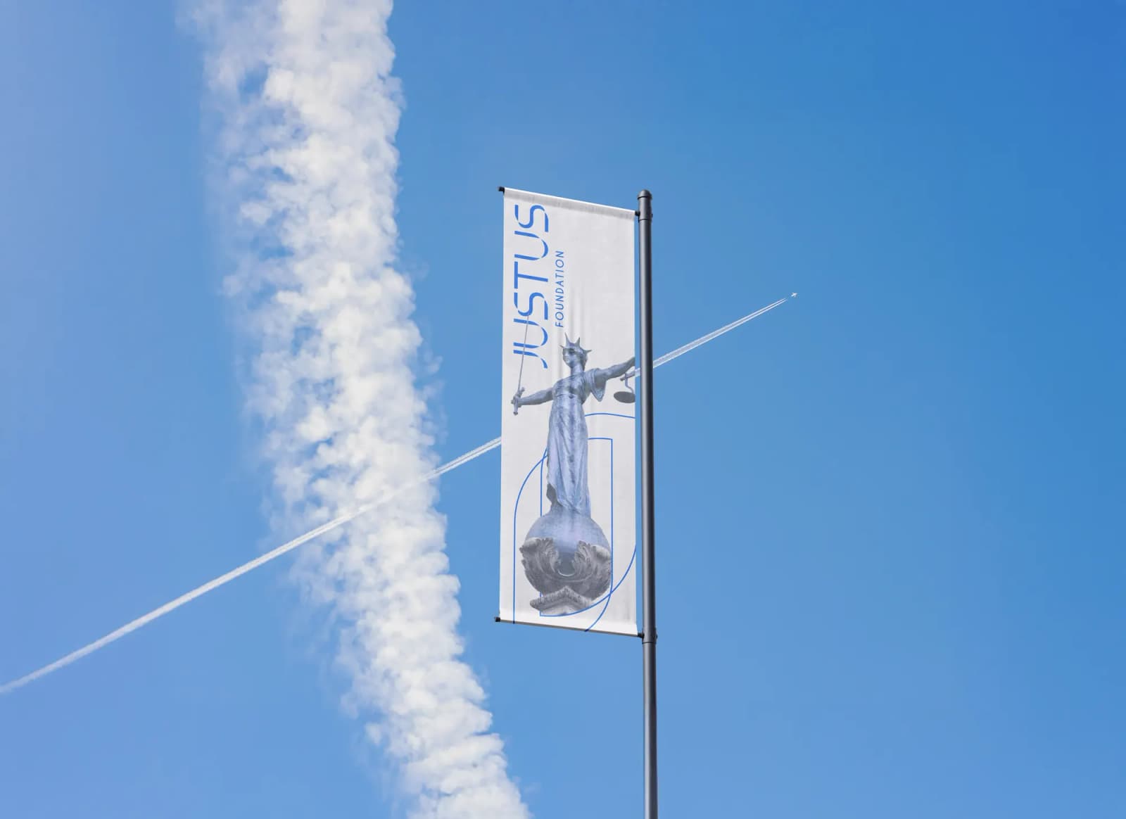
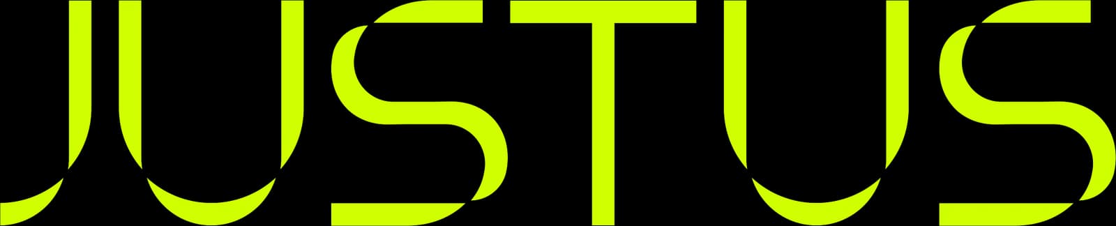
Logo design


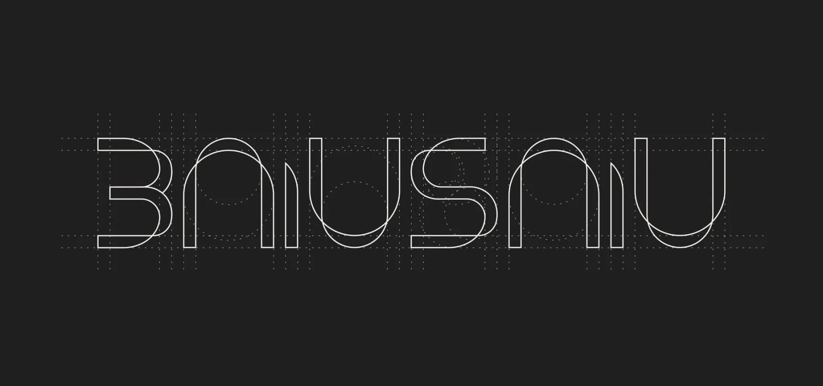
Visual identity
COLOR SYSTEM
OXFORD NAVY
Pantone 282 C
FOUNDATION OF TRUST
Oxford Navy is our ground.
It represents:
Institutional integrity
This is the color of structures that endure
and holds the system together,
like justice itself: calm, firm, non-negotiable.- RGB 2, 35, 68
- CMYK 97, 49, 0, 73
- Hex #022344
INTENSE AZURE
Pantone 285 C
CLARITY & TRANSPARENCY
Intense Azure is the color of openness.
It signals:
This is where complexity becomes understandable.
Where institutions speak to people, not above them.
Azure brings air into the system.
It prevents justice from becoming distant or abstract.- RGB 0, 108, 226
- CMYK 100, 52, 0, 11
- Hex #006CE2
INDIGO DYE
Pantone Dark Blue C
- RGB 2, 25, 153
- CMYK 94, 79, 0, 43
- Hex #021999
VOLT
Pantone 389 C
MORAL ENERGY
Volt is intention.
It represents:
•Civic responsibility
•Urgency without aggression
•The energy to act when values are at stake
Justice must be felt, not only understood.- RGB 207, 255, 0
- CMYK 19, 0, 100, 0
- Hex #CFFF00
CLOUD DANCER
Pantone 663 C
HUMAN CONTEXT
Cloud Dancer is space.
It allows:
Human presence within structure
This color softens the system without weakening it.
It creates room for dialogue, empathy, and reflection.
Justice must remain human, or it loses legitimacy.- RGB 243, 238, 234
- CMYK 0, 2, 4, 5
- Hex #F3EEEA
AURORA BLACK
Pantone 419 C
- RGB 32, 31, 31
- CMYK 0, 3, 3, 88
- Hex #201F1F
GRADIENT

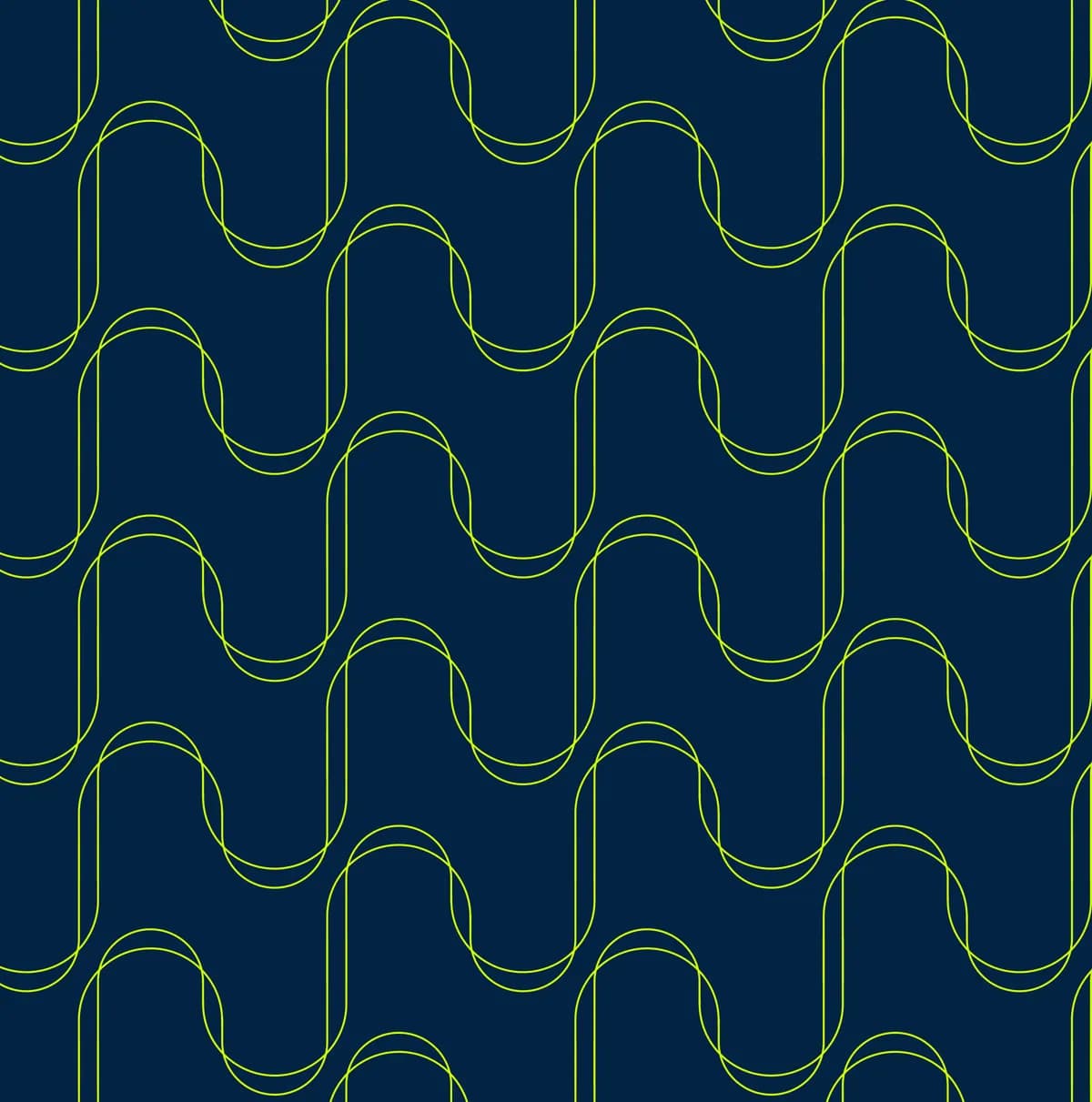
PATTERN



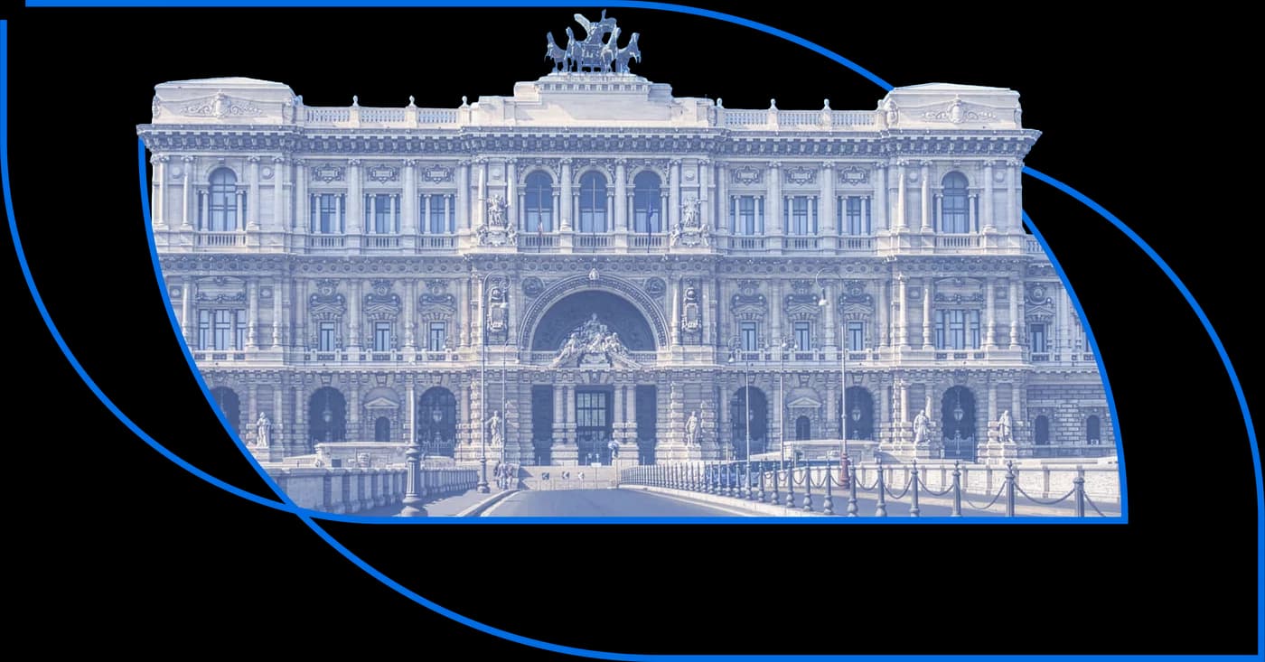
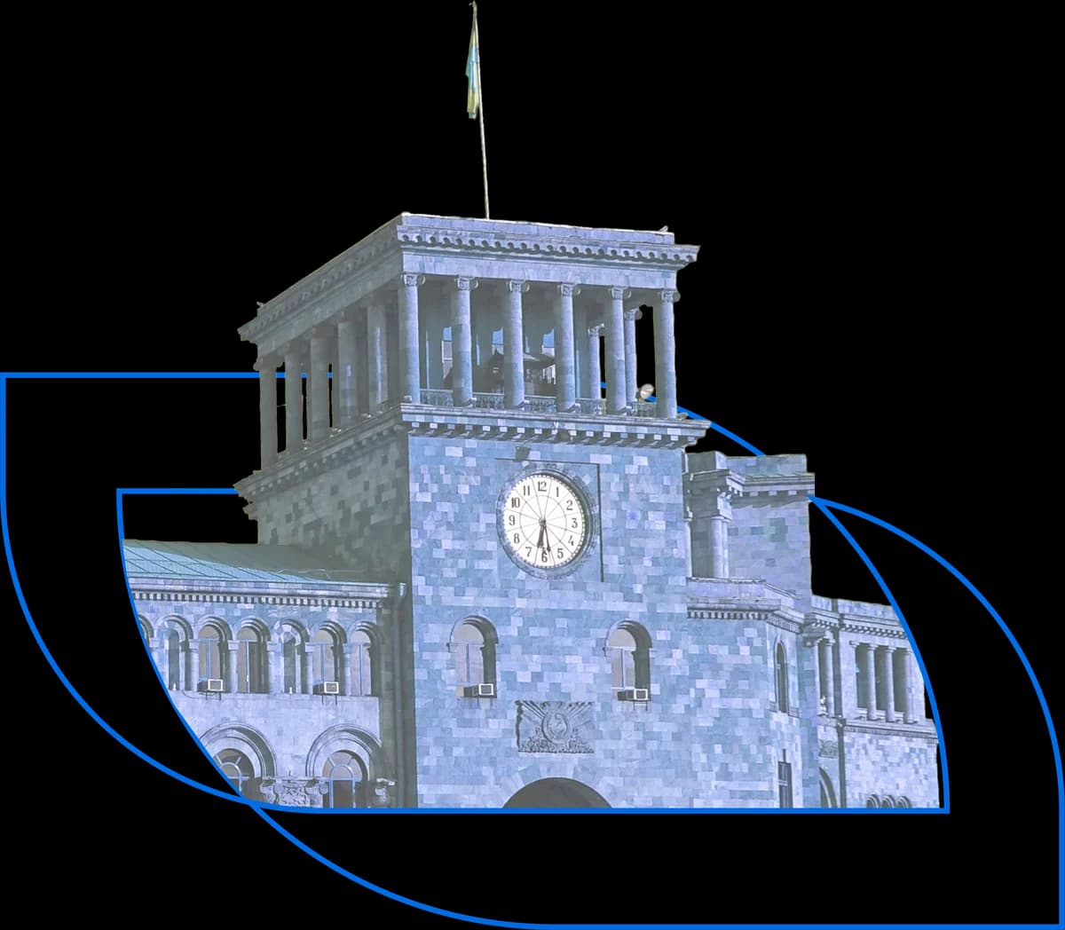
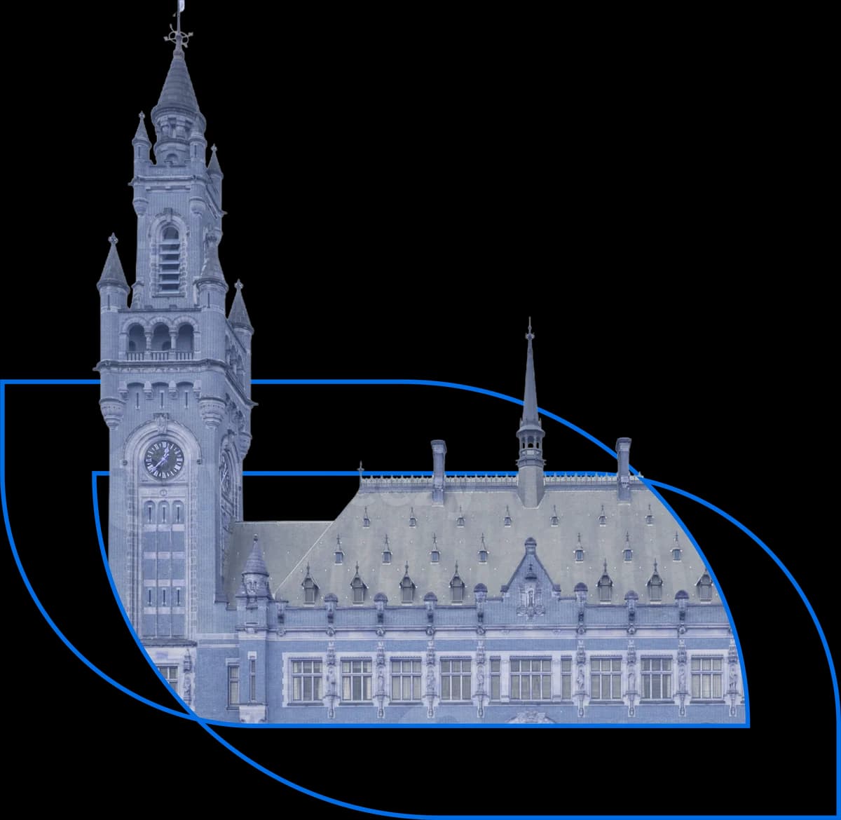
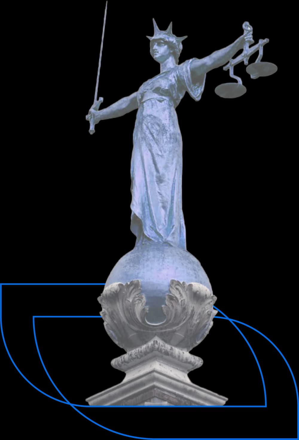
VISUALS
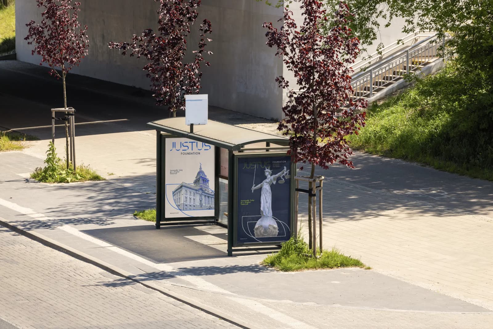
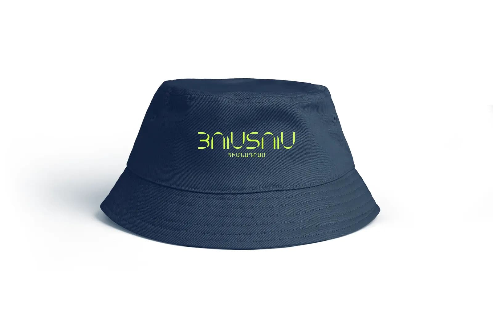
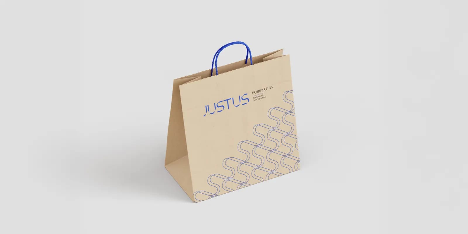
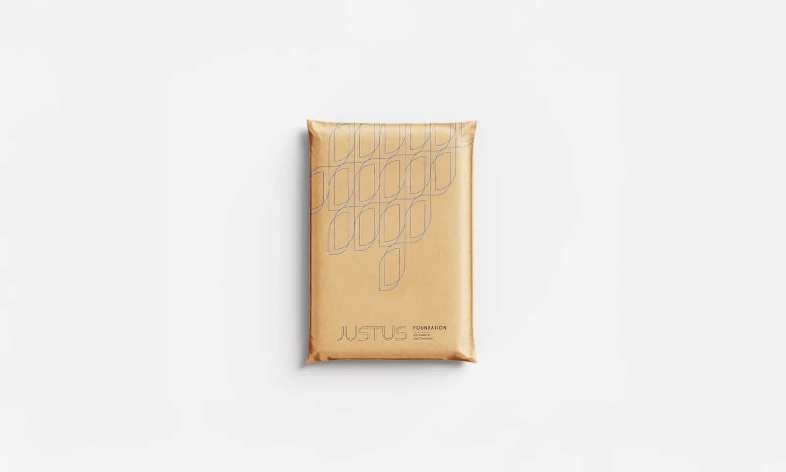
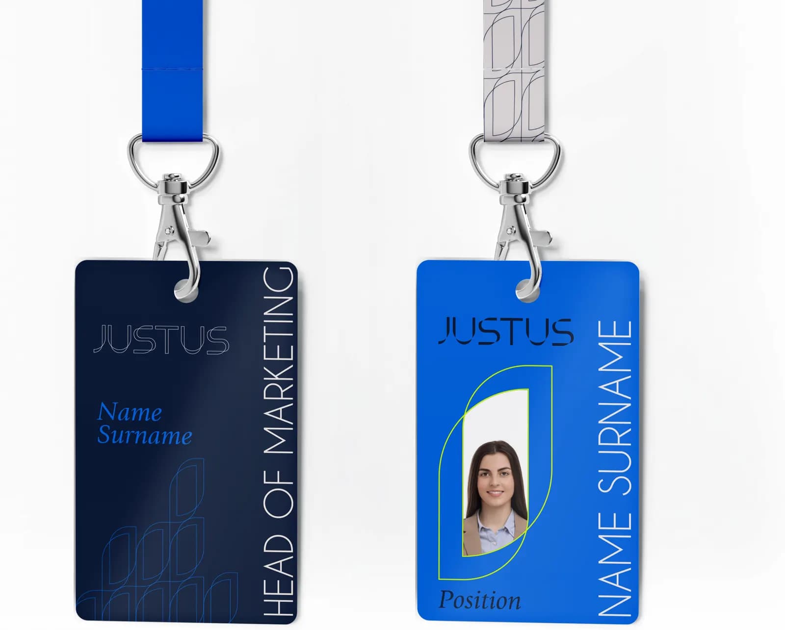
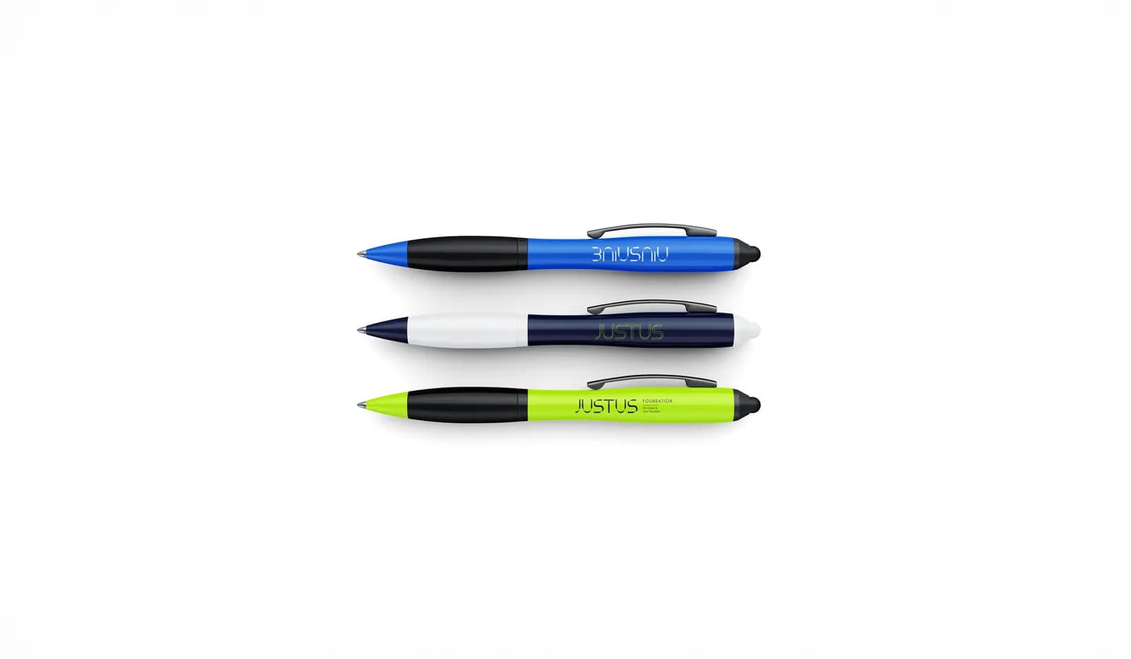
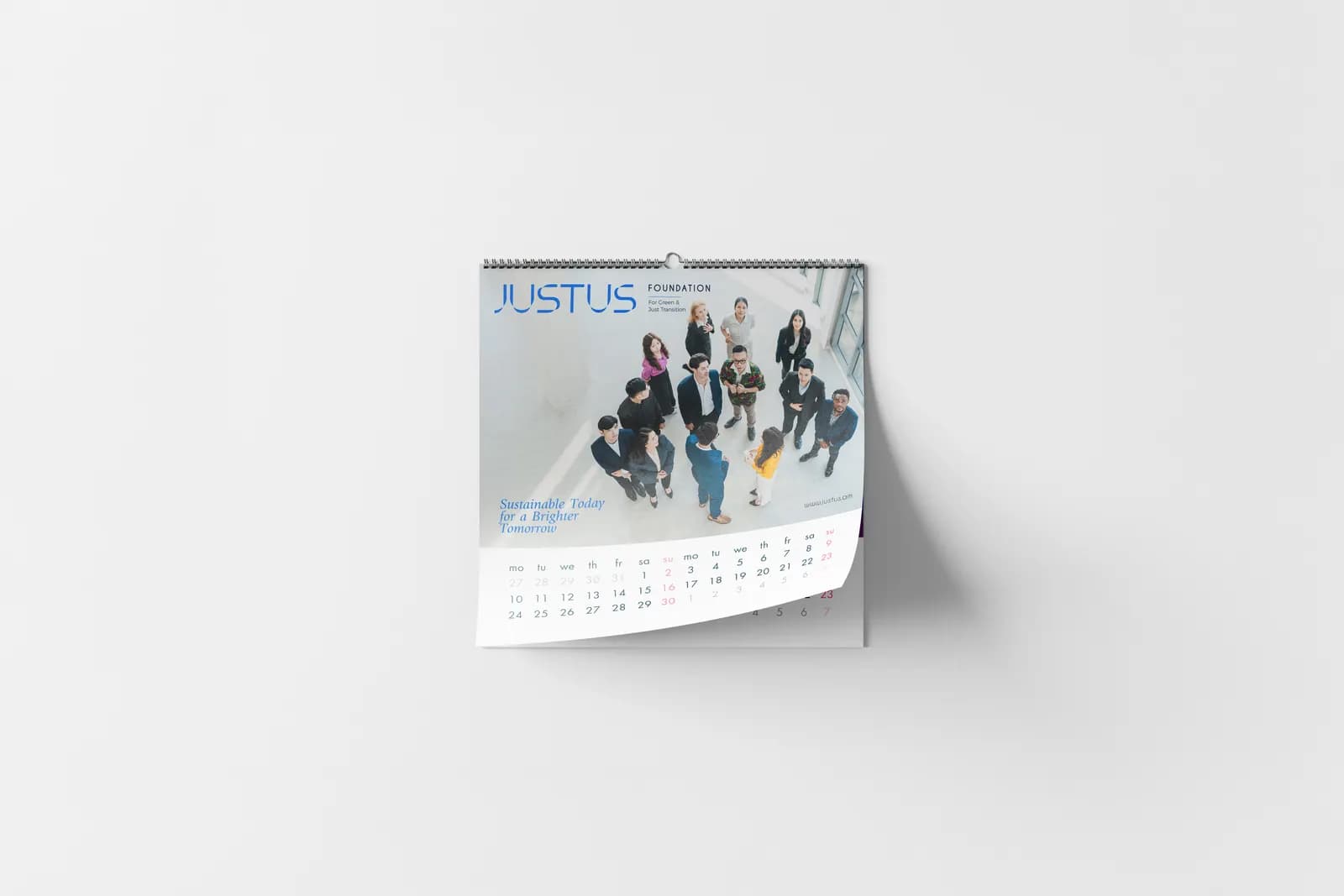
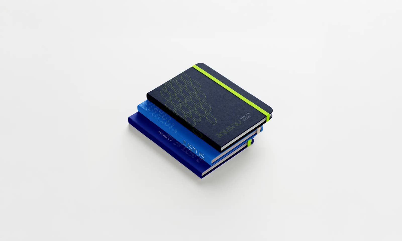
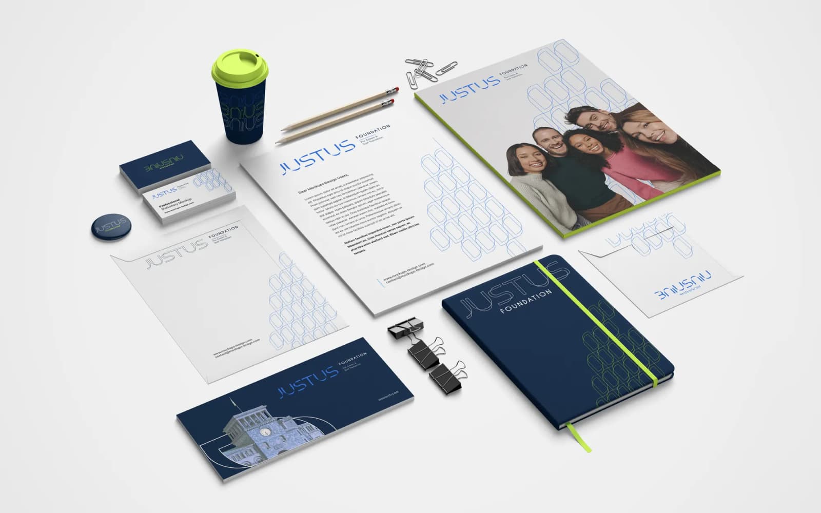
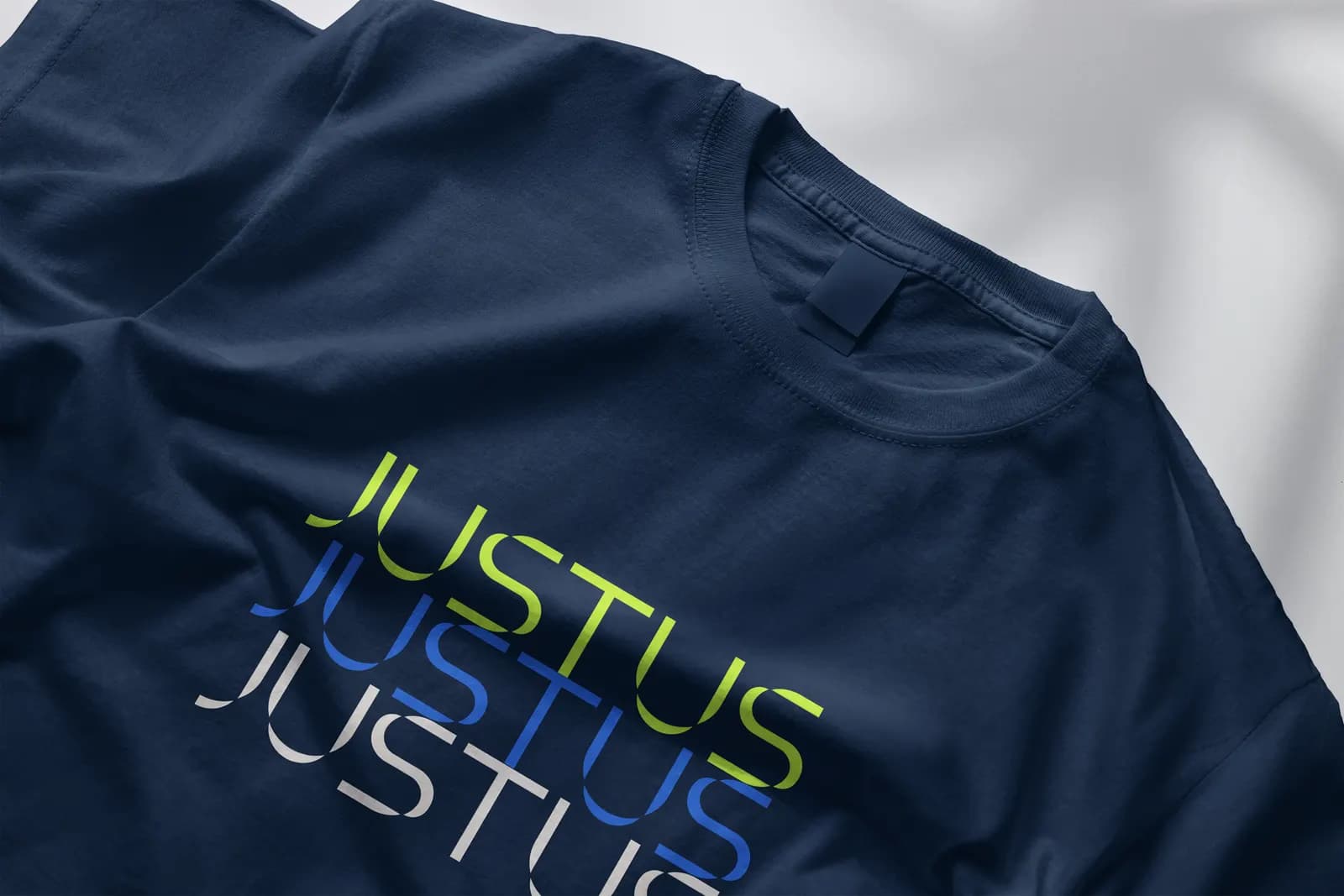
Brand identity in use