I TEMPI
Branding and Visual Identity
- Year
- 2025
- Client
- I TEMPI - Swiss Chamber Orchestra
- Service Scope
- Branding and Visual Identity
Project Overview
I TEMPI is a chamber orchestra in Basel, founded in 2013 by Armenian-born conductor Gevorg Gharabekyan. It plays music from the Baroque to the present day on historical instruments, and in some concerts it changes instruments partway through the programme, so the audience hears different eras of sound in a single evening.
CREO approached the work from the inside out, first defining what the orchestra stands for and how it speaks.
Rebranding
 Before
 After
Brand strategy
Positioning
ModernClassics
Mission
I TEMPI delivers exceptional musical experiences, shaped with precision, driven by spirit, and crafted to resonate deeply.
Vision
Creating meaningful moments through sound that speaks to the heart and mind.
What isI TEMPI?
I TEMPI unites disciplined musical interpretation with a contemporary artistic voice. Each performance is designed to resonate with lasting impact.
As a cultural institution, I TEMPI offers a consistent artistic presence shaped by commitment to excellence, emotional integrity, and meaningful audience connection.
CoreValues
Authenticity
We stay true to the music, the moment, and the listener, performing with honesty and emotional presence.
Excellence
We uphold the highest standards in our work, through discipline, preparation, and attention to every detail.
Expression
We believe music should speak with precision, depth, and feeling. Every performance is a conversation.
Resonance
We create experiences that stay with people, not just through volume or technique, but through emotional connection and lasting impact.
Tone of Voice
At I TEMPI, how we communicate off stage is as important as how we perform on it. Our tone of voice reflects our identity: disciplined, expressive, and deeply intentional. Every message we share, whether in writing or speech, should carry the same clarity, structure, and depth as our music.
- We speak with professionalism, not formality.
- We convey emotion, but never dramatize.
- We are open, but never vague.
Core Tone Attributes
Professional
We maintain credibility and respect: consistent in tone, measured in expression.
Expressive
Emotion is present, but never exaggerated. Our voice reflects feeling through balance and clarity.
Consistent
Whether it’s a concert brochure, social post, or press release, we speak with one voice.
Tagline
Music. Motion. Emotion
I TEMPI’s identity: the clarity of music, the energy of motion, and the depth of emotion.
It reflects our foundation in structure and timing, our dynamic performance presence, and our commitment to creating lasting emotional impact through sound.
Logo design





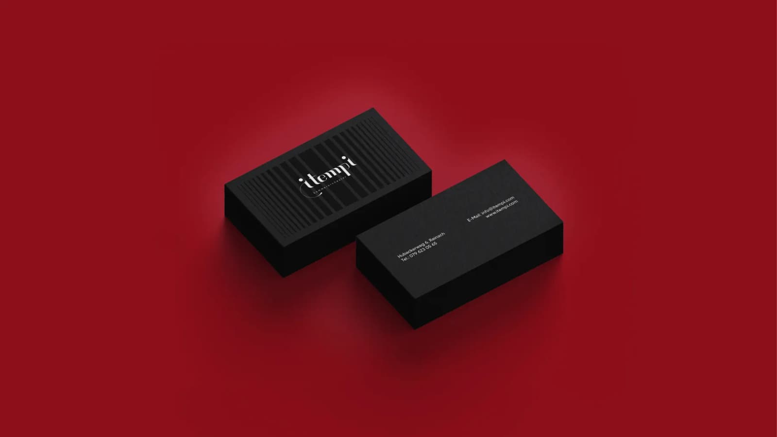
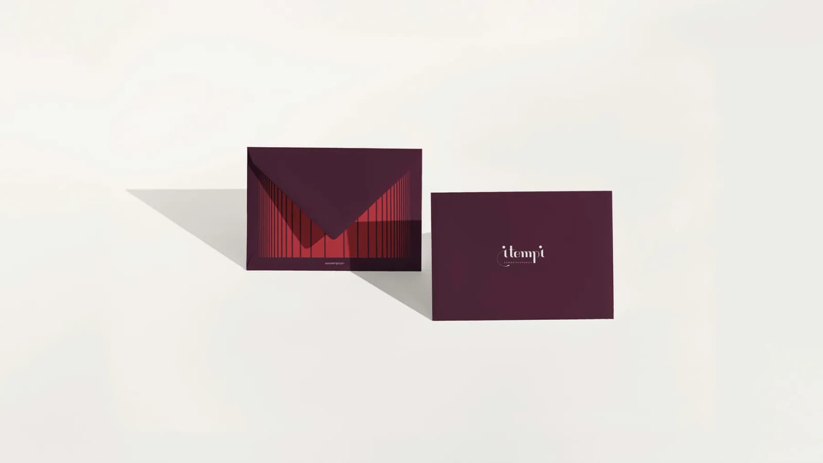
The logo is constructed on a nine parallel barlines, representing musical measures. These lines are the raw material: a symbol of pure form and temporal flow before interpretation begins.
Each letter in the itempi wordmark is built from these barlines, the vertical lines that define time in music. This creates a consistent, minimalist structure that reflects discipline, clarity, and continuity.

Visual identity
Main Colors
These colors reflect I TEMPI’s balance of strength and sensitivity, form and feeling.
Vivid Burgundy
Symbolizes depth, emotion, and the richness of musical expression: bold yet composed.
- HEX
- #B31B1B
- RGB
- 179, 27, 27
- CMYK
- 0, 100, 79, 20
- Pantone®
- 187
Isabelline
Brings warmth, openness, and balance: a neutral space where sound and silence coexist.
- HEX
- #F4F3ED
- RGB
- 244, 243, 237
- CMYK
- 0, 0, 3, 4
- Pantone®
- 663 C
Italian Black
Represents structure, clarity, and timeless form, grounding the brand in discipline and precision.
- HEX
- #1B1C1B
- RGB
- 27, 28, 27
- CMYK
- 4, 0, 4, 89
- Pantone®
- 419 C
Primary Colors
These primary colors are exclusively used as background colors to support visual consistency, create contrast, and reflect the brand’s character without distraction.
Black
- HEX
- #1B1C1B
- RGB
- 0, 0, 0
- CMYK
- 0, 0, 0, 100
- Pantone®
- Black 6 C
Dark Chocolate
- HEX
- #4A102A
- RGB
- 74, 16, 42
- CMYK
- 0, 78, 43, 71
- Pantone®
- 4975 C
Oxford Blue
- HEX
- #0B2447
- RGB
- 11, 36, 71
- CMYK
- 85, 49, 0, 72
- Pantone®
- 289 C
Russian Violet
- HEX
- #331D47
- RGB
- 51, 29, 71
- CMYK
- 28, 59, 0, 72
- Pantone®
- 2695 C
Secondary Colors
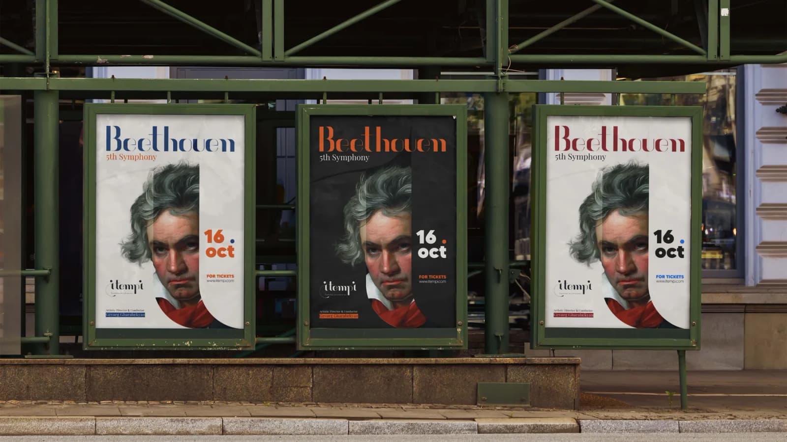
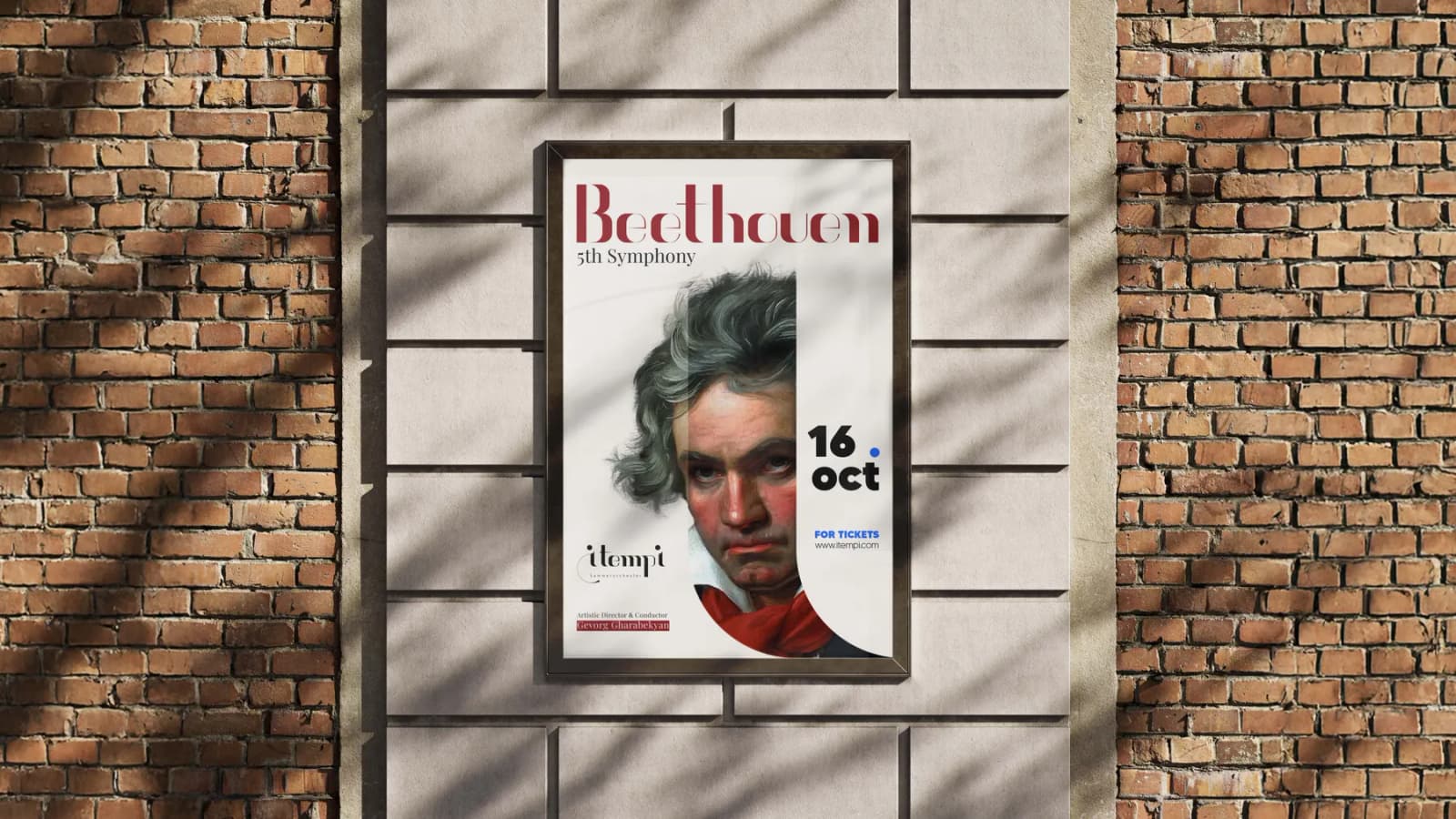
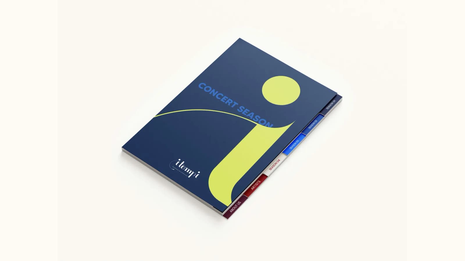
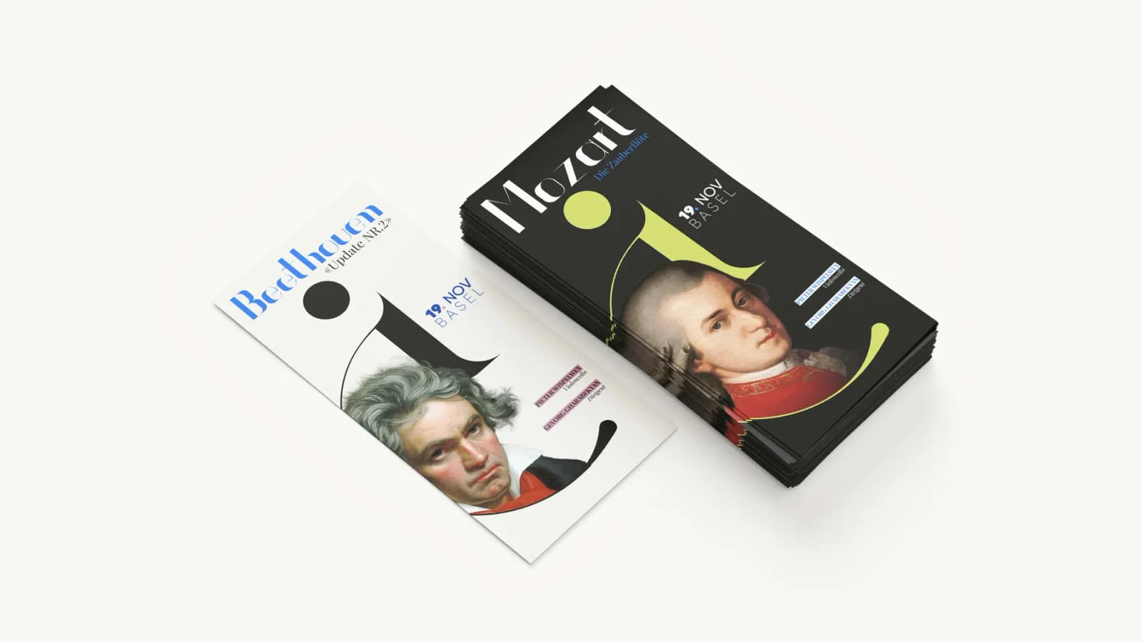
These colors are used only for graphic elements and are applied primarily in posters and outdoor visuals to support specific compositions, highlight thematic variations, and evoke mood.
Yale Blue
- HEX
- #144EA0
- RGB
- 20, 78, 160
- CMYK
- 88, 51, 0, 37
- Pantone®
- 2133 C
Brandeis Blue
- HEX
- #0473FF
- RGB
- 4, 115, 255
- CMYK
- 98, 55, 0, 0
- Pantone®
- 285 C
Parrot Pink
- HEX
- #CF98AE
- RGB
- 207, 152, 174
- CMYK
- 0, 27, 16, 19
- Pantone®
- 507 C
International Orange
- HEX
- #FD5101
- RGB
- 253, 81, 1
- CMYK
- 0, 68, 100, 1
- Pantone®
- Orange 021 C
Philippine Red
- HEX
- #C5172E
- RGB
- 197, 23, 46
- CMYK
- 0, 88, 77, 23
- Pantone®
- 186 C
Chinese Green
- HEX
- #C5D164
- RGB
- 197, 209, 100
- CMYK
- 6, 0, 52, 18
- Pantone®
- 584 C
Pattern



Brand guidelines