Green Conference Armenia
Branding and Visual Identity · Integrated Marketing · Event Management
- Year
- 2025
- Stakeholders
- Austrian Development Agency
- Austrian Development Cooperation (ADC)
- EU-GAIA (Green Agriculture Initiative in Armenia)
- Armenian National Agrarian University (ANAU)
- Service Scope
- Branding and Visual Identity
- Integrated Marketing
- Event Management
Project Overview
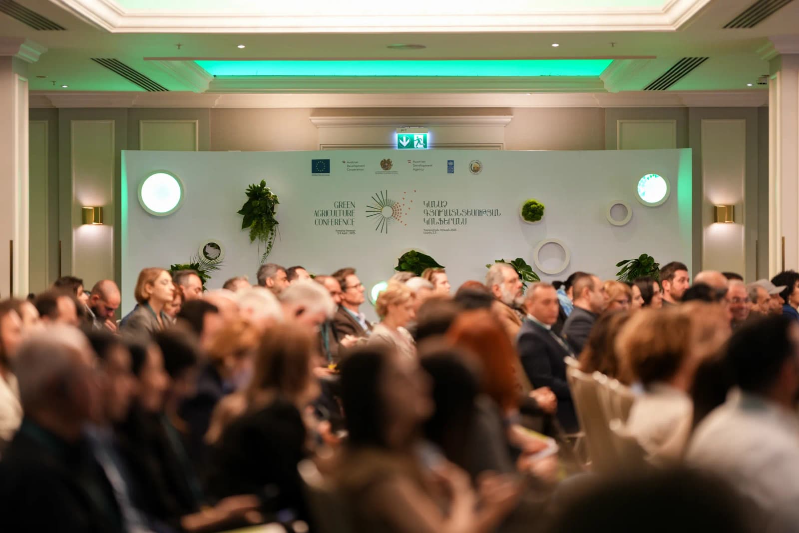
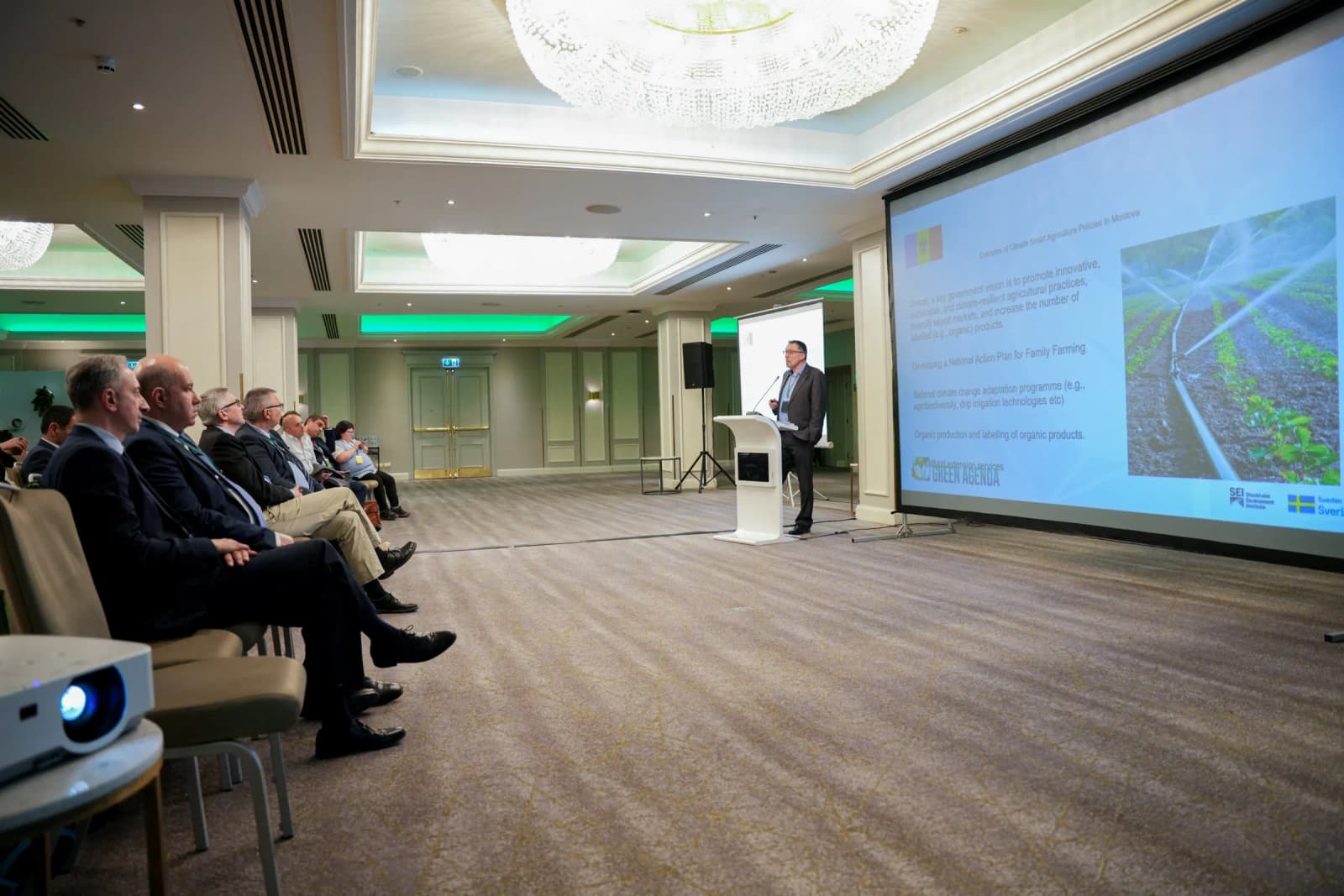
Green agriculture is not just a way of farming. It is a shift in how a whole country grows, produces and decides. Green Agriculture Conference Armenia, the country’s first international platform on the subject, brings that conversation into one room, connecting researchers, farmers, policymakers and international partners. We gave it one message, Green Shift: Embracing Sustainability, and carried it through the identity, the communication and the two days on-site events.
Green Shift:
Embracing Sustainability
Our Approach
A Visual Identity Built on the Idea of “Green Shift”
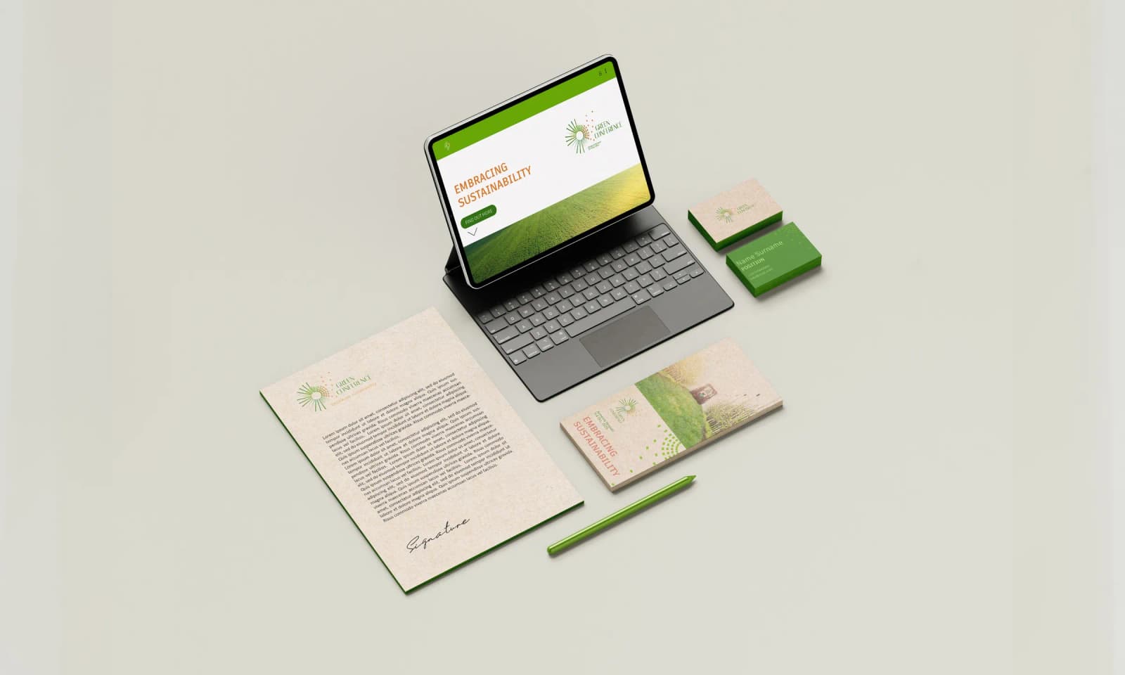
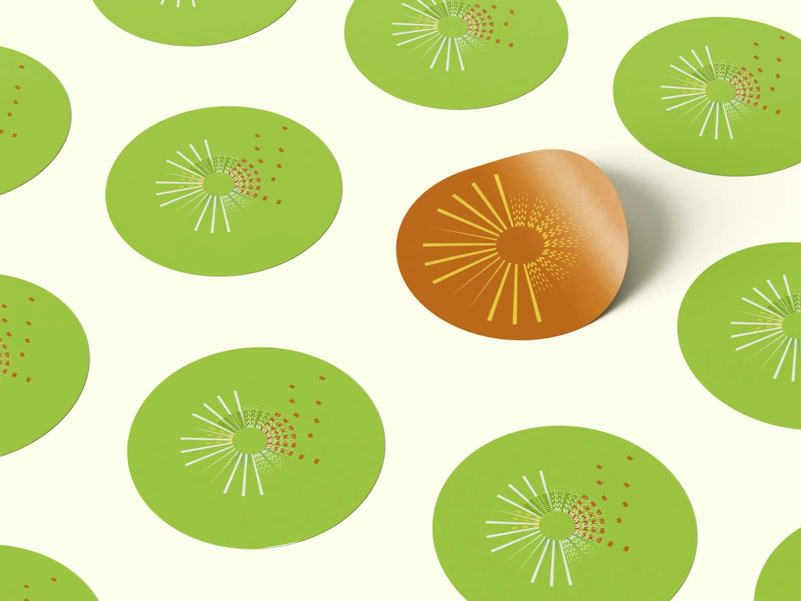
We translated the conference’s concept into a cohesive visual identity that gives the shift a form. It is inspired by six elements, each drawn from a landscape of change.
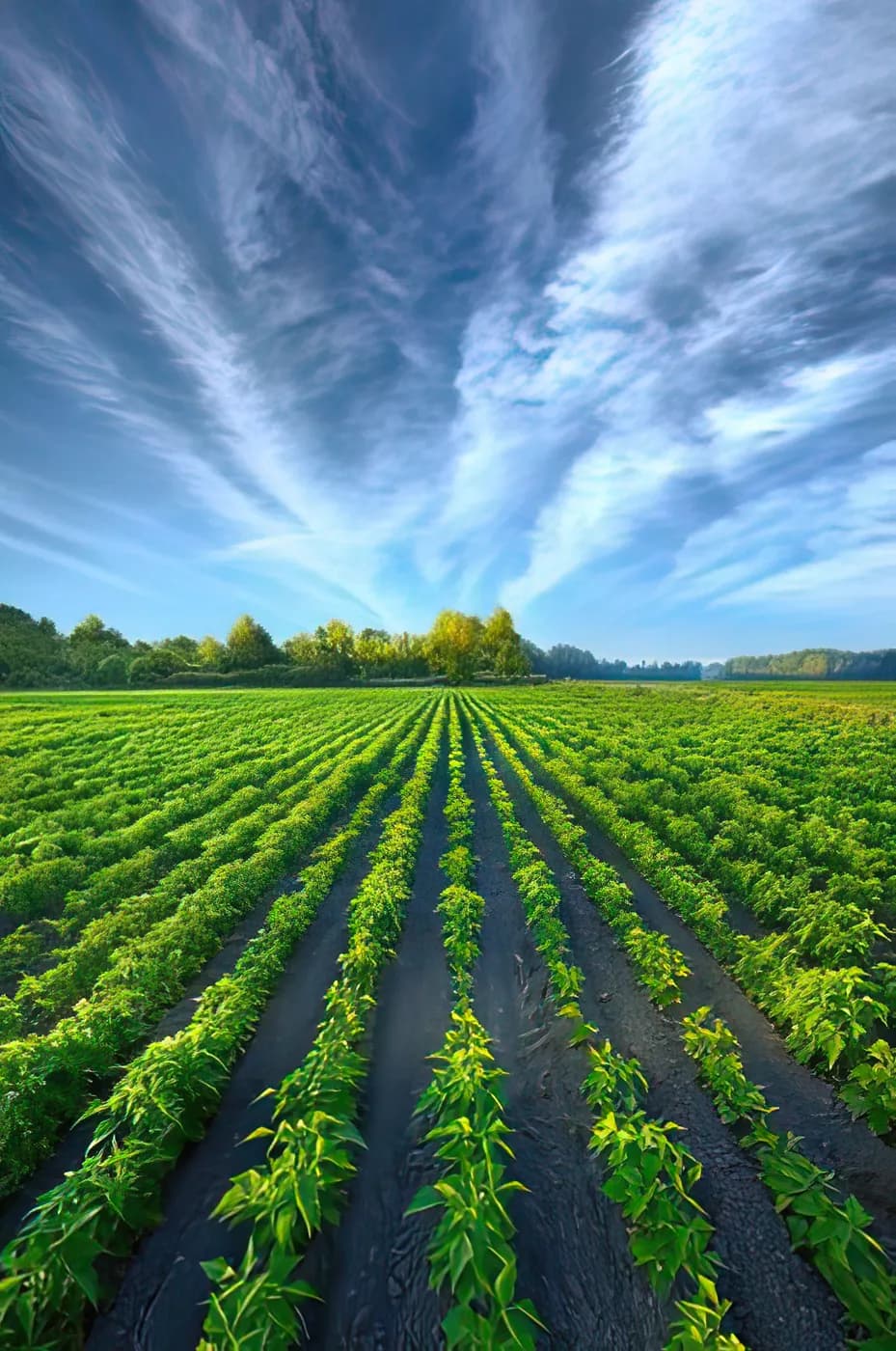
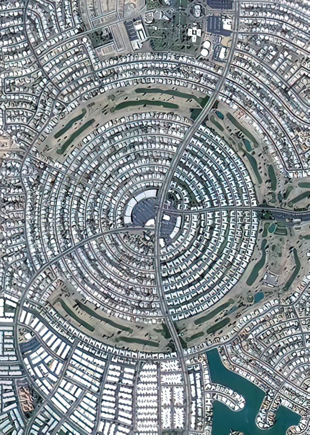


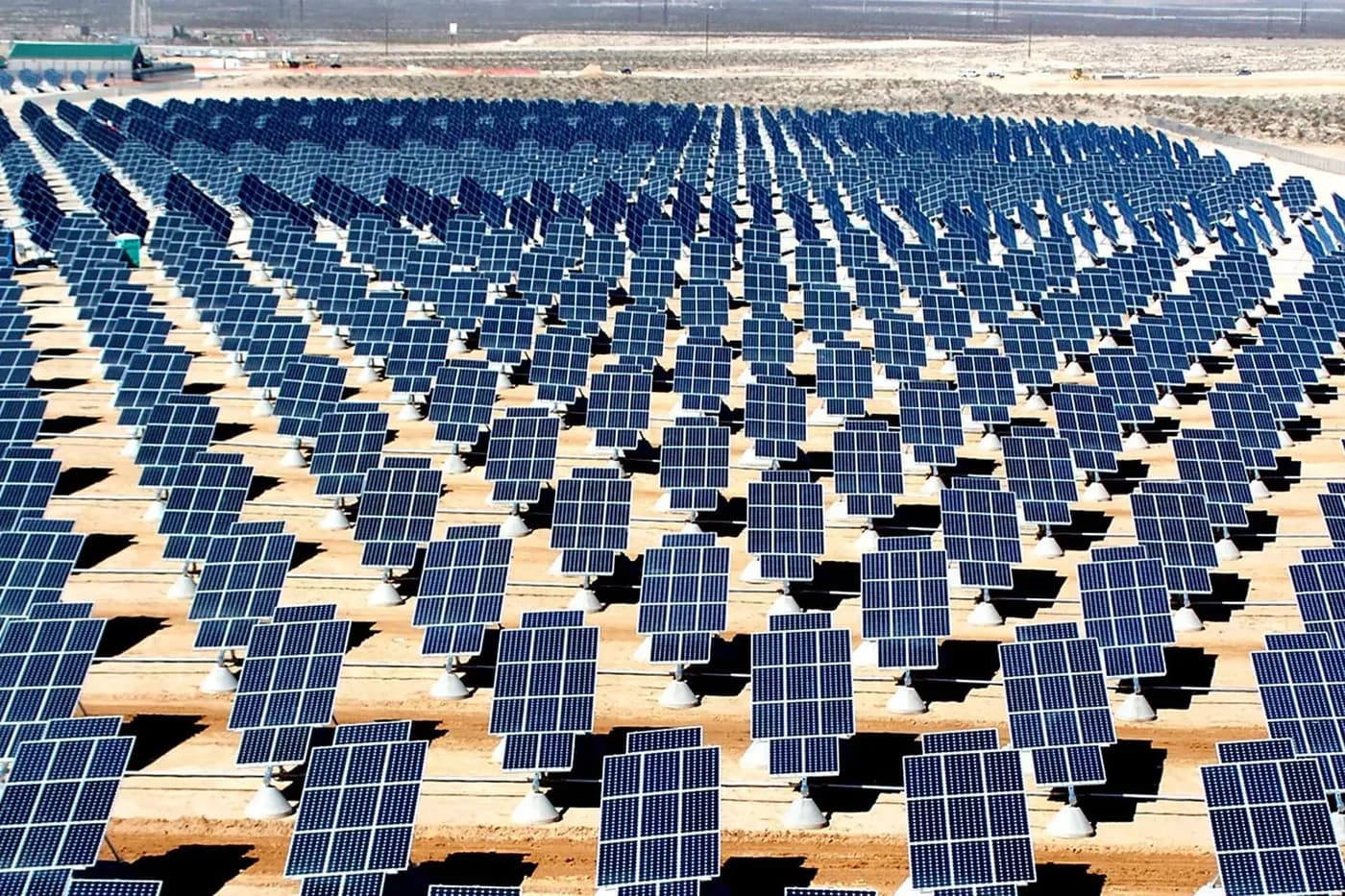
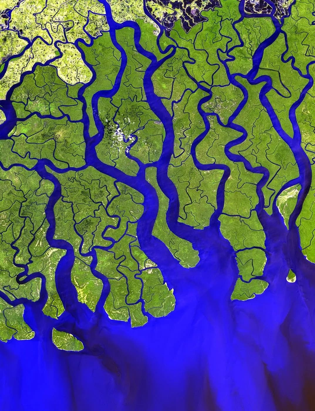
The final logo incorporates all elements together, harmoniously conveying the idea of a continuous development cycle. It encapsulates the urgency of embracing green practices across diverse sectors, catalyzing innovative solutions and tangible steps towards a sustainable future. The circular shape signifies unity among all stakeholders and the transformative power of sustainability.
The Colour Palette
Sacramento State Green
- Hex
- #02312D
- RGB
- 2, 49, 45
- CMYK
- 96, 0, 8, 81
- Pantone
- 546 C
- #0A3B2A
- #124527
- #1A4F24
- #225A20
- #2A641D
- #326E1A
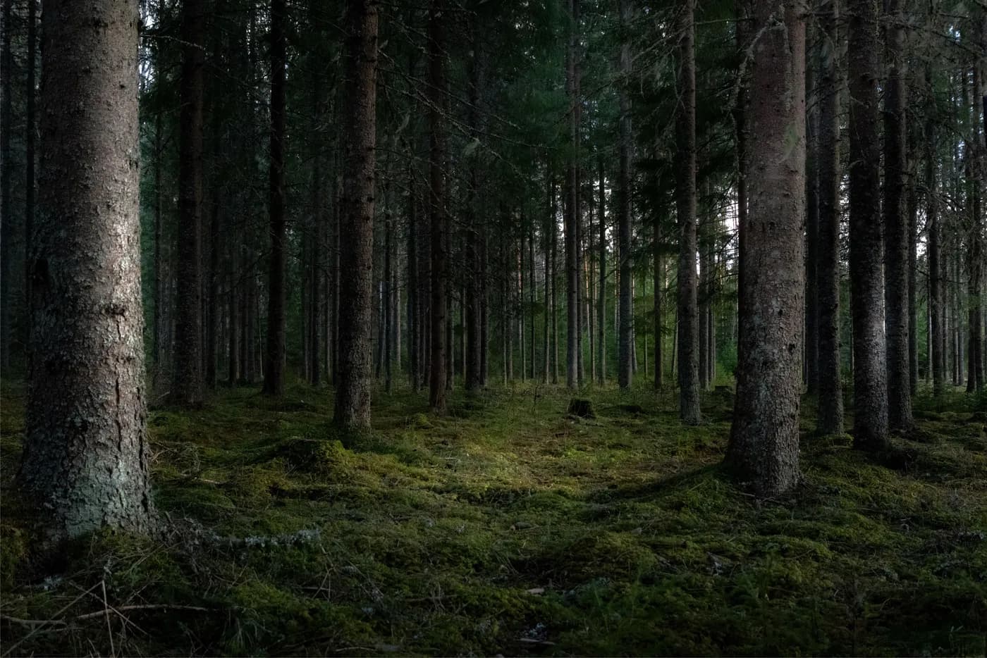
Different shades of green reflect both the beauty of nature and the commitment to a greener future, while also representing the diverse stages of sustainability adoption among individuals, organizations, industries, countries etc.
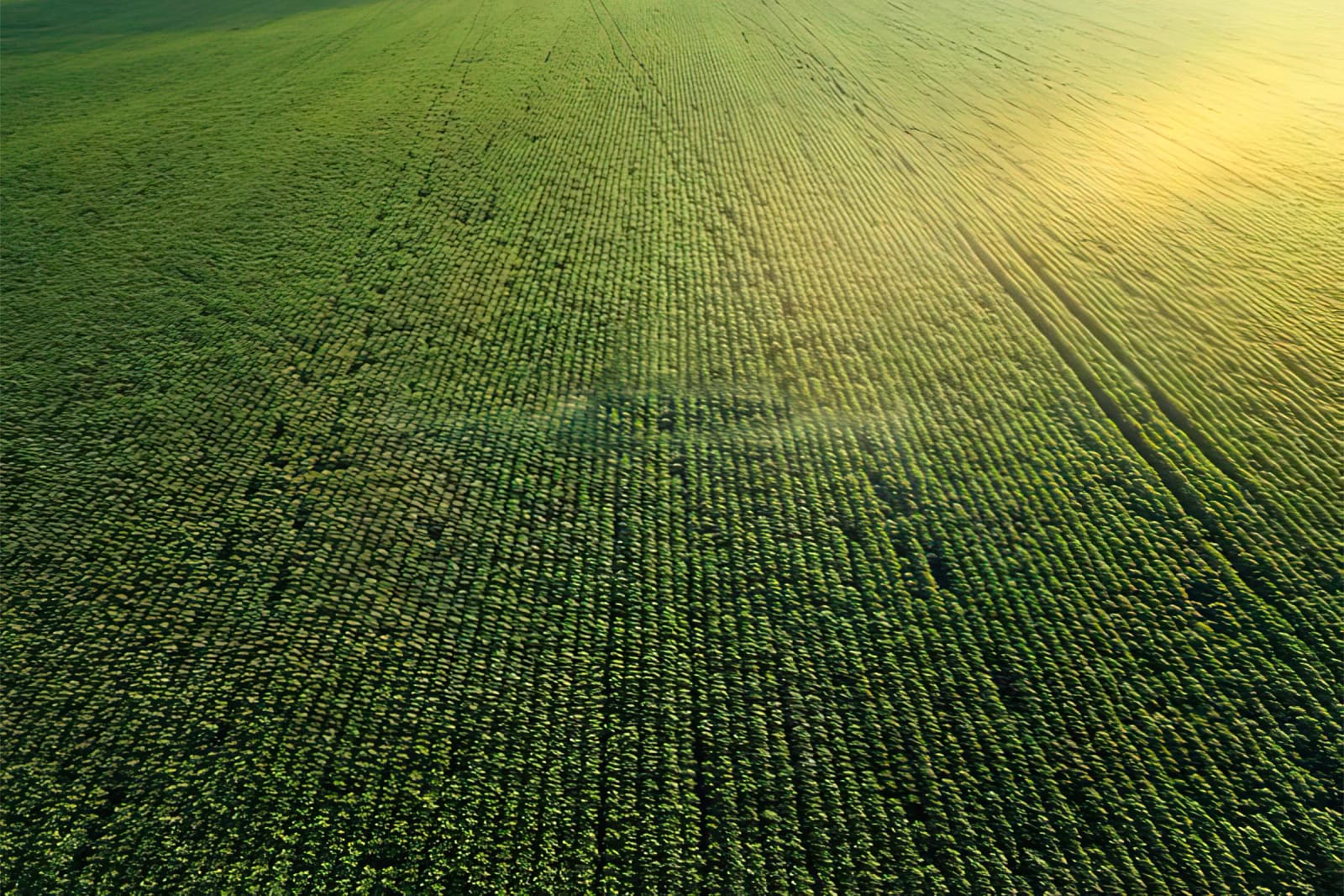
The deep green symbolizes industries that have long embraced sustainable practices, showcasing their leadership and experience in the journey towards a greener future.
Japanese Laurel
- Hex
- #3A7817
- RGB
- 58, 120, 23
- CMYK
- 52, 0, 81, 53
- Pantone
- 364 C
- #3A7817
- #4A8711
- #52910E
- #5A9C0B
- #62A608
- #6AB005
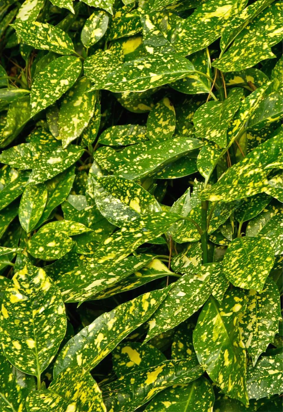
The green represents industries that are in the process of transitioning towards sustainability. It signifies the progress and growth of these industries as they take significant steps towards embracing greener practices. This shade embodies the transformative journey and serves as a bridge between the darker and lighter shades.
Apple Green
- Hex
- #72BF02
- RGB
- 114, 191, 2
- CMYK
- 40, 0, 99, 25
- Pantone
- 376 C
- #7FC313
- #87CC23
- #94D534
- #A1DF44
- #AEE855
- #BBF165
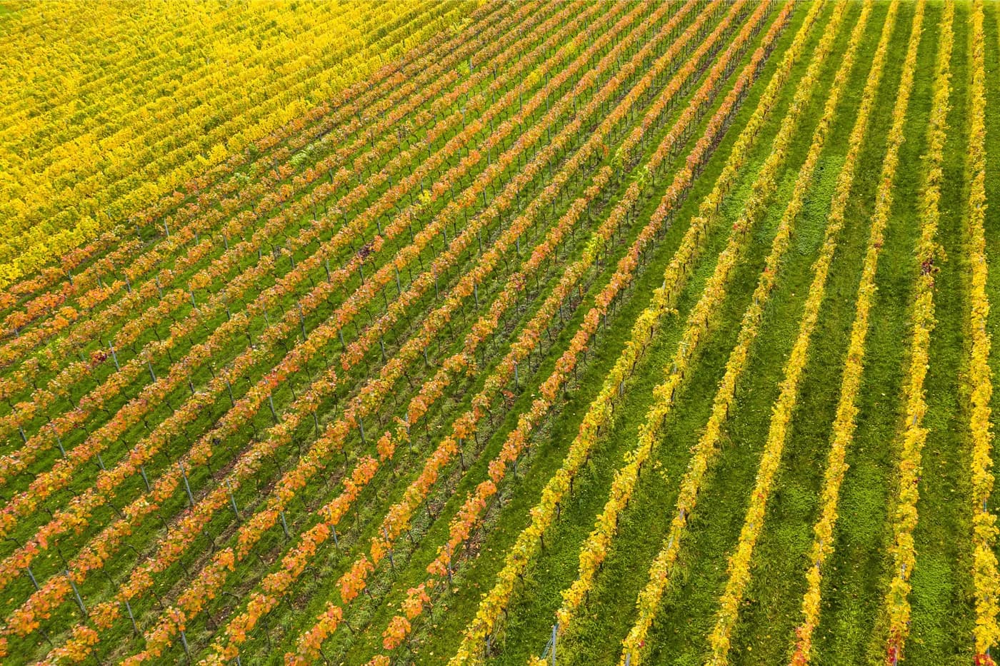
The light green signifies all those who are just beginning to embark on their sustainable journey. It represents the fresh sprouts of change, symbolizing their initial steps towards sustainability. This shade conveys optimism, growth, and the potential for future flourishing as these industries embrace greener practices.
Cyan (Process)
- Hex
- #0CBEED
- RGB
- 12, 190, 237
- CMYK
- 95, 20, 0, 7
- Pantone
- 311 C
- #1EBFEB
- #2FC5ED
- #41CBF0
- #53D2F2
- #65D8F5
- #76DEF7

The blue color symbolizes the essential elements of life, representing clear air and water vital for sustenance. Beyond that, it embodies our unwavering commitment and the clarity of our objectives. This color also signifies innovation, technology, and a futuristic approach, highlighting our dedication to creating a sustainable future through cutting-edge solutions.
Lemon Yellow
- Hex
- #FFF44F
- RGB
- 255, 244, 79
- CMYK
- 0, 4, 69, 0
- Pantone
- 376 C
- #F58226
- #F6942D
- #F7A634
- #F7B93A
- #F8CB41
- #F9DD48
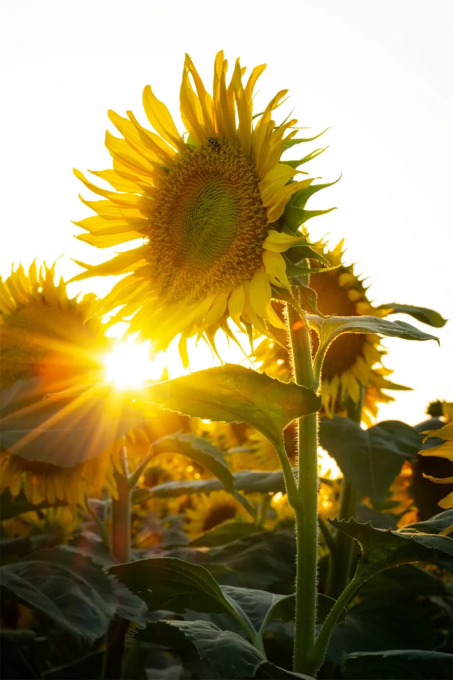
The yellow color represents not only the essential role of the sun in agriculture but also symbolizes the energy and enthusiasm necessary for taking action. It embodies the birth of ideas, as the glowing bulb illuminates our minds, igniting the realization of the urgent need for sustainable practices.
Apricot (Pantone)
- Hex
- #F19035
- RGB
- 241, 144, 53
- CMYK
- 0, 40, 78, 6
- Pantone
- 15-1153 TCX
- #DE694F
- #E0704A
- #E37646
- #E67D42
- #E9803E
- #EB8739
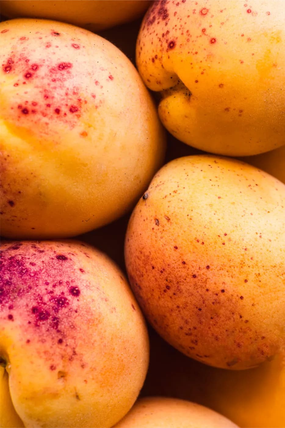
To add a touch of vibrancy and optimism, we introduce the apricot color. It represents blessings, prosperity, and the multitude of positive outcomes we will achieve by following the green path. It reminds us of the countless rewards and benefits we can unlock through sustainable choices.
The Identity in Use
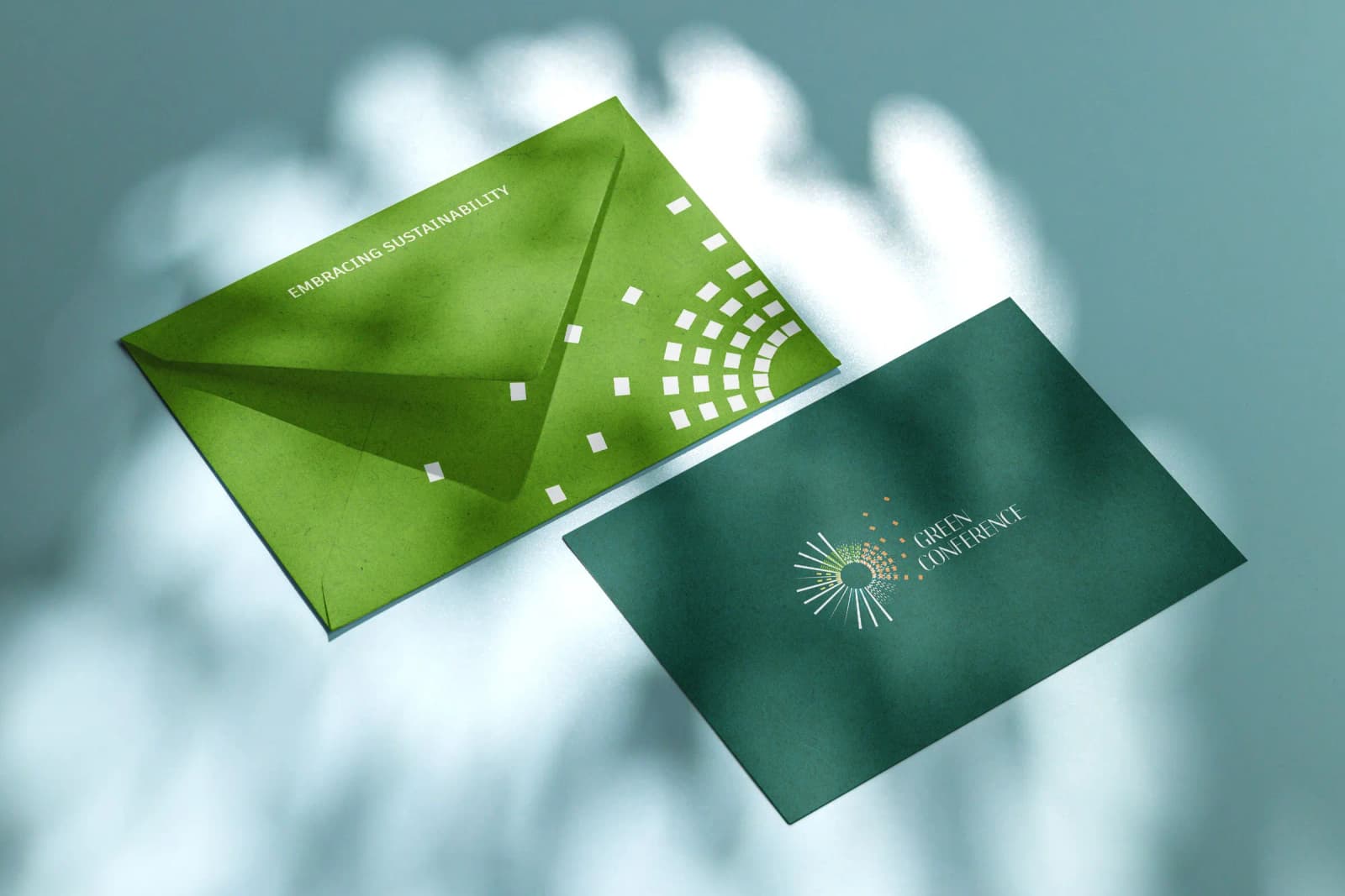
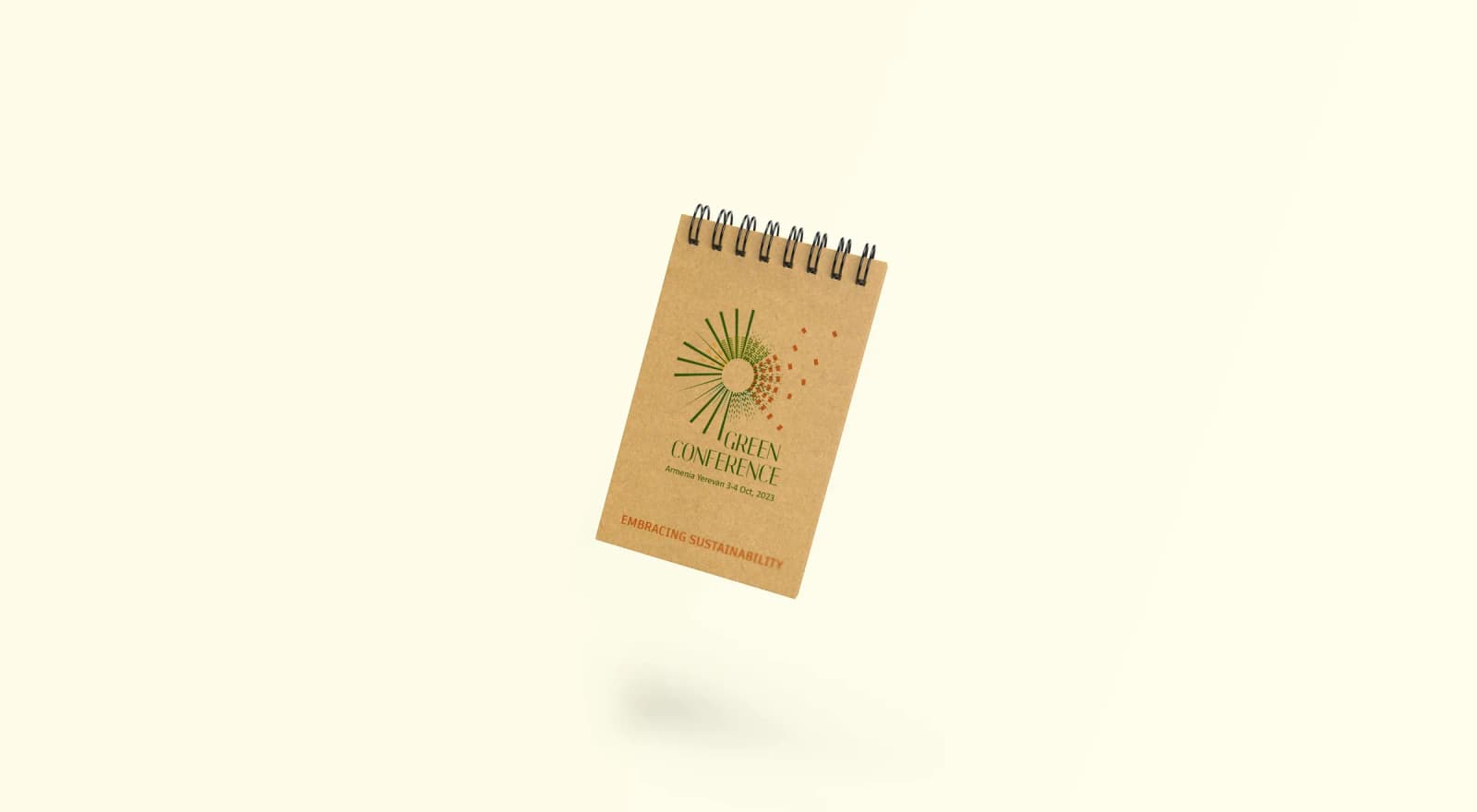
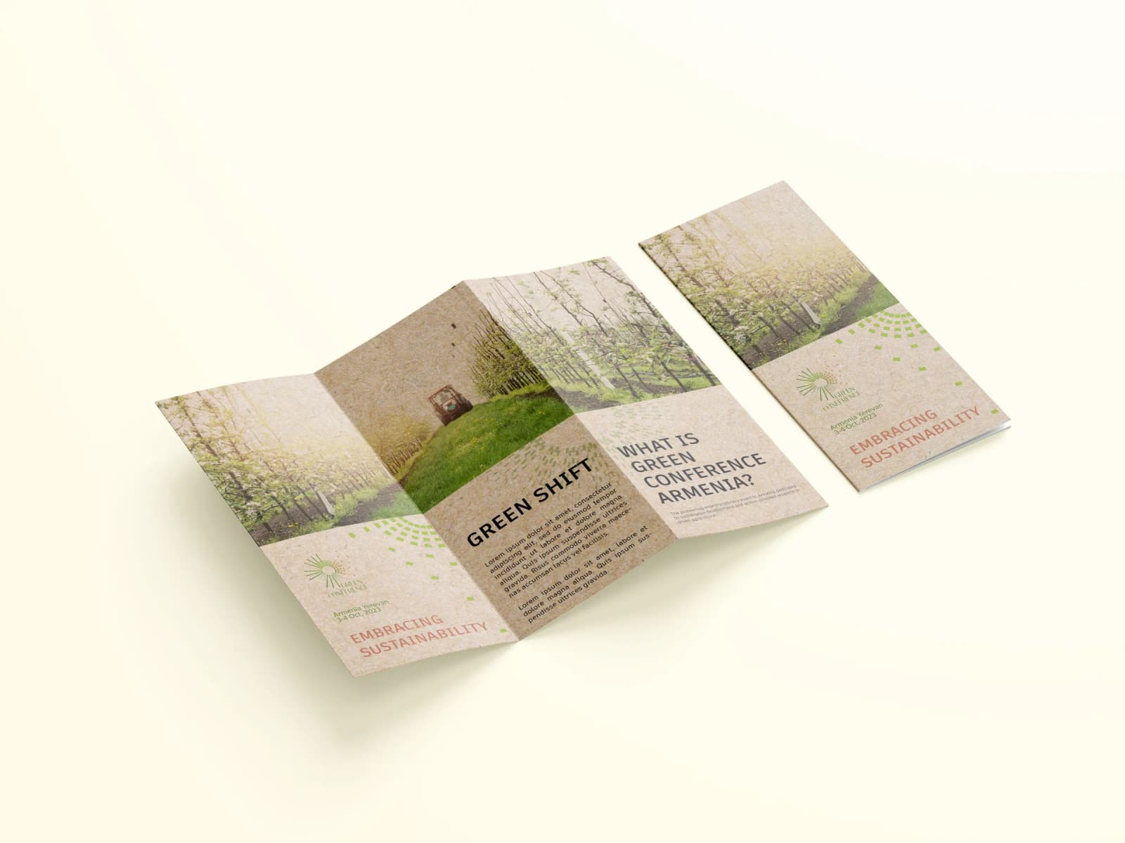

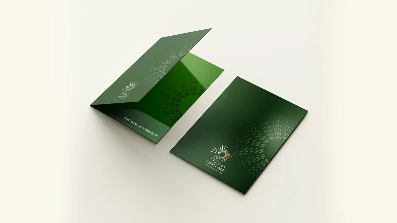
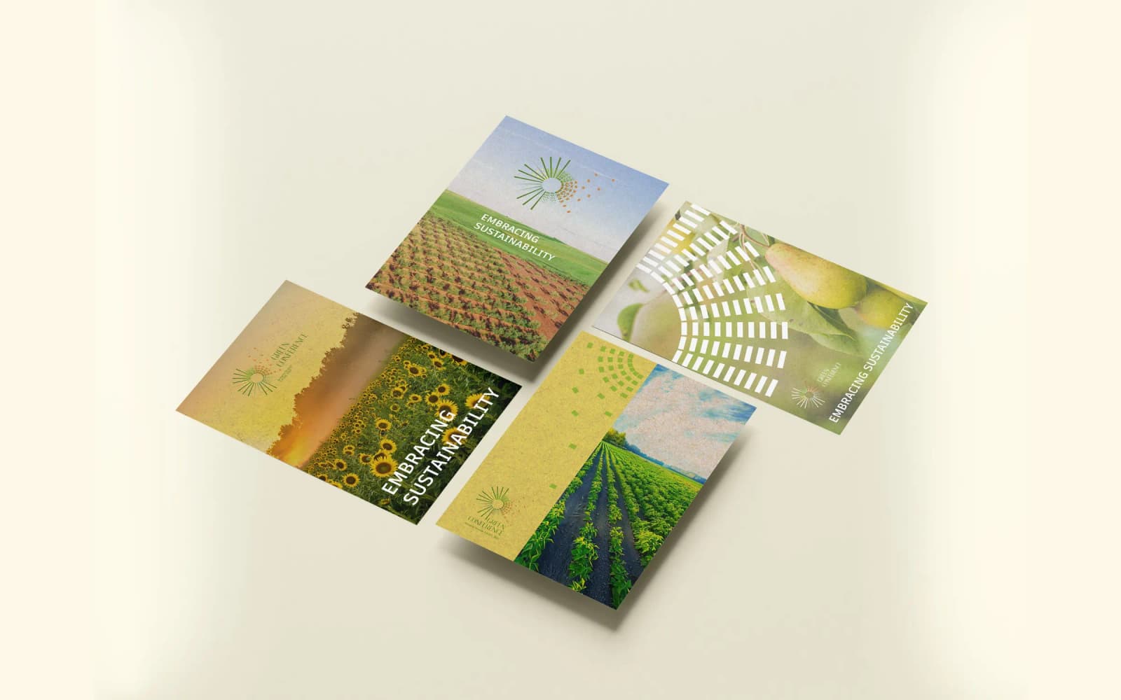
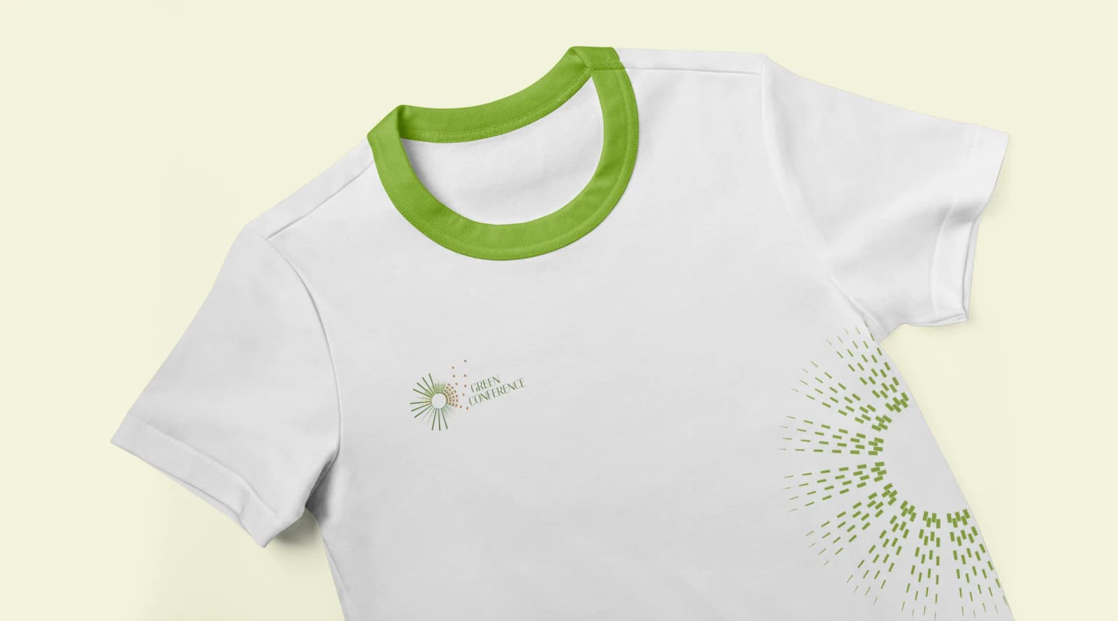
Transition of the Idea into an Experience
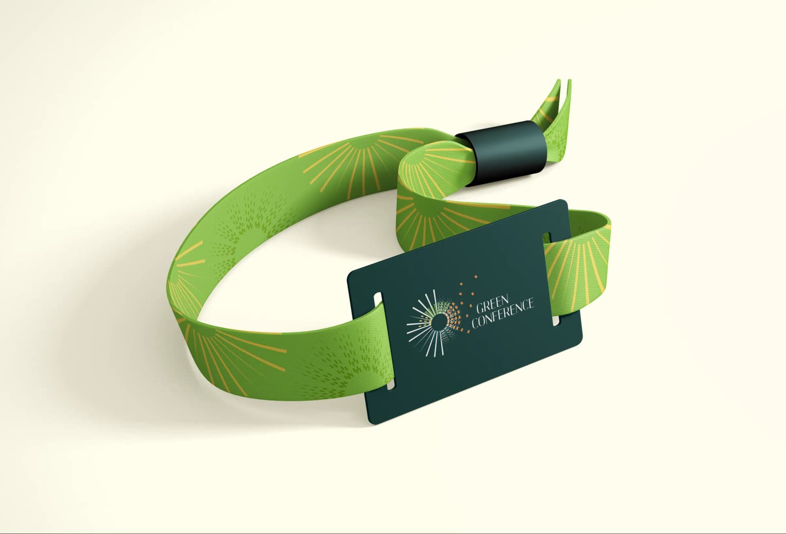
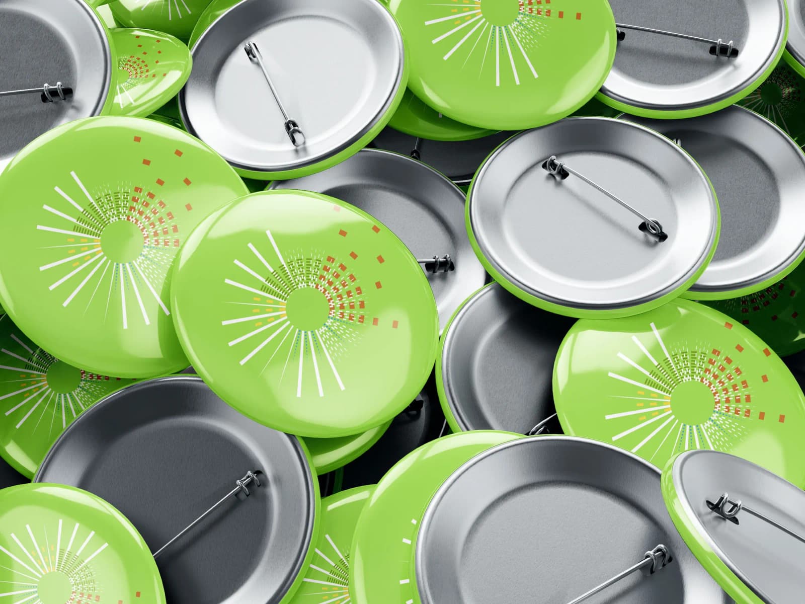
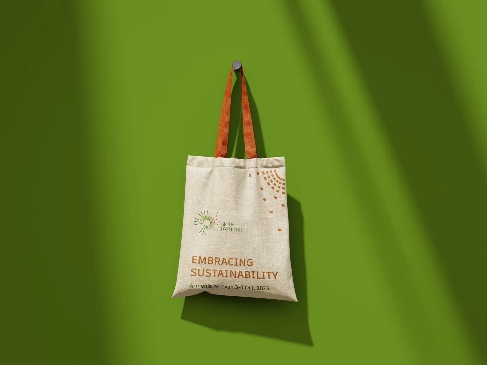
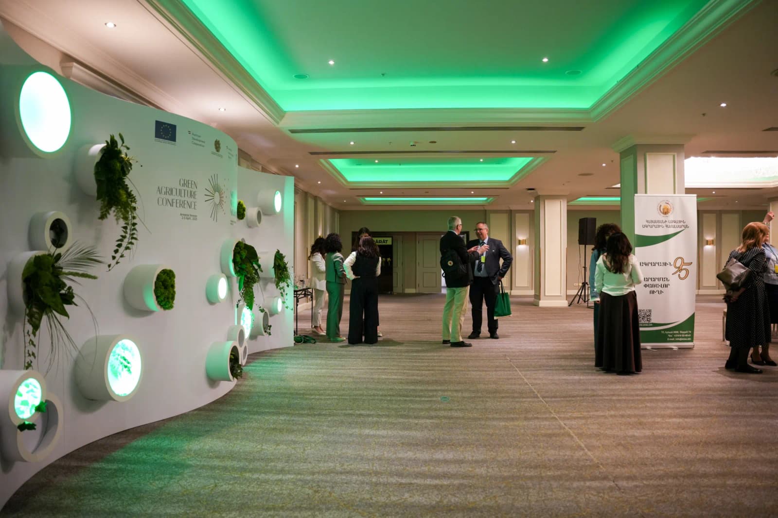
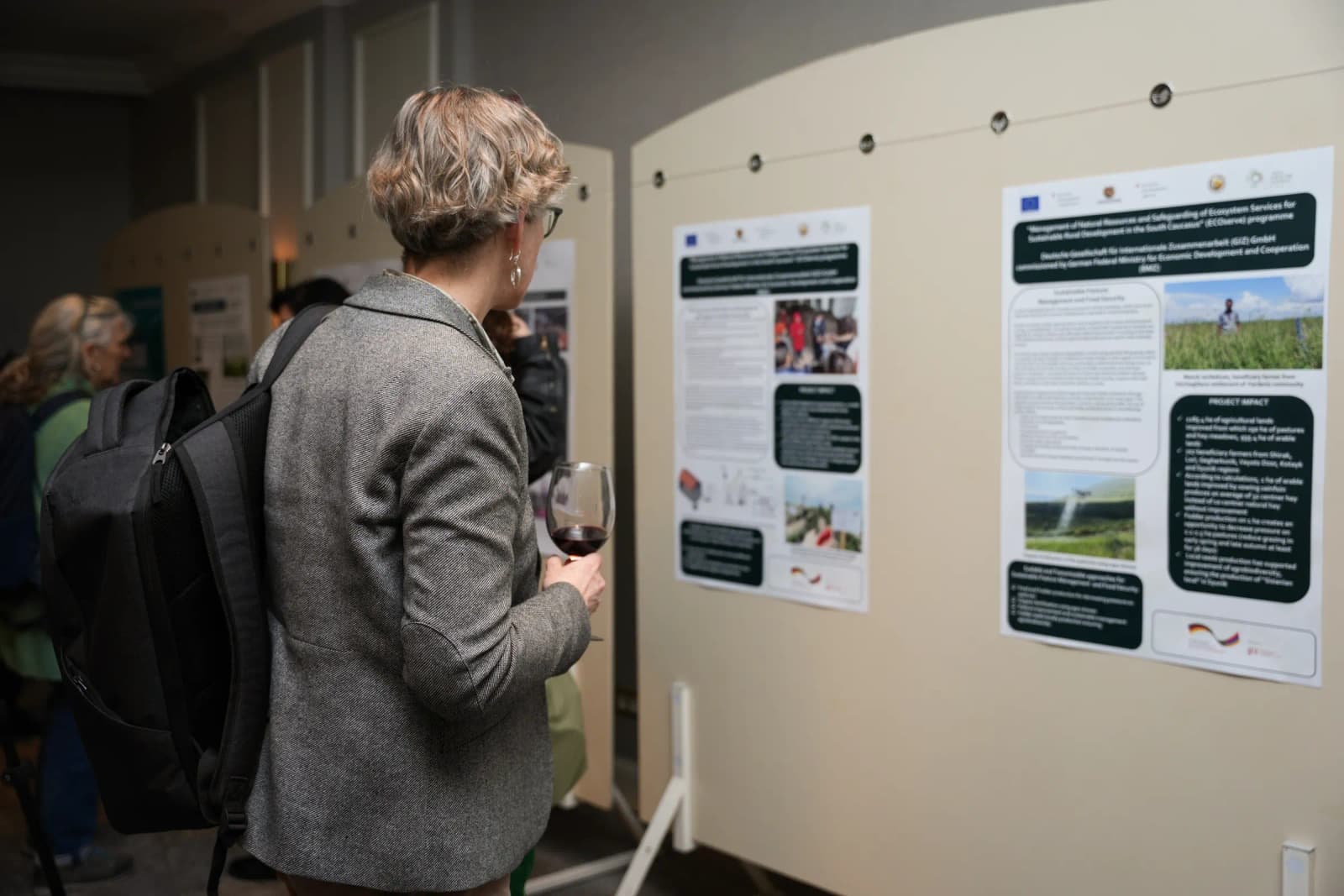
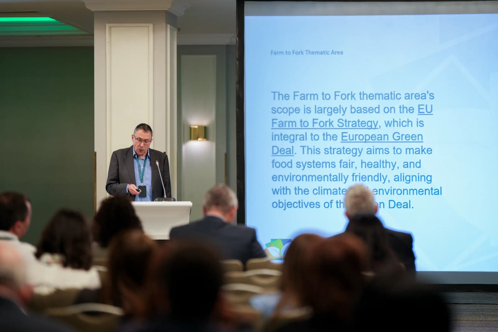
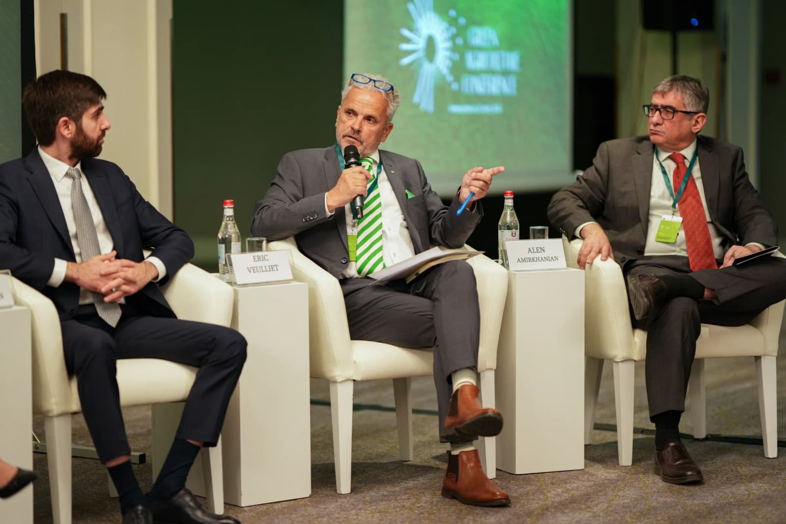
We managed the conference from the first invitation to the final session. The identity moved from paper into space. POS materials, branded participant kits, signage and installations shaped the venue. Its centrepiece was the photo zone, a press wall grown from real plants. This living installation turned the idea of a green shift into something guests could see and stand in front of.
Event Communication and Media Relations
Ahead of the event, we made the conference website its main point of entry, a place where participants could explore the agenda, meet the speakers, register and submit their research.
A dedicated social media campaign on Facebook and LinkedIn brought the conversation to local and international audiences. Targeted press outreach and media relations placed the conference in the national spotlight.